Butterick’s Practical Typography
Free crash course in typography
A couple years ago, I reviewed typographer-lawyer Matthew Butterick’s book, Typography for Lawyers. It “isn’t just for lawyers,” I said then, “it’s for anyone who cares about how text looks in print or on the Web.”
Now Butterick has web-published a new book on typography for a general audience, Butterick’s Practical Typography. It covers the same subject, but without directives specific to the legal profession.
This time it’s not a print book. It’s not an e-book, either. It was created and coded by Butterick himself specifically for the Web. You can read it through like a book, but it’s set up as an easy reference guide, with links to font basics, font recommendations, text formatting, sample documents, etc. For those in a hurry, there’s a “Typography in Ten Minutes” section.
The book is freeware, but you can kick the author some compensation for his work through the website.
I love type. I’ve read many bookis on the subject. Butterick’s are by far the clearest and most useful of them all.
01/7/14Excerpt
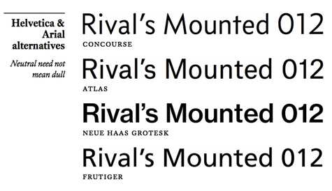
Criticizing Helvetica is one of the favorite pastimes of typographers: It’s bland. It’s overused. It’s inapt for most projects. All true statements.
Yet they sort of miss the point. It’s like criticizing Star Wars because the visual effects are unrealistic. Or because the dialogue is wooden. Or because the plot is pinched from The Hidden Fortress. All true statements. But so what? It’s still Star Wars. And like Star Wars, Helvetica will be with us for the foreseeable future.
Should you use Helvetica? Look, I like Helvetica. Though mostly in the rear-view mirror. Today, we have better options. For Helvetica diehards, there is neue haas grotesk, a lovely revival of the original Helvetica design. Others can try a font that’s neutral without being dull, like my own concourse, or the excellent new atlas. Even good old frutiger would be an improvement.
And don’t worry—no matter which alternative you choose, Helvetica will still be with us.
*
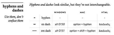
The hyphen (-) is the smallest of these marks. It has three uses.
1. A hyphen appears at the end of a line when a word breaks onto the next line. These hyphens are added and removed automatically by the automatic hyphenation in your word processor or web browser.
2. Some multipart words are spelled with a hyphen (topsy-turvy, cost-effective, bric-a-brac). But a prefix is not typically followed with a hyphen (nonprofit, not non-profit).
3. A hyphen is used in phrasal adjectives (viewer-supported radio, dog-and-pony show, high-school grades) to ensure clarity. Nonprofessional writers often omit these hyphens. As a professional writer, you should not.
For instance, consider the unhyphenated phrase five dollar bills. Is five the quantity of dollar bills, or are the bills each worth five dollars? As written, it suggests the former. If you mean the latter, then you’d write five-dollar bills.