

downtowns
Charts: Monotheism, Retail, Urbanity, Home Size
Ask
Make extrapolated charts for the following:
Monotheism vs. Other & non-affiliated
Ecommerce vs. Physical retail sales
Global urban population
Average house size
Results
Extrapolate: Monotheism vs. other & non-affiliated
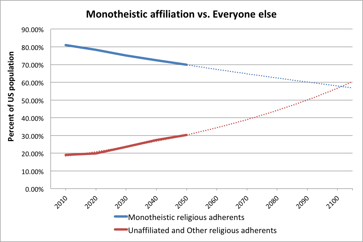
KEVIN: I’M HAVING TROUBLE UNDERSTANDING WHY THESE LINES DON’T CROSS AT 50%. THESE CURVES DON’T SEEM TO BE DIRECTLY CORRELATED.
In this chart, Christians, Muslims, and Jewish adherents are grouped in the Monotheistic adherents category. The red line includes the religiously unaffiliated, Buddhists, Hindus, followers of folk religions, and other religious adherents. Additional methodology on how Pew defined religious groups is available here.
Data for extrapolation (percentage of US population)
2010
Monotheistic religions
Christians 78.3
Jews 1.8
Muslims 0.9
Other
Unaffiliated 16.4
Buddhists 1.2
Folk Relions 0.2
Hindus 0.6
Other Religions 0.6
2020
Monotheistic religions
Christians 75.5
Jews 1.7
Muslims 1.1
Other
Unaffiliated 18.6
Buddhists 1.2
Folk Relions less than 1
Hindus less than 1
Other Religions less than 1
2030
Monotheistic religions
Christians 72.2
Jews 1.6
Muslims 1.4
Other
Unaffiliated 21.2
Buddhists 1.3
Folk Relions less than 1
Hindus less than 1
Other Religions 1.1
2040
Monotheistic religions
Christians 69.1
Jews 1.5
Muslims 1.8
Other
Unaffiliated 23.6
Buddhists 1.4
Folk Relions less than 1
Hindus 1.1
Other Religions 1.3
2050
Monotheistic religions
Christians 66.4%
Jews 1.4
Muslims 2.1
Other
Unaffiliated 25.6
Buddhists 1.4
Folk Relions 0.5
Hindus 1.2
Other Religions 1.5
Sources
Pew Research Center. April 2, 2015.
“The Future of World Religions: Population Growth Projections, 2010-2050.”
US Decadal data
NOTE: Figures for the “less than 1%” values are available for 2010 and 2050 (but not the intervening decades) in the full report
Table: Religious Composition by Country, 2010 and 2050, p.244
*
Extrapolate: Ecommerce Retail
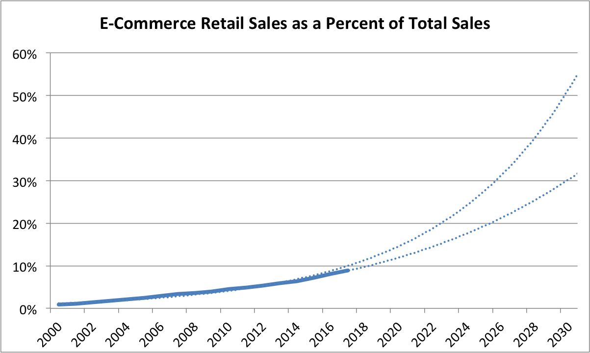
KEVIN – THE STEEPER CURVE IS AN EXPONENTIAL TREND LINE, BUT I FEEL THE POLYNOMIAL TREND LINE LOOKS LIKE A BETTER FIT. AGREE?
Source
U.S. Bureau of the Census, E-Commerce Retail Sales as a Percent of Total Sales [ECOMPCTSA], retrieved from FRED, Federal Reserve Bank of St. Louis; February 28, 2018.
ECOMPCTSA
Frequency: Annual
FRED Graph Observations
Federal Reserve Economic Data
*
Extrapolate: Urbanization

Source
United Nations, Department of Economic and Social Affairs, Population Division (2014). World Urbanization Prospects: The 2014 Revision, custom data acquired via website.
From the FAQ
How do we define “urban”?
We do not use our own definition of “urban” population but follow the definition that is used in each country. The definitions are generally those used by national statistical offices in carrying out the latest available census. When the definition used in the latest census was not the same as in previous censuses, the data were adjusted whenever possible so as to maintain consistency. In cases where adjustments were made, that information is included in the sources listed online. United Nations estimates and projections are based, to the extent possible, on actual enumerations. In some cases, however, it was necessary to incorporate other estimates of urban population size. When that is done, the sources of data indicate it.
*
Extrapolate: Home Size
Kevin, the following paper on US housing stock and floor space is very good. I’ll excerpt generously from it, but you may like to review the original article, “120 Years of U.S. Residential Housing Stock and Floor Space.”
I DON’T HAVE ACCESS TO THE DATA TO BE ABLE TO EXTRAPOLATE, BUT PERHAPS WE COULD REQUEST IT FROM THE AUTHORS.
Excerpts:
Excerpted Discussion:
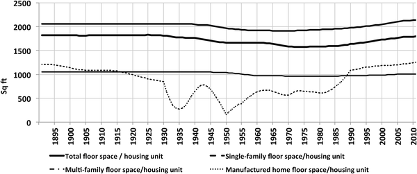
Fig 7 shows the estimated aggregated floor space average over the 120-year period, for each building type, calculated as the ratio of the two estimated time–series, total U.S. floor space and housing stock. Average floor space per unit remained approximately constant throughout the period. A slight ‘dip’ occurred in the 1940–2000 period, but the average returned to pre-1940’s values in the 2000’s, and so floor space per unit averages played a relatively minor role in overall floor space evolution over the very long term.
Excerpted Discussion:
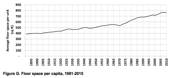
The number of U.S. homes and their associated total floor space have risen dramatically over the last century. From the end of the 19th to the mid-20th century, a net average of half a million homes was added annually to the country’s stock, corresponding to over 850 million square feet added annually. In the last half century, the net average of homes added annually doubled to one million, which led to a tripling of floor space growth, with 2,700 million square feet added annually, with new construction far exceeding retirements. Over the 1891–2010 period, floor space increased almost tenfold, which corresponds to a doubling of floor space per capita (from approximately 400 to 800 square feet (Fig G in S6 File).
Excerpted Conclusion:
Our results show that over the last 120 years floor space and housing stock in the U.S. increased approximately tenfold, while population increased approximately fivefold and household size decreased by a dramatic 50%. Average floor space has remained approximately constant. But can these long-term trends be expected to continue into the future? The interplay between the evolution of population, household size, average floor space growth, as well as other factors, such as the construction rate of single-family homes and the retirement of older smaller vintages, could become significant in future dynamics.
In order to look ahead, it is important to distinguish between short-and long-term trends. The 2008 housing crisis is a recent event from which the housing market is still recovering, so trends in the last decade may not be representative of future developments. Taking the last 30 years into account, however, allows for a better insight into the near future. It is particularly instructive to examine the two factors that have evolved differently over the last three decades, compared to their previous evolution, namely household size and average floor space.
Decreasing household size is a trend with roots in a combination of factors: increased national income, increased mobility, demographic factors such as the aging of the population and the proportion of young adults who are potential homebuyers, and cultural factors such as changing family structures (ex. the increase of the median age at first marriage, family size and the overall decline in the number of married adults, [24]. These factors could contribute to a further long-term decrease of household size, but compared to the decrease in household size since the late 19thC, household size in the U.S. has been decreasing at a slower pace since the 1980’s. In 2007–2010 there was a slight increase from 2.31 to 2.34 persons per household (Fig 6, top), which could either be immediate consequence of the housing crisis, or could indicate a more fundamental change in the long-term trends. A slow economic recovery, with still relatively high unemployment, a rising student debt and the difficulty of obtaining mortgage credits, are all factors that may contribute to a slower decrease or an increase in household size, as young adults are less able to move out of their parents’ homes [25].
In the last 30 years floor space averages have been increasing, as older post-1940 vintages consisting of smaller units, such as those built in the post-war “baby boom” years progressively retire, while larger units are added to the stock. New single family homes built in the first decade of the 21st century averaged 2,673 square feet, while those built in the 1980’s averaged 2,162 square feet (see Table 1). The overall average floor space for units of all building types increased by 13% in the last 30 years, reaching almost 1,800 square feet per unit in 2010 (see Fig 9).
These two factors–household size and floor space averages—have the potential to drive floor space in opposite directions. The observed increase in average floor space is a clear trend, which might only be attenuated if the rate of construction of single-family homes or retirement of older units also slows down. On the other hand, if the tendency for household size to decrease more slowly or increase is indeed a new trend, then both the number of housing units and floor space might accompany population growth more closely than has been the case in the past.
Src:
Maria Cecilia P. Moura, Steven J. Smith, David B. Belzer. August 2015.
“120 Years of U.S. Residential Housing Stock and Floor Space.” PLOS ONE
Note: Figure G (floorspace per capita) is from the supporting document:
S6 File. Results: Floor space time-series.
Downtowns
Summary
This collection of data includes the following indicators, dates, and sources:
Acreage
urban acreage, 1992-2100 & 2000-2050 & 1950-2010, USGS & Lincoln Inst & US Census
Population
urban population, 1950-2050, United Nations
young adults by proximity to center, 1990/2012, UVA
elderly by proximity to center, 1990/2012, UVA
white residents by proximity to center, 1990/2012, UVA
black residents by proximity to center, 1990/2012, UVA
population by proximity to center, 1990/2012 & 2000/2010, UVA & US Census
population distribution by proximity to center, 2000/2010, US Census
Jobs
metro area jobs, 2002/2011 5-yr period, US Census
skilled jobs by proximity to center, 1980-2010 decadal, US Census
Education
full-time workers with BA+ by proximity to center, 1980-2010 decadal, US Census
educational attainment by proximity to center, 1990/2012, UVA
Desirability/Walkability
competitiveness of city centers, 2002/2011 5-yr period, City Observatory/US Census
cities most likely to be WalkUPs in the future, GWU
Personal Income
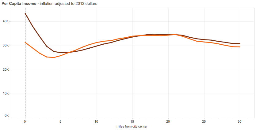
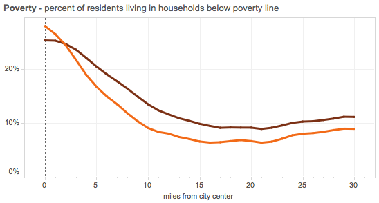
per capita income by proximity to center, 1990/2012, UVA
proportion residents living below poverty line by proximity to center, 1990/2012, UVA
home prices by proximity to center, 1980-2010 decadal, US Census
Housing and Density
occupied housing units by proximity to center, 1990/2012, UVA
percent of rented housing by proximity to center, 1990/2012, UVA
population density by proximity to center, 1990/2012, UVA
NOTE: Might be worth talking to someone from MIT’s Center for Advanced Urbanism, or an editor from City Lab or Next City for suggestions of additional “downtown” indicators and possible data sources, as well as more forecast data, which is quite lacking in this round-up.
keywords:
urban development
central business districts
city centers
data desired but lacking:
traffic congestion
construction trends
walkability (longitudinal data)
energy consumption per capita (vs. rural)
Findings
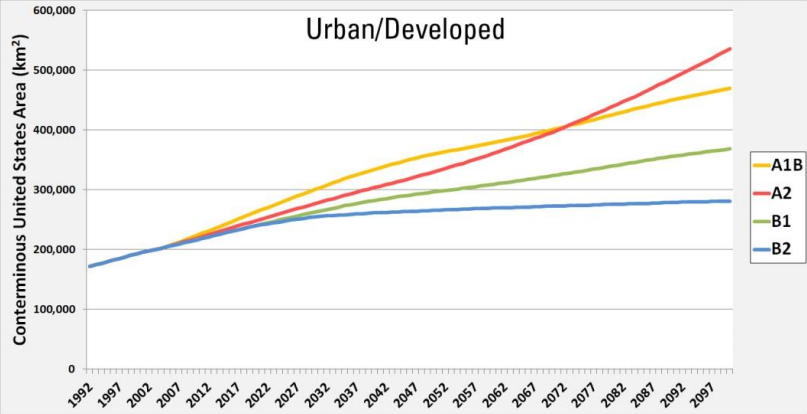
Urban Acreage
The U.S. Geological Survey tracks and forecasts several categories of land use, with charts and maps showing change under four different scenarios from 1992 through 2100. The land-use categories include acreage that is 1) urban/developed, 2) forest, 3) cropland, 4) grassland/shrubland, 5) hay/pasture, and 6) wetland.
Urban/Developed Land Area in Four Scenarios, 1992-2100
Excerpt:
Researchers at the USGS Earth Resources Observation and Science Center have developed the FOREcasting SCEnarios of land-cover change (FORE-SCE) model that is based on consistent and systematic historical data derived from Landsat satellite imagery of rates and spatial patterns of land cover change over many years. As part of USGS research to assess potential greenhouse gas fluxes and carbon storage in vegetated landscapes, FORE-SCE has been used to produce projected, annual land-cover maps from 1992 through 2100 for four future scenarios for the conterminous United States. The land cover maps provide 250-meter resolution information for 17 different land-use and land-cover classes, offering an unprecedented combination of thematic detail and spatial resolution for land-cover projections.
The four land cover scenarios that were modeled are based, in turn, on carefully-defined environmental scenarios from the Intergovernmental Panel on Climate Change (IPCC), ensuring that the projected land cover maps may be used in assessment frameworks consistent with IPCC scenario characteristics. The scenarios vary in terms of both climate and socioeconomic conditions in the future.
The A1B scenario is characterized by very high economic growth, strong technological innovation, and open, global economies and societies. Projected land use changes include sprawling urban growth, agricultural expansion, and heavy use of forested lands for wood products.
The A2 scenario is characterized by moderate economic growth, very high population growth, and less open economies and societies. Land use changes include very high urban growth, massive expansion of agricultural lands to feed a growing population, and loss of natural landscapes.
The B1 scenario has high economic growth, moderate population growth, and a focus on environmental sustainability. Land-use change is modest, with compact urban growth and modest increases in agricultural land.
The B2 scenario has moderate economic growth, low population growth, and a focus on environmental sustainability. Natural landscapes are preserved and even expanded in this scenario, with a reduction in lands devoted to agriculture.
Image Src:
Terry Sohl, et al. December 2012.
“The Completion of Four Spatially Explicit Land-use and Land-cover (LULC) Scenarios for the Conterminous United States.” P.28
U.S. Geological Survey.
NOTE: This PDF includes the same charts for Forest, Cropland, Grassland/Shrubland, Hay/Pasture, and Wetland
Excerpt Src:
Jon Campbell. Sep 2014.
“Modeling a Changing American Landscape”
USGS Science Features.
contact: Terry Sohl, sohl@usgs.gov
TO DO: CONTACT TERRY SOHL, sohl@usgs.gov, FOR DATA POINTS. MIGHT BE AVAILABLE VIA ONE OF THE (HUGE) EXCEL FILES ON THIS PAGE.
*
The Lincoln Institute has also projected urban land coverage based on a 1990-2000 sample of 120 global cities.
Three projections are made based on three different assumptions about density change over time: (a) no density change; (b) a 1 percent annual density decline; and (c) a 2 percent annual density decline.
US Urban Land Cover Projections in Three Scenarios, 2000-2050

Src:
XLS: “Urban Land Cover Projections for Countries and Regions, 2000-2050”
Via:
Shlomo Angel, et al. 2010.
“Section 3 – Urban, National, and Regional Data.”
Atlas of Urban Expansion. Lincoln Institute of Land Policy.
*
Demographia.com, maintained by Wendell Cox (a pro-automobile urban planner who favors low-density planning), has aggregated a few urbanizations statistics from the US Census Bureau. Indicators include urban land area (square miles), urban population, urban households, population density, and household density, as well as annual percent change for all of the above. Decadal data points are available from 1950 through 2010.
src:
Demographia. 2012.
“Urbanization in the United States from 1945.”
Demographia.com, Wendell Cox Consultancy.
citing:
US Census Bureau
TO DO: EXTRACT/CONFIRM DATA.
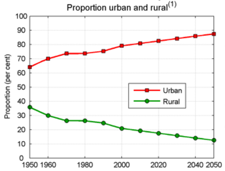
Urban Population
Proportions of urban and rural population in the current country or area in per cent of the total population, 1950 to 2050.
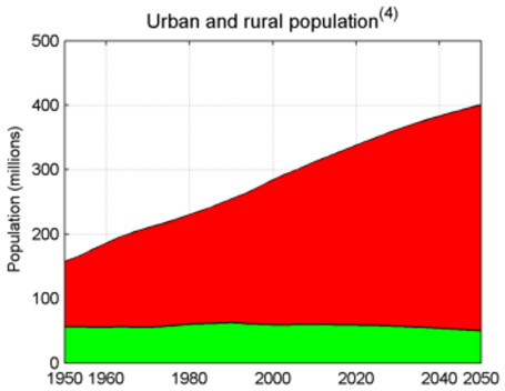
Total urban and rural population
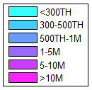
Urban population of the current country by size class of its urban agglomerations in 2014.

The light blue area is a residual category, which includes all cities and urban agglomerations with a population of less than 300,000 inhabitants. The size classes correspond to the following legend:
src:
United Nations. 2014
“Country Profile: United States of America,” in World Urbanization Prospects: The 2014 Revision.
Department of Economic and Social Affairs, Population Division.
TO DO: EXTRACT DATA. ANNUAL DATA AVAILABLE HERE.
*
dark red – 2012
orange – 1990
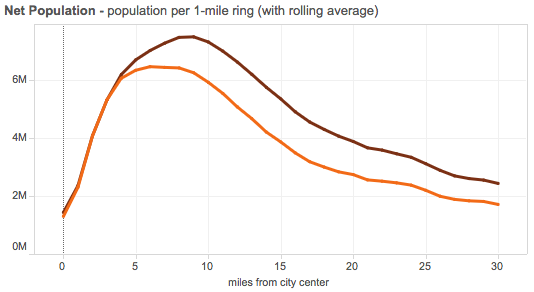
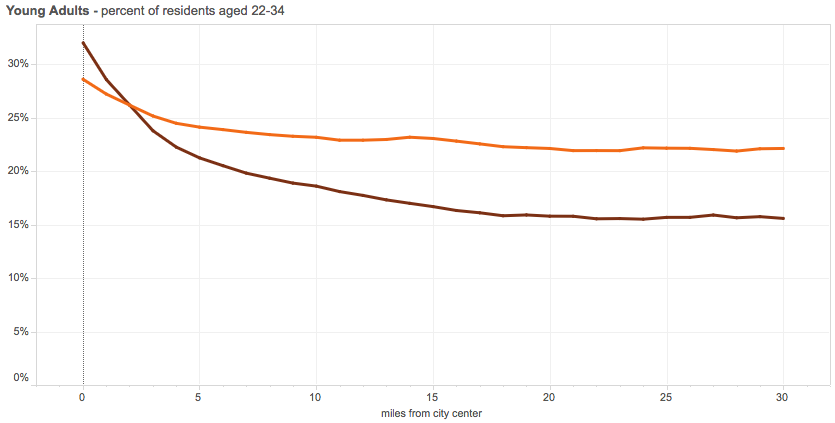
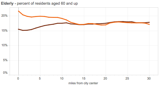
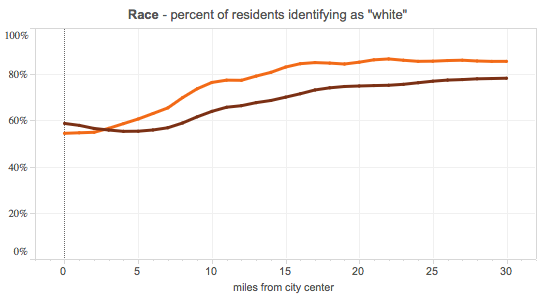
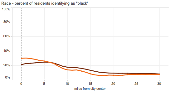
src:
Luke Juday. Accessed August 19, 2016.
“The Changing Shape of America’s Metro Areas.”
University of Virginia. Demographics Research Group.
citing: 1990 Census data and the 2008-2012 American Community Survey
*
Based on the Census Bureau’s data for the 51 major metropolitan areas (those with more than 1 million population).
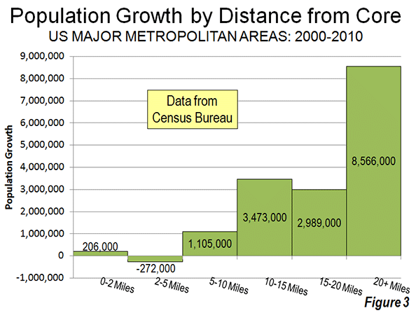

src:
Wendell Cox. October 2012.
“Flocking Elsewhere: The Downtown Growth Story.”
New Geography.
citing:
US Census Bureau. September 2012.
“Patterns of Metropolitan and Micropolitan Population Change: 2000 to 2010.”
Metro Area Jobs
City Observatory analyzed Census Bureau data from the 2002-2007 period to the 2007-2011 period and finds that after a long period of decentralization, economic and demographic indicators are now favoring city centers.
Excerpts:
When we compared the aggregate economic performance of urban cores to the surrounding metro periphery over the four years from 2007 to 2011, we found that city centers—which we define as the area within 3 miles of the center of each region’s central business district—grew jobs at a 0.5 percent annual rate. Over the same period, employment in the surrounding peripheral portion of metropolitan areas declined 0.1 percent per year. When it comes to job growth, city centers are out-performing the surrounding areas in 21 of the 41 metropolitan areas we examined. This “center-led” growth represents the reversal of a historic trend of job de-centralization that has persisted for the past half century.
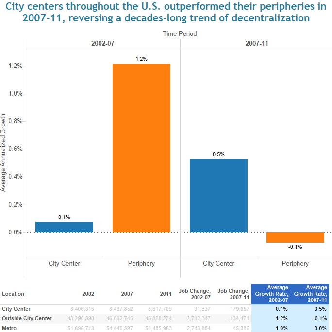
src:
Joe Cortright. February 2015.
“Surging City Center Job Growth.”
City Observatory.
*
Economists at Columbia University and the Getulio Vargas Foundation have also analyzed Census Bureau data from 1980 to 2010, finding that center cities and downtown living are making a come back. Their analysis is based on data from 27 heavily populated U.S. cities, from the CBD to 35 miles away from the center of the cities. Their report includes an interesting graphic on skilled jobs, although these are not the exclusive focus of the report. Elsewhere in this roundup, I’ve also excerpted a graphic for home prices and and education which follow the same trend.
Excerpts:
Skilled Jobs:
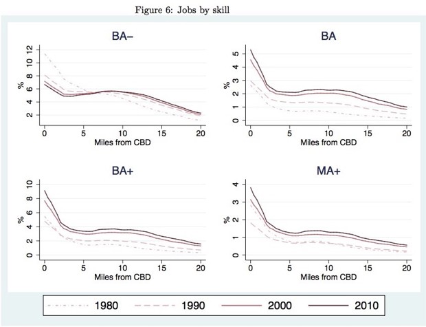
src:
Lena Edlund, et al. 2015.
“Bright Minds, Big Rent: Gentrification and the Rising Returns to Skill.”
National Bureau of Economic Research. NBER Working Paper No. 21729.
via:
Eric Jaffe. November 2015.
“Why the Wealthy Have Been Returning to City Centers.”
Atlantic City Lab.
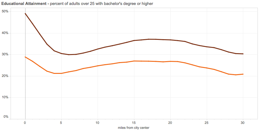
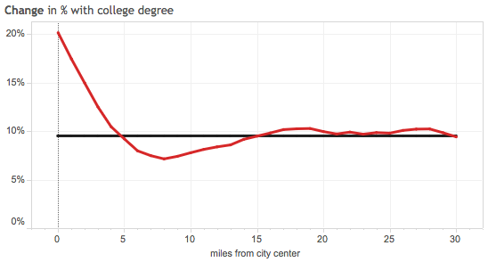
Education
Full-time workers with at least a bachelor’s degree working 40 or 50 hours per week:

The data for men show similar trends, with shares rising a bit more toward the periphery.
src:
Lena Edlund, et al. 2015.
“Bright Minds, Big Rent: Gentrification and the Rising Returns to Skill.”
National Bureau of Economic Research. NBER Working Paper No. 21729.
via:
Eric Jaffe. November 2015.
“Why the Wealthy Have Been Returning to City Centers.”
Atlantic City Lab.
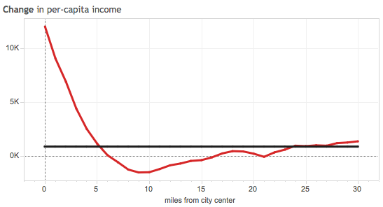
*
dark red – 2012
orange – 1990
red – 1990-2012 change
black – baseline change for whole metro area
src:
Luke Juday. Accessed August 19, 2016.
“The Changing Shape of America’s Metro Areas.”
University of Virginia. Demographics Research Group.
citing: 1990 Census data and the 2008-2012 American Community Survey
Desirability/Walkability
In City Observatory’s analysis of 2002-2007 and 2007-2011, referred to above, they also came up with a competitiveness calculation which favors city centers.
Excerpt:
We undertook a shift-share analysis that allowed is to separate out the effects of changing industry mix from relative competitiveness. The data make it clear that city centers are more competitive in 2011 than they were in 2007. While city centers had a negative competitive effect in the 2002-07 period, their relative competitiveness for industry has been equal to peripheral locations from 2007-11.
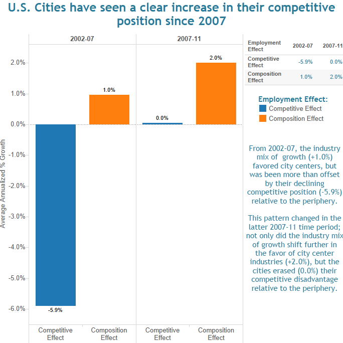
src:
Joe Cortright. February 2015.
“Surging City Center Job Growth.”
City Observatory.
*
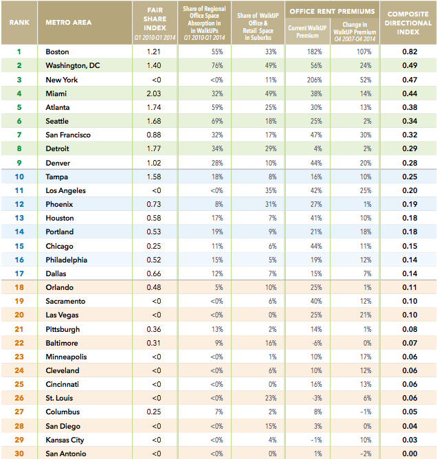
Researchers at The George Washington University School of Business identified and analyzed 558 walkable urban places (WalkUPs) in the 30 largest metropolitan areas in the United Station, and then ranked the 30 metros according to their current walkable urbanism. This research, published in 2014, is an update to the Brookings Institution’s initial scoring in 2007.
The researchers find that the most walkable urban areas are correlated with substantially higher GDPs per capita and percentages of college graduates over 25 years old. They also find that walkable urban office spaces command a 74% rent-per-sq-foot premium over rents in drivable suburban areas.
They assert that walkable urban development is not limited to center cities, but includes the urbanization of suburbs.
They predict future demand for tens of millions square feet of walkable urban development and hundreds of new WalkUPs.
Walkable urban places are defined as having 1.4 million square feet or more of office space and/or 340,000 square feet or more retail space, as well as a Walk Score value greater than or equal to 70 at the 100 percent location of the WalkUP.
Current Ranking
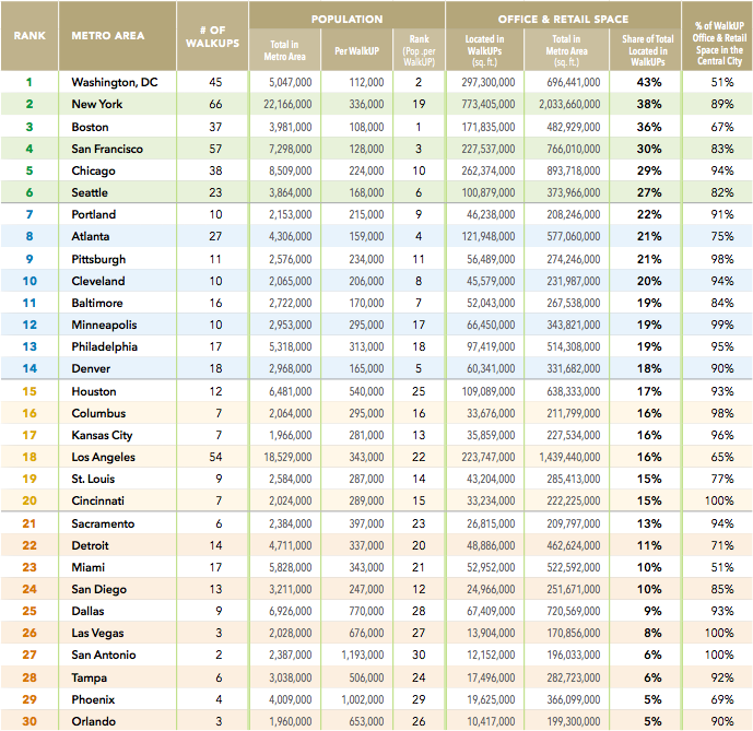
Future Ranking
Note: This ranking refers to the level of expected future walkability, but does not define a particular point in time in the future. Although there are only 6 metro areas currently ranked as highly walkable, 9 are expected to be highly walkable in the future.
src:
Christopher B. Leinberger & Patrick Lynch. 2014.
“Foot Traffic Ahead: Ranking Walkable Urbanism in America’s Largest Metros.”
The George Washington University School of Business.
citing:
CoStar for office and retail data
Walk Score index
Local transit agency web sites
The American Community Survey for educational attainment & population data
U.S. Bureau of Economic Analysis for per capita GDP
Personal Income
dark red – 2012
orange – 1990
red – 1990-2012 change
black – baseline change for whole metro area
src:
Luke Juday. Accessed August 19, 2016.
“The Changing Shape of America’s Metro Areas.”
University of Virginia. Demographics Research Group.
citing: 1990 Census data and the 2008-2012 American Community Survey
*
Home Prices:
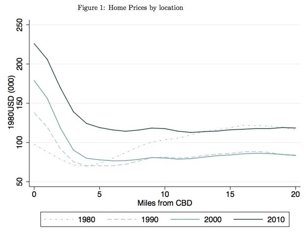
src:
Lena Edlund, et al. 2015.
“Bright Minds, Big Rent: Gentrification and the Rising Returns to Skill.”
National Bureau of Economic Research. NBER Working Paper No. 21729.
via:
Eric Jaffe. November 2015.
“Why the Wealthy Have Been Returning to City Centers.”
Atlantic City Lab.
Housing & Density
dark red – 2012
orange – 1990

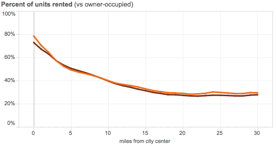
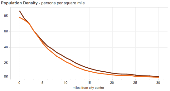
src:
Luke Juday. Accessed August 19, 2016.
“The Changing Shape of America’s Metro Areas.”
University of Virginia. Demographics Research Group.
citing: 1990 Census data and the 2008-2012 American Community Survey
Models of Change
The University of Virginia’s Demographics Research Group has analyzed the demographic trends of 66 major US metropolitan areas with regard to their distance from the city center. City Lab reports that, in many cases, the findings help to support Aaron’s Renn’s “new donut” model of cities, although some cities continue to follow other growth models, referred to as “magnetic” cities and “old donut” cities.
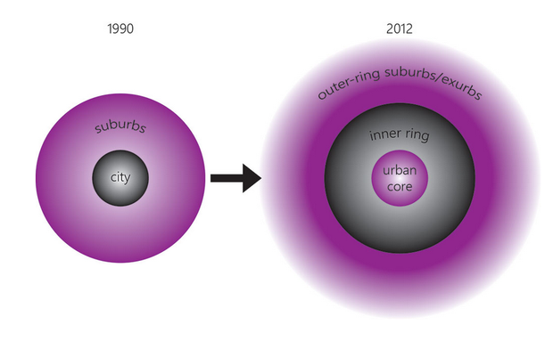
In the “old donut” model, growth and wealth are concentrated in the suburbs.
In the “magnetic” model, growth and income are highest in the center and gradually decline all the way to the periphery.
In the “new donut” model, city centers and outer-ring suburbs have the highest performing indicators, but the inner ring suburbs are characterized by decline.
src:
Tanvi Misra. March 2015.
“This Chart Tool Shows How City Centers Are Doing Better Than Inner Suburbs.”
Atlantic City Lab.
citing:
Aaron Renn. September 2014.
“The New Donut.”
and also citing:
Luke Juday. March 2015.
“The Changing Shape of American Cities.”
University of Virginia. Weldon Cooper Center for Public Service.
which cites: 1990 Census data and the 2008-2012 American Community Survey
The University of Virginia also released a charting tool associated with their report. In addition to showing charts for individual cities, it also includes charts for a composite of the 50 largest metropolitan areas.
The charts below (also excerpted elsewhere in this roundup) show the “new donut” model.
dark red – 2012
orange – 1990
red – 1990-2012 change
black – baseline change for whole metro area
src:
Luke Juday. Accessed August 19, 2016.
“The Changing Shape of America’s Metro Areas.”
University of Virginia. Demographics Research Group.
*
A US Census Bureau report from 2012 also shows a “new donut” model of population change for the period 2000-2010, although Wendell Cox argues that the growth in city centers is over-exaggerated. Cox created the following graphics (also excerpted above) based on the Census Bureau’s data for the 51 major metropolitan areas (those with more than 1 million population).
Cox puts it this way, and it’s true, based on the data: “The one percent flocked to downtown and the 99 percent flocked to outside downtown.” The literal figures are 1.3% and 98.7%.
src:
Wendell Cox. October 2012.
“Flocking Elsewhere: The Downtown Growth Story.”
New Geography.
citing:
US Census Bureau. September 2012.
“Patterns of Metropolitan and Micropolitan Population Change: 2000 to 2010.”
Other Resources
MIT Center for Advanced Urbanism
CAU’s Twitter feed
“Future of Suburbia” conference program, conference videos
increased mobility for everyone
greater need for proximity
more of the same
more exurbia
more growth at the core
more gentrified neighborhoods with trees and shopping
more dev in the suburbs with skyscrapers and higher density
for a multi-nucleated urban system
Amanda Kolson Hurley. June 6, 2016.
“The “Future of Suburbia,” according to MIT.”
Architect.
Somewhat critical review of the MIT Center for Advanced Urbanism conference on suburbs, spring 2016. Lists a few other centers and researchers examining suburbs. Not a lot of data sources though.
Here’s a news article from MIT promoting the conference.
Joel Budd. June 2016.
“Healthy, Happy And Hands Free.”
1843 Magazine.
Vision of the future of cities as impacted by driverless cars. Very short.
The elderly, young, and disabled will be more mobile.
Parking lots could be turned into green spaces, or offices or housing.
People might spend less time commuting, or they might commute farther.
Downtowns AND distant villages could both become more appealing.
Suburbs may dwindle.
Reporting:
Atlantic CityLab
Next City
