

Internet Connectivity and Infrastructure
Pew Internet/Broadband Fact Sheet
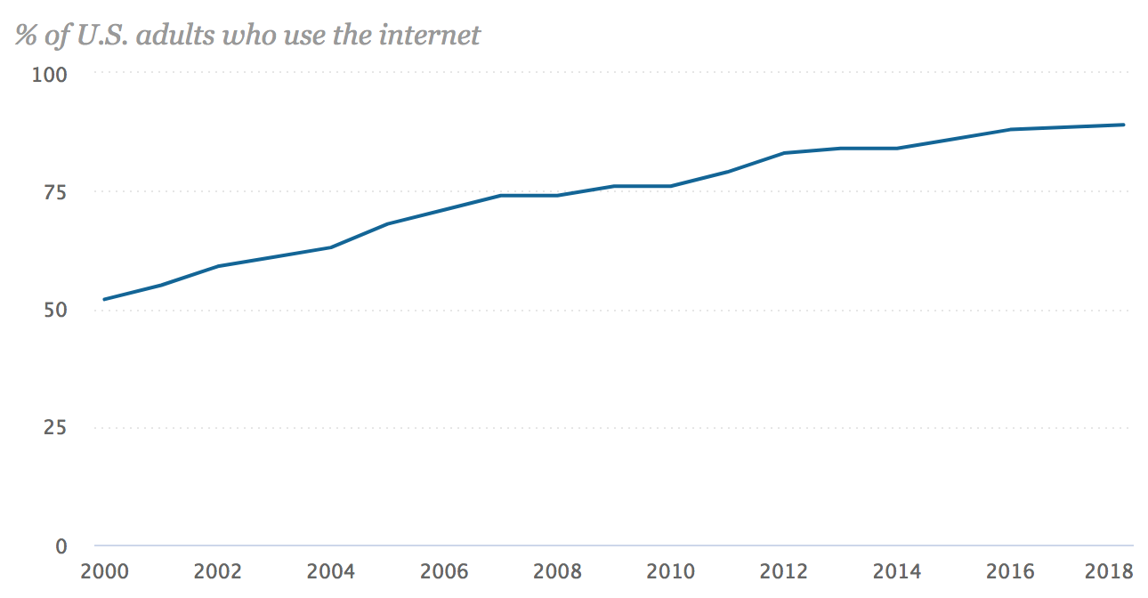
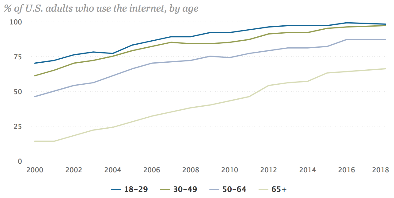


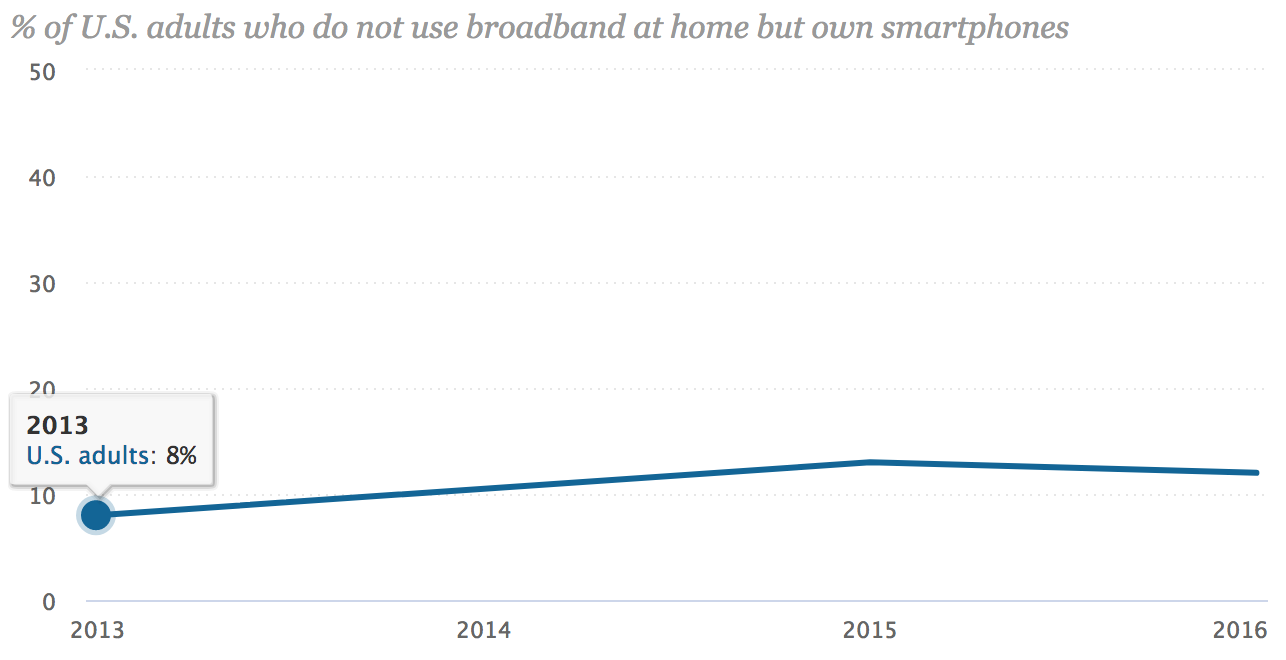
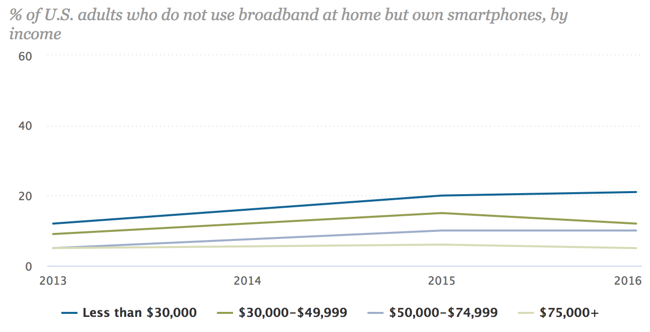
src:
Pew Research Center, Feb 2018
“Pew Internet/Broadband Fact Sheet”
*
FCC Fixed Broadband Deployment Map


See the source link for an interactive version of the map.
src:
FCC Fixed Broadband Deployment
Accessed April 2018
Note: Discussion of the FCC map and it’s latest version is available here. The latest map is based on 2016 data. FCC does not have an equivalent map for mobile broadband, although it does publish an annual report on mobile wireless competition.
*
20th Mobile Wireless Competition Report Quick Facts

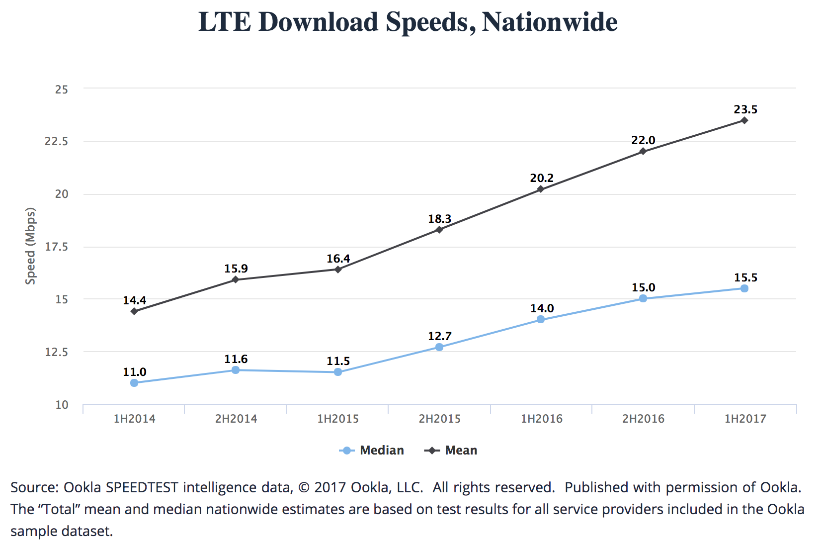

src:
FCC, September 2017
20th Mobile Wireless Competition Report Quick Facts
A couple more interesting bits from the full report…
NOTE: MOU = minutes of voice use
[p.72]

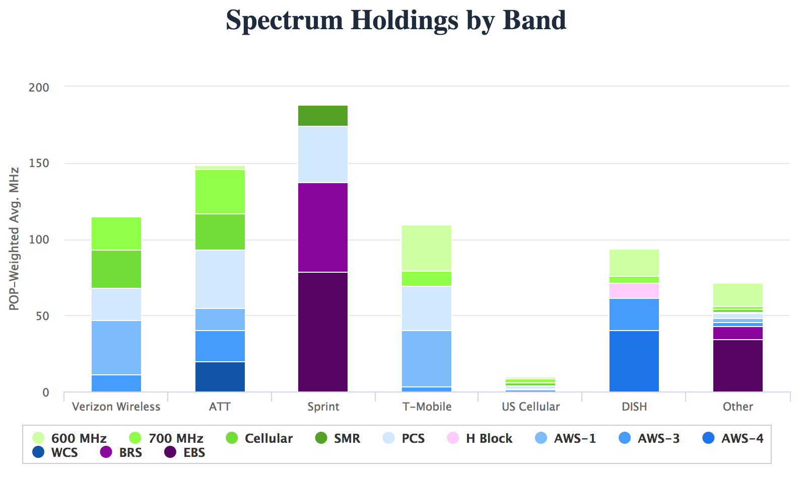
Note: A “connection” is a paid subscription, equivalent to the number of ‘lines’ when discussing landline phone service.
[p.73]
[p.74]
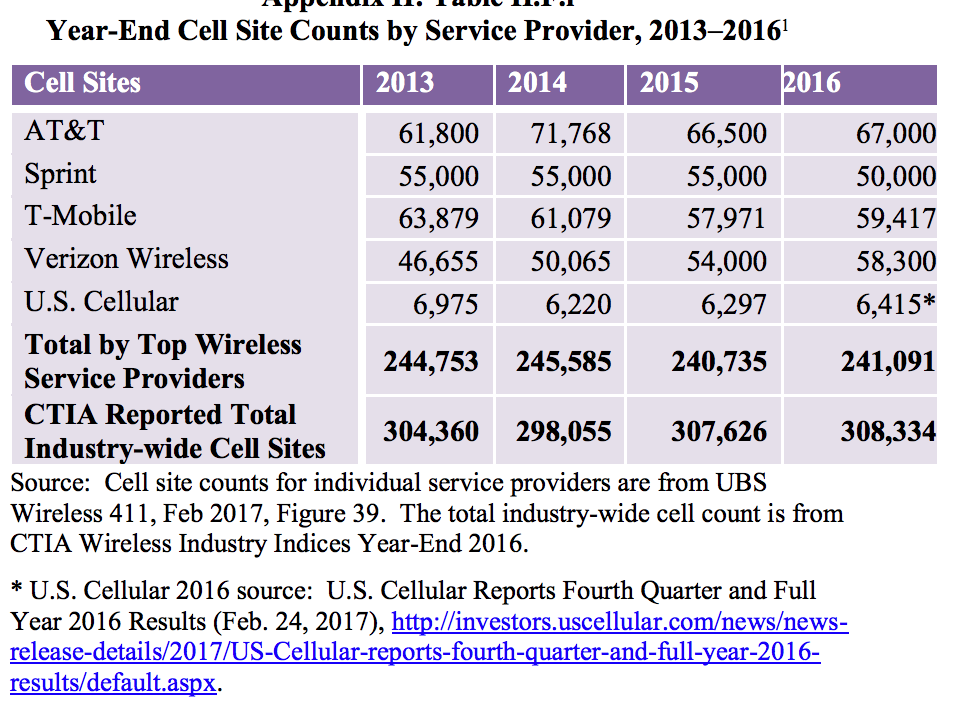
Note: According to CTIA, there has been an approximate 57 percent growth in the number of cell sites over the last ten years (in 1986, there were 1,531 cell sites in service).
The report notes that, according to CTIA, the number of cell sites will significantly increase as the mobile wireless industry densifies and prepares for 5G. Also, because multiple cell sites can be co-located in the same “tower” site, the reported cell sites should not be equated with “towers.” The reported cell sites include repeaters
and other cell-extending devices (e.g., femtocells or distributed antenna systems).
A specialized communications tower industry has developed to provide and manage the
support structures for the cell sites. Today, there are more than 120 tower and DAS operators in the United States, and a majority of towers are now owned or operated by independent companies rather than by mobile wireless service providers.142 Independent tower operators own, operate and lease shared wireless communications and broadcasting towers, manage other tall structure sites (such as rooftops and water towers), and to a lesser extent, own and operate neutral facilities to host small cells and DAS networks for mobile service providers. [p.32]
src:
FCC, Sep 2017
“Implementation of Section 6002(b) of the Omnibus Budget Reconciliation Act of 1993, Annual Report and Analysis of Competitive Market Conditions with Respect to Mobile Wireless, Including Commercial Mobile Services”
*
[In the U.S.] Expected arrival time-frame for 5G roll out with decent coverage and availability in handsets:
early 2020s
(Although 2019 phones will be advertising capacity, even if there’s no network to connect to right away.)
“I believe that eventually consumers will pay for just one broadband connection, fixed and mobile. When I say 50M or more homes, I mean wireless substitution. I think you can draw a parallel with local telephone service and long distance. The long distance business evaporated. Similarly, today’s fixed and mobile broadband services will collapse into one. The cellular operators today are better positioned to take that market.” Peter Rysavy (wireless technologies consultant)
src:
Forbes, Sep 2017
“The Dawn Of 5G: Will Wireless Kill the Broadband Star?”
Ericsson (Nov 2017) has the same prediction for 5G, anticipating coverage for more than 20% of the global population (1 billion) by the end of 2023. First deployments are expected in 2019.
*
Submarine Cable Capacity

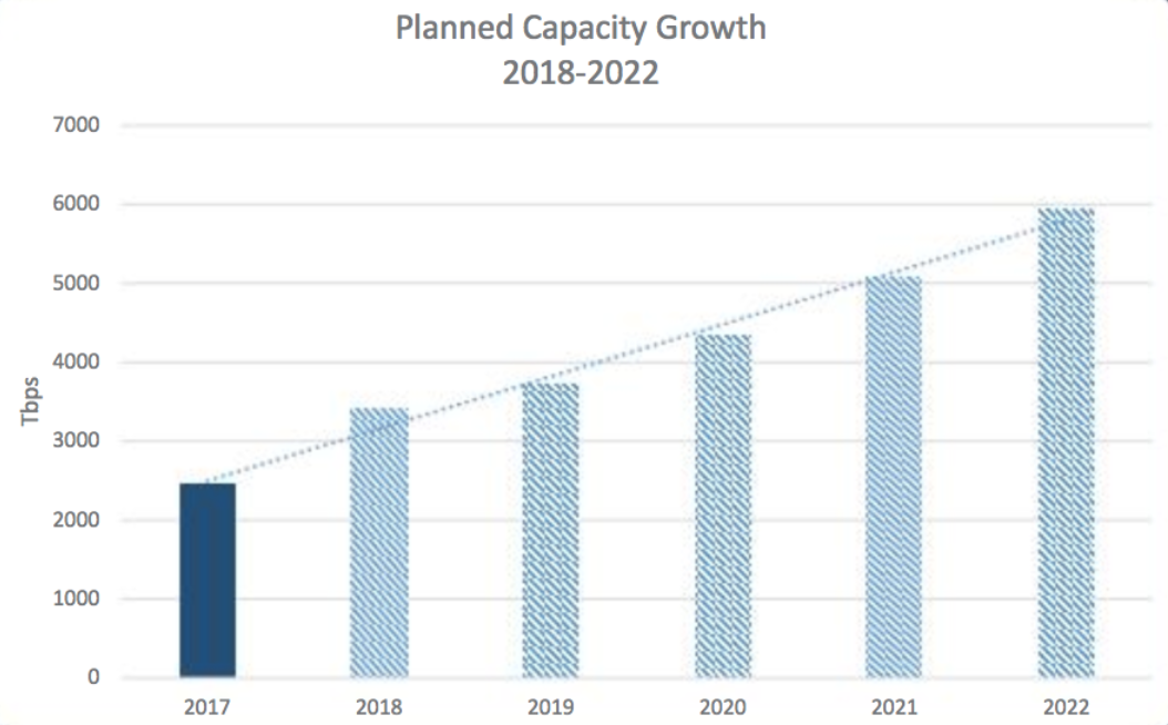
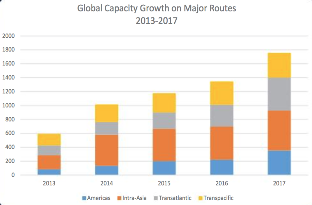
src:
Submarine Telecoms Industry Report 2017
[p.17]
*
Network World, Mar 2018
“Submarine cable boom fueled by new tech, soaring demand”
Excerpts:
Between 2013 and 2017, the subsea cable industry has added an average of 32 percent of capacity annually on major submarine cable routes.
SubTel Forum projects global submarine cable capacity will increase up to 143 percent between 2017 to 2022, and it also notes that a construction boom is already underway. Last year, 62,000 miles of submarine cable was added globally. This, after global averages didn’t crack 19,000 miles of added cable between 2013 to 2016.
According to TeleGeography, the international capacity deployed by companies such as Google, Facebook, Microsoft, and Amazon rose 14-fold between 2012 to 2016. … By investing in them, these mega-companies get them built faster. They also get a level of control over construction, maintenance and operation that’s ultimately more economical than becoming a paying customer on a telecom’s cable.
[It’s now cheaper to build systems with greater bandwidth. In 2013, new systems averaged 9 terabits per second (Tbps) — multiple systems planned for 2018 and 2019 will have capacities of 60 Tbsp. Tech advances are also eliminating costly and complex infrastructure layers, such as regen equipment. In addition, new cables can land directly inside multi-tenant data centers, rather than a traditional cable landing station (CLS) on the beach.]
*
Telegeography, Nov 2017
“A Complete List of Content Providers’ Submarine Cable Holdings”
This article lists cables owned or strongly supported by Amazon, Facebook, Google, and Microsoft.
Excerpt:
The amount of capacity deployed by content providers has outpaced all other customers of international bandwidth in recent years. Between 2012 and 2016 the amount of international capacity deployed by companies like Google, Facebook, Microsoft, and Amazon has risen 13-fold to 179 Tbps. (In contrast, international capacity deployed by all other operators only rose threefold, to 272 Tbps).
Content providers prioritize some submarine cable routes more than others in their network deployments. Between 2012 and 2016, content provider demand was the strongest across the Atlantic where capacity rose at a compound annual rate of 66 percent to 42 Tbps.
And as such, the largest content providers have built U.S.-centric network architectures. Their investments on systems directly connecting Europe to Asia are almost non-existent, in comparison. In the Atlantic and Pacific, content providers accounted for over half of total demand in 2016. In contrast, content providers represented only a small share of capacity usage on routes connected to the Middle East and Africa.
Used International Bandwidth by Source, 2002-2016

*
Submarine Telecoms Industry Report 2017
Excerpts:
Submarine fiber systems ownership
2013-2017: 61% private, 39% consortium
2018 and beyond: 83% private, 17% consortium
A recent trend towards private ownership has been observed compared to historical trends of primarily consortia ownership. Business cases for smaller systems have been prevalent, and the demand driving these systems has differed from years past. Globe-spanning infrastructure cables that require consortium ownership have fallen out of favor, contributing to this trend shift.
The boom of private ownership will continue to extend well into the future, as more niche and point-to-point systems are implemented. Much of this is driven by intra-regional needs — typically for smaller nations looking to get connected. However, a growing number of systems are being driven by factors not previously seen in the submarine fiber industry.
[p.22]
*
Norway Telecom Trends
The Norwegian Communications Authority prepares a twice annual report of statistics showing developments in electronic communications services, including fixed telephony, mobile telephony and services, broadband and TV transmissions.
See especially Chapter 2, Development Trends, stating on page 11
src:
Norwegian Communications Authority, May 2016
“The Norwegian Electronic Communications Service Market 2015”
Sports and Recreation Participation
Summary
Forecast data for sports and recreation participation seems rare.
The USDA Forest Service has published a few 50-year forecasts of outdoor recreation participation. The forecasts are based on data from it’s semi-regular National Survey on Recreation and the Environment. However, the only national-level forecast I’ve seen was published in 1999. I’ve emailed the authors to inquire if more recent national forecasts have been made. (Forecasts for the southern region of the US have been made as recently as 2013).
The Bureau of Labor Statistics publishes 10-year job outlook and employment change forecasts for professional athletes. The latest figures were published December 2015.
Beyond these two forecasts, I’ve found a couple sources for historic sports participation data: the Sports & Fitness Industry Association’s “Sports Participation in America” and ”Trends in Team Sports Report” (tidbits available through press releases going back to 2007); The Physical Activity Council Report (data for 2010-2015 available, possibly going back to 2000 – emailed for more info); United Health Foundation’s annual “American’s Health Rankings” survey; the National Federation of State High School Associations’ “Athletics Participation Survey” (annual data available 1971-2014).
Data and Excerpts
Non-Professional Adult Participation
The most significant forecast data I’ve found comes from the USDA Forest Service, via a 1999 publication. Later forecasts have been made for specific regions of the US. This is the only set of national-level forecasts I’ve found.
The publication gives projections of future recreation participation (by millions of participants aged 16 and over) and consumption (by millions of days annually and by millions of primary purpose trips taken) at lo-year intervals beginning in 2000 and ending in 2050. Projections for 24 specific outdoor activities and sports are grouped as following: winter, water, wildlife, dispersed land, and developed land. The projections are given as indexes, based on the year 1995.
Two types of regional cross-sectional models were used:
– a logistic regression model (for participation)
– a negative binomial form of a count data model (for consumption)
I’ve aggregated the forecasts in this table.
The data in these projections comes from the National Survey on Recreation and the Environment (NSRE), which has been collected since 1960 (originally as the National Recreation Survey). The survey has been conducted in 1960, 1965, 1970, 1972, 1977, 1982-83, 1994-95, 1999-2001, 2005-2011 (although this report only reflects data through the 94-95 survey).
Src: J.M. Bowker, Donald B.K. English, H. Ken Cordell. 1999. “Projections Of Outdoor Recreation Participation To 2050.” In Outdoor Recreation in American Life.
Note: Emailed the authors, Bowker and Cordell March 14, 2016, to inquire about subsequent national-level projections. No reply received.
*
Sports & Fitness Industry Association (SFIA) reports
The SFIA (formerly the Sporting Goods Manufacturers Association, or SGMA) has published an annual report called “Sports Participation in America” since 2000 (data going back to 1999). The report describes participation levels in over 100 sports, recreation, and outdoor activities. Each report includes a general breakdown of the number of Americans aged 6 and older who participated in at least one of the covered sports frequently, occassionally (later: regularly or casually), or did not participate in any.
Here’s an example of the chart from the report published in 2004:
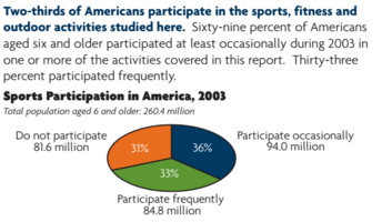
Src:
SGMA. 2004. “Sports Participation in America: 2004 Edition.” file name: Sports Part in Am 2004.pdf
I’ve seen data like the above from 1999-2003, and 2008, which is aggregated in this table, in columns C, and E-F. [Sources given in the comments for each cell.] The participation reports also gives a variety of other statistics describing the growth in participation in individual sports, including participation differences correlated with demographic characteristics.
In addition to the participation report, SFIA also publishes data describing core participants in team sports (”Trends in Team Sports Report” — tidbits available through press releases going back to 2007). The distinction of “core” indicates frequent and regular players (the threshold varies by sport/activity). This is the largest collection of core sports participation I’ve found:
Team Sports Core Participation (in thousands)

click for larger
Via: Hotel News Now, May 28, 2013
Note: Emailed Corey Bockhaus, cbockhaus@sfia.org, research@sfia.org, 3/14 to ask about older and more recent data like above. Hoping he can fill the gap in general participation data from 2004-2007, and 2009+.
*
2016 Physical Activity Council Report
Annual study tracking participation in over 120 sports. The PAC report gives overall statistics (percentages and raw figures), as well as sport-specific statistics (raw figures, and annual change percentages).
“The overall levels of inactivity decreased marginally in the last 12 months from 28.3% of Americans age six and older in 2014 to 27.7% in 2015. However, there are still 81.6 million inactive Americans.”
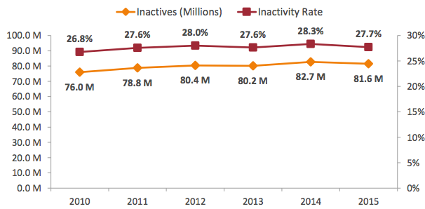
“Inactivity decreased for most age groups, with 13 to 17 year olds having the biggest drop (1.4%) and 35 to 44 year olds having the lowest decrease (0.2%) in 2015. While those Americans between the ages of 45 to 54 remained flat in inactivity, there was a gradual increase in inactivity for 55 to 64 year olds.”
212.6 million “actives” taking part in a wide range of sports and fitness activities in 2015, a slight increase from 209.3 actives in 2014.
| Total Participation Rate by Activity Category, 2015 | |
| Fitness Sports | 61.5% |
| Outdoor Sports | 48.4% |
| Individual Sports | 34.8% |
| Team Sports | 23.1% |
| Racquet Sports | 13.5% |
| Water Sports | 14.2% |
| Winter Sports | 7.4% |
| Activity Category Segmented by Generations, 2015 | |||||||
| Individual Sports | Racquet Sports | Team Sports | Outdoor Sports | Winter Sports | Water Sports | Fitness Sports | |
| Gen Z (2000+) | 48.2% | 18.8% | 58.8% | 61.8% | 13.1% | 17.5% | 50.6% |
| Millennials (1980-1999) | 43.6% | 20.2% | 31.8% | 57.4% | 12.2% | 20.3% | 66.7% |
| Gen X (1965-1979) | 36.9% | 13.4% | 17.9% | 51.4% | 7.0% | 14.8% | 66.2% |
| Boomers (1945-1964) | 24.1% | 7.1% | 6.4% | 38.6% | 2.9% | 9.2% | 60.0% |
| Fitness and Activity-Related Spending over a 5-year Span, 2015 (% of people who spent on) |
|
| Sports/recreation footwear | 45.3% |
| Sports/recreation clothing | 44% |
| Outdoor recreation activities | 39.5% |
| Sports/recreation equipment | 34.9% |
| Gym/membership fees | 29.3% |
| Travel to take part in sports & recreation | 28.1% |
| Team sports outside of school | 25% |
| Team sports at school | 20.2% |
| Individual sports events | 19.7% |
| Lessons/instruction/sports camps | 19.3% |
| Winter sports | 17.9% |
Based on 32,658 online interviews with a 95% confidence level. A weighting technique was used to balance the data to reflect the total US population ages six and above. The total population figure used was 294,141,894 people ages six and older.
“Inactivity” is defined to include those participants who reported no physical activity in 2015 and an additional
18 sports/fitness activities that require minimal to no physical exertion.
Contributions from International Health, Racquet and Sportsclub Association, The National Golf Foundation, The Outdoor Foundation, The Snowsports Industries America, The Sports and Fitness Industry Association, The Tennis Industry Association, and United States Tennis Association
The report indicates that data have been collected since 2000, but the report only shows figures going back to 2010.
Note: I’ve emailed to inquire about pre-2010 data (March 9, 2016, info@sportsmarketingsurveysusa.com).
Src: Physical Activity Council. March 1, 2016. “2016 Participation Report.”
*
| Adults reporting no physical activity or exercise outside of work in last 30 days |
|
| 2015 | 22.6% |
| 2014 | 25.3% |
| 2013 | 22.9% |
| 2012 | 26.2% |
| 2011 | 23.9% |
| 2010 | 23.8% |
| 2009 | 24.6% |
| 2008 | 22.6% |
| 2007 | 22.6% |
| 2006 | 23.8% |
| 2005 | 22.5% |
| 2004 | 22.7% |
| 2003 | 24.1% |
| 2002 | 25.4% |
| 2001 | 26.7% |
| 2000 | 27.7% |
| 1999 | 27.7% |
| 1998 | 27.8% |
| 1997 | 27.8% |
Src: United Health Foundation. “United States Physical Inactivity (1997-2015).” Accessed March 16, 2016.
*
Professional Participation
BLS – Athletes and Sports Competitors
2014
Median Pay – $43,350/year
Number of Jobs – 13,700
Job Outlook 2014-2024 – 6% (as fast as average for all occupations)
Employment change 2014-2024 – 800 more jobs
Src:
Bureau of Labor Statistics. Occupational Outlook Handbook. “Athletes and Sports Competitors.” Summary. December 17, 2015.
| Year | Total Employment |
| 1999 | 10,620 |
| 2000 | 9,920 |
| 2001 | 10,520 |
| 2002 | 10,400 |
| 2003 | 11,840 |
| 2004 | 12,250 |
| 2005 | 12,230 |
| 2006 | 12,500 |
| 2007 | 12,670 |
| 2008 | 13,960 |
| 2009 | 13,620 |
| 2010 | 12,660 |
| 2011 | 12,630 |
| 2012 | 12,450 |
| 2013 | 13,880 |
| 2014 | 11,520 |
| 2015 | 11,710 |
Src:
Bureau of Labor Statistics. Occupational Employment Statistics. “OES Data.” 1999-May 2015.
and
Bureau of Labor Statistics. Occupational Employment Statistics. “27-2021: Athletes and Sports Competitors.”
*
Student/Youth Participation
The National Federation Of State High School Associations has conducted its annual “Athletics Participation Survey” since 1971. The survey is completed by high schools with membership in the NFHS and its member associations.
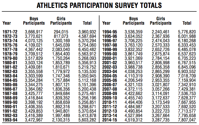
Src: National Federation of State High School Associations. “2014-15 High School Athletics Participation Survey Results.” Page 55 (page 3 of this PDF).
Press release for 2014-15 school year available here.
Excerpt:
“Based on figures from the 51 NFHS member state high school associations, which includes the District of Columbia, the number of participants in high school sports reached an all-time high of 7,807,047 – an increase of 11,389 from the previous year.”
Participation data for recent individual years available are available on the NFHS website at the “Participation Statistics” page.
Note: 3/9 Emailed Bruce Howard to ask what percentage of high school students participate in sports, and what percentage of high schools participate in their survey.
*
Among 6- to 17-year-olds, the average number of team sports played per participant has fallen 5.9 percent in the last five years, dropping from 2.14 to 2.01, according to the SFIA.
| Tracking The Changes In Youth Sports Participation (Participants by ages 6-17, thousands) |
|||
| 2009 | 2014 | % Change | |
| Baseball | 7,012 | 6,711 | -4.3% |
| Basketball | 10,404 | 9,694 | -6.8% |
| Field hockey | 438 | 370 | -15.5% |
| Football (tackle) | 3,962 | 3,254 | -17.9% |
| Football (touch) | 3,005 | 2,032 | -32.4% |
| Gymnastics | 2,510 | 2,809 | 11.9% |
| Ice hockey | 517 | 743 | 43.7% |
| Lacrosse | 624 | 804 | 28.8% |
| Rugby | 150 | 301 | 100.7% |
| Soccer (indoor) | 2,456 | 2,172 | -11.6% |
| Soccer (outdoor) | 8,360 | 7,656 | -8.4% |
| Softball (fast-pitch) | 988 | 1,004 | 1.6% |
| Softball (slow-pitch) | 1,827 | 1,622 | -11.2% |
| Track and field | 2,697 | 2,417 | -10.4% |
| Volleyball (court) | 3,420 | 2,680 | -21.6% |
| Volleyball (sand/beach) | 532 | 652 | 22.6% |
| Wrestling | 1,385 | 805 | -41.9% |
Src: SFIA, via Sports Business Daily, “2014 Trends in Team Sports,” August 10, 2015
Press release for the 2013 Trends in Team Sports available here
[no press releases for more recent reports]
Excerpt:
“Compared to 2011, which saw an increase in only 5 of the 24 sports, the surge in core participation in the most current U.S. Trends in Team Sports Report is proof of the growing trend of specialization in team sports. While there are more quality participants (core), the report also reveals the decrease in overall (casual) team sports participants over the last five years. Since 2008, team sports have lost 16.1 million participants or 11.1% of all team participants, measured by those who played at least once a year.”
2007 Edition excerpts
“While 31.6 million U.S. children (age 6-17) participate in team sports on a ‘frequent’, ‘regular’, or ‘casual’ basis, nearly 19 million U.S. children do not participate in team sports at all.”
…
“900,000 17-year olds played basketball in 2006 which means 17.9% of all 17-year olds played basketball in 2006.”
Src: SFIA. 2007. “U.S. Trends in Team Sports 2007 Edition.”
Smart Clothing and Fitness Devices
Summary
Smart clothing seems to be just around the corner, with several companies already selling specialty items (athletic wear, baby clothes, etc) embedded with sensors. However, quantitative forecasts describing the prevalence of smart clothing in the next 10 years or so are hard to find. Gartner made a forecast to 2016 back in 2014. Tractica has a forecast to 2020. Both forecasts describe millions of units shipped worldwide. Although it’s difficult to extrapolate market penetration, both reports suggest that smart clothing will be more prevalent than wearable devices. Other research firms and analysts are skeptical of such a swift uptake by smart garments, instead forecasting dominance by other wearable devices.
Research Excerpts
Tractica forecasts that smart clothing shipments will grow from 140,000 units in 2013 to 10.2 million units by 2020, while body sensor shipments will decrease from 3.0 million units in 2013 to 1.2 million by 2017, before rising again to 3.1 million units in 2020.
Src:
Tractica. May 4, 2015. “The Wearable Devices Market is Poised for Expansion into Smart Clothing and Body Sensors.”
Executive Summary
Chart from above report:
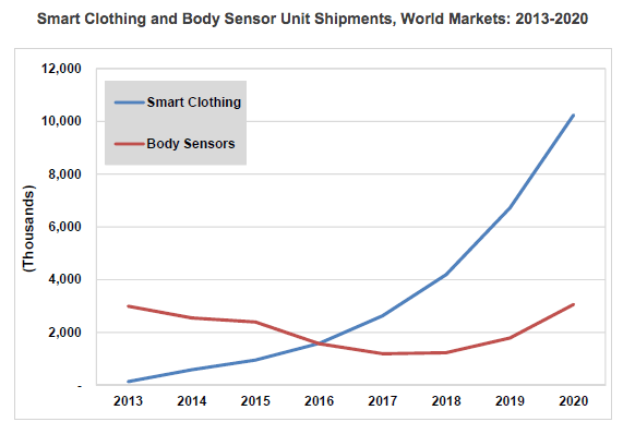
[via Global Information]
*
| Worldwide Wearable Electronic Fitness Devices Shipments (millions of units) | ||||
| Device Category | 2013 | 2014 | 2015 | 2016 |
| Smart Wristband | 30 | 20 | 17 | 19 |
| Sports Watch | 14 | 18 | 21 | 24 |
| Other Fitness Monitor | 18 | 20 | 12 | 15 |
| Chest Strap | 11 | 12.1 | 8 | 7.3 |
| Smart Garment | 0.01 | 0.1 | 10.1 | 26 |
| Total Market | 73.01 | 70.2 | 68.1 | 91.3 |
Src:
Gartner. November 18, 2014. “Gartner Says in 2015, 50 Percent of People Considering Buying a Smart Wristband Will Choose a Smartwatch Instead.”
Note: Angela McIntyre, Gartner research director – gave an interview to The Guardian. Might be available for comment.
*
Growth will be “largely driven by the sales of wrist-based trackers, while hundreds of thousands of connected garments used by professional sports teams showcase wearable technology’s most advanced capabilities.” Hundreds of thousands of thousands of connected garments is hardly a drop in the ocean compared to the millions of Fitbits, Xiaomis, Apple Watches, Jawbones and other devices which will be coining in the revenue by 2020. [emphasis mine]
Src:
James Stables. November 18, 2015. “Juniper Report Skeptical on Smart Clothing but Says Fitness Trackers are Set to Soar.” Wearable.com.
*
In our latest smart glasses report, we expect over 3 million smart glasses to be in use in enterprise by 2018, with nearly 6 million users. [worldwide, I think]
Src:
Juniper Research. 2015. “The World In 2020 – A Technology Vision.”
Note: The White paper seems to be referring to this paid research report.
*
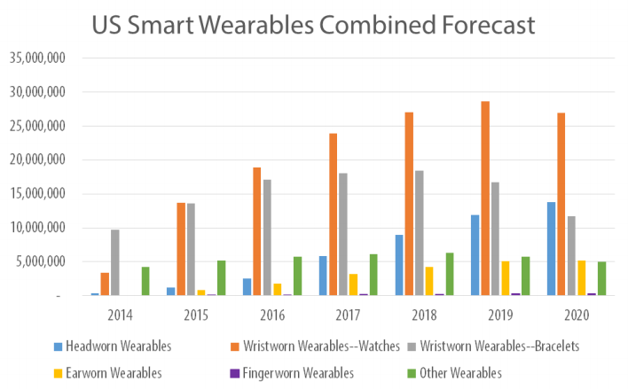
The US market for wearables is forecast to evolve more quickly than worldwide, leading to a peak of 68.3 million units in 2019, then dropping to 62.9 million in 2020.
Smart watches will be the top category as of this year in the US, followed by smart bands/bracelets.
In 2020, headworn wearables are expected to become the number two segment.
Src:
Bob O’Donnell. May 2015. “The Slow Build: Smart Wearables Forecast, 2014-2020.” Technalysis Research.
Note: This report does not include clothing with embedded sensors. Bob O’Donnell is skeptical of the ability of smart clothing to surpass other wearables in the foreseeable future.
Clothing Expenditures and Prices
Overview
The Bureau of Labor Statistics tracks apparel expenditures as well as indexed prices (CPI – prices relative to a base year, not actual prices). Apparel includes a broad range of subcategories. Where available, we have also sought item-level data, using men’s Tshirts as an exemplar. Expenditure data is available going back to 1990. CPI data is available going back to 1947. Tshirt CPI data is available back to 1997 (possibly earlier – awaiting clarification from BLS). No forecasts found.
Findings
Clothing Expenditures – 1990-2014
Google Spreadsheet
The apparel and services category had one of the largest increases in 2014.
Average expenditures per consumer unit in 2014 were $53,495, a 4.7percent increase from 2013 levels, the U.S. Bureau of Labor Statistics reported today. During the same period, the Consumer Price Index (CPIU) rose 1.6 percent(1). In 2013, spending decreased 0.7 percent. Average pretax income per consumer unit increased at about the same pace as expenditures, up 4.8 percent from 2013.
Consumer units include families, single persons living alone or sharing a household with others but who are financially independent, or two or more persons living together who share expenses.
Srcs:
[embedded in chart above]
Note: The “Apparel and Services” category includes apparel and footwear for adults, children, and babies (including sportswear, and uniforms), as well as material for making clothes, shoe repair, alterations, sewing patterns and notions, clothing rental, storage, dry cleaning and sent-out laundry, watches, jewelry, and repairs to watches and jewelry.
Src:
Consumer Expenditure Survey Glossary, Bureau of Labor Statistics
*
Consumer Price Index, Apparel – 1947-2014
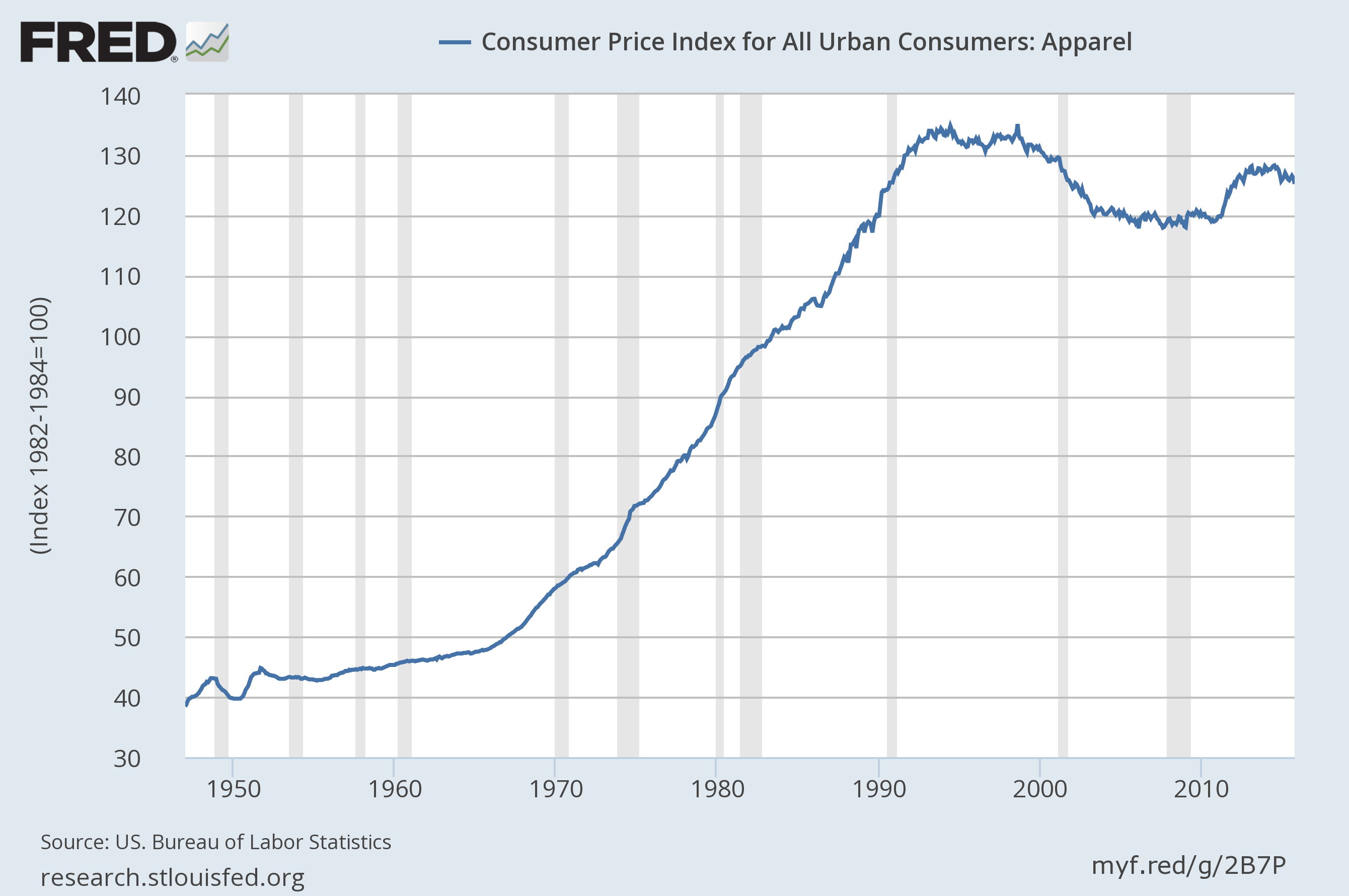
(click for larger)
Src:
US. Bureau of Labor Statistics, “Consumer Price Index for All Urban Consumers: Apparel [CPIAPPSL].” Retrieved from FRED, Federal Reserve Bank of St. Louis, November 18, 2015.
Note: Data available for download.
*
Shirt CPI 1998-2014
Men’s shirts and sweaters (SEAA03)
Series ID: CUUR0000SEAA03
base period: 1997
Annual average:
1998 100
1999 98.6
2000 98.3
2001 93.9
2002 88.8
2003 85.2
2004 85.3
2005 84.2
2006 84.7
2007 82.53
2008 80.444
2009 80.968
2010 78.642
2011 79.583
2012 82.224
2013 82.876
2014 80.973
Src:
“Consumer Price Index – All Urban Consumers.” Custom table, November 19, 2015. Bureau of Labor Statistics.
Nicole Rope, of the BLS CPI Apparel division, warns that there is much more volatility in individual clothing items that in the category on the whole (and more so compared with other items in other categories). She offers to speak with us if we have any other questions about apparel. 202-691-5395.
She also said that the Information and Analysis Section might also be helpful. Ken Stewart, manager, x6966. Steve Reed, senior economist x5378. They would be able to let us know if data older than 1997 is available. Shirt data was collected before that, but under a different name/definition.
UPDATE: Steve Reed shared the following data by email. He said that price data (not index data) older than 1977 may be available on an inconsistent basis. He will followup with whatever he can find later in December or January.
Annual Average CPI for Men’s Shirts 1978-1997
Series Id: MUUR0000SE3604
Not Seasonally Adjusted
Area: U.S. City Average
Item: Men’s shirts
Base Period: 198284=100
1978 81
1979 84.3
1980 91.4
1981 95.4
1982 98.4
1983 99.3
1984 102.4
1985 106.3
1986 107.1
1987 113.7
1988 119.9
1989 123.2
1990 128.1
1991 132.3
1992 135.3
1993 134.1
1994 131.5
1995 133
1996 135.3
1997 138.1
*
T-Shirt Prices – Misc dates 1938-2013
Based on old Sears catalogs featuring men’s white undershits
1938 .24 ($3.97 in 2013)
1945 .79 ($10.22 in 2013)
1955 .79 ($6.87 in 2013)
1970 1.492 (8.9512.01 in 2013)
1990 3.10 (Hanes)
2010 1.90 (Hanes)
2013 2.33 (Hanes)
Src:
Samantha Sharf. July 2, 2013. “The TShirt Turns 100.” Forbes.
Tech Research Firms’ Annual Predictions
NYT’s Bits blog covered the recently released annual prediction reports from IDC, Gartner, and Forrester. IDC and Gartner’s reports include several 35 year predictions. Forrester’s report focuses on 2016, but reinforces the predictions of the other firms.
Although we’re generally after forecasts that address the everyday life of the average American, the forecasts in this set have broad economic and employment implications that certainly will affect a large number of people, and certainly the technology tools we use every day.
IDC’s report features several predictions for the 20182020 period, meant to provide guidance for business and industry strategists in the coming year. Here are a few excerpts via Bits as well as the original report:
•By 2018, corporations pursuing digital transformation strategies would “more than double the size of their software development teams.”
•By 2018, the number of Internet of Things devices will more than double, prompting the development of 200,000 new apps. By 2020, devices will triple and apps will exceed 250,000.
•By 2018, 65% of all IT assets used by companies will be housed offsite in collocation, hosting, and cloud data centers and one third of IT “staff” will actually be employees of organizations’ third party managed service providers.
•By 2020, more than 30 percent of today’s tech suppliers will “not exist as we know them today,” having been acquired or failed.
•By 2020, spending on cloud services and related hardware and software will be more than $500 billion, three times the current level.
•By 2020, providers of underlying cloud infrastructure will significantly consolidate,” with “six or fewer cloud platform vendors” holding 80 percent or so of the market. Probably Amazon, Microsoft, Google, Salesforce, IBM, Alibaba and Tencent.
•By 2020, over 70% of 3rd Platform IT spending will be driven by doing entirely new things, rather than on using new technologies to do traditional things in a new way.
•By 2020, 50% or more of e-commerce transactions will be enabled or influenced by Facebook and other regional social network leaders (e.g., Tencent’s Weibo in China).
•By 2020, one of the more frenetic IoT segments, wearables, will consolidate, as over half of today’s players will exit the market.
Gartner issued a similar set of predictions to 20182020, including the following:
•By 2018, 20 percent of business content will be authored by machines (eg: shareholder reports, legal documents, market reports, press releases, articles and white papers).
•By 2018, six billion connected things will be requesting support.
•By 2018, more than 3 million workers globally will be supervised by a “robo-boss.”
•By year-end 2018, 20 percent of smart buildings will have suffered from digital vandalism.
•By 2018, 45 percent of the fastest growing companies will have fewer employees than instances of smart machines (eg: fully automated supermarket, drone-only surveillance services).
•By year-end 2018, customer digital assistant will recognize individuals by face and voice across channels and partners.
•By 2018, two million employees will be required to wear health and fitness tracking devices as a condition of employment (eg: emergency responders, pro athletes, political leaders, airline pilots, industrial workers, remote field workers).
•By 2020, autonomous software agents outside of human control will participate in five percent of all economic transactions (eg: banking, insurance, markets, exchanges, crowdfunding).
•By 2020, smart agents (virtual personal assistants) will facilitate 40 percent of mobile interactions, and the post-app era will begin to dominate.
•Through 2020, 95 percent of cloud security failures will be the customer’s fault.
Forrester’s report only looks out as far as 2016, and doesn’t offer as many numeric predictions, but the concepts are similar. Excerpts:
•Leaders will understand and anticipate individual needs to deliver personalized experiences, sharply increasing their lead in the market.
•We will see extraordinary leadership disruption as companies adapt to a customer-led market.
•Leaders will invest in culture to accelerate both the pace of change and their speed of business.
•Cutting-edge algorithms will give leaders a leg up over competitors drowning in data and using run-of-the-mill analytical tools.
•Privacy will move from a niche consideration to a value to which customers will respond.
Sources
Steve Lohr. November 4, 2015. “Digital Transformation Going Mainstream in 2016, IDC Predicts”. Bits. New York Times.
Frank Gens. November 2015. “IDC FutureScape: Worldwide IT Industry 2016 Predictions — Leading Digital Transformation to Scale.” IDC #259850.
October 6. “Gartner Reveals Top Predictions for IT Organizations and Users for 2016 and Beyond.” Gartner.
October 2015. “The 2016 Top 10 Critical Success Factors To Determine Who Wins And Who Fails In The Age Of The Customer.” Forrester.
The Science of Forecasting and Prediction
Last week we were fortunate to have had one of the foremost statistical forecasters in the world, Dr. Rob Hyndman, join us for a Big Thinkers talk on the science of forecasting and prediction. Dr. Hyndman delivered a captivating seminar called, “Exploring the boundaries of predictability: what can we forecast, and when should we give up?”
In his talk, Dr. Hyndman discussed his research efforts to realize his long-term goal of understanding what models work best at predicting various types of time-series. Professor Hyndman demonstrated the aspects that make certain time-series more predictable than others by giving real-life examples based on his own research and work consulting for the Australian government. He explored different features that can be extracted from time-series and how they can be used to judge if something is predictable. Professor Hyndman also talked about his work with Yahoo Labs on Anomaly Detection and how extracted time-series features can be used for finding anomalies. While Dr. Hydnaman’s goal of finding the right time-series model for a given dataset is still under active pursuit, his work on anomaly detection in collaboration with Yahoo Labs has already been open-sourced.
The event was broadcast live on our labs.yahoo.com homepage and viewers had the opportunity to ask questions and comment on our Twitter stream @YahooLabs as well as our Facebook page.
If you would like to learn what it takes to forecast and accurately predict the future, watch the full seminar here.

Great overview of basic forecasting methodology from Rob Hyndman.
Rule of thumb – ok to forecast ahead a third of the length of your data. So, if you have 15 years of data, a five-year forecast should be pretty reliable. But doing a 20 year forecast based on 15 years of data is going to be pretty unreliable.
Plastic Surgery
There are at least two professional organizations that publish plastic surgery statistics: American Society of Plastic Surgeons (ASPS), and The American Society for Aesthetic Plastic Surgery (ASAPS). Figures from the latter tend to be a bit lower than the former. Seeking clarification on the discrepancy. Procedures are typically broken down into two major categories: cosmetic and reconstructive. All readily available figures from ASPS are below (2005-2014). Awaiting to hear if pre-2005 figures are also available from ASPS.
Google Sheet (with links to individual reports)
Src:
American Society of Plastic Surgeons, 2006-2015
Alternate lead:
The American Society for Aesthetic Plastic Surgery, 1997-2014 Statistics
China, Ethiopia Traffic Fatality Forecasts
Came across these papers while looking for US injury forecasts.
Haimanot Gebrehiwot Moges and Solomon Meseret Woldeyohannes. 2014. “Trends and Projections of Vehicle Crash Related Fatalities and Injuries in Northwest Gondar, Ethiopia: A Time Series Analysis.”International Journal of Environmental Health Engineering 3 (1): 30. doi:10.4103/2277-9183.139752.
Aichun Tan, Danping Tian, Yuanxiu Huang, Lin Gao, Xin Deng, Li Li, Qiong He, Tianmu Chen, Guoqing Hu, and Jing Wu. 2014. “[Forecast the trend of burden from fatal road traffic injuries between 2015 and 2030 in China].” Zhonghua Liu Xing Bing Xue Za Zhi = Zhonghua Liuxingbingxue Zazhi 35 (5): 547–51.http://www.ncbi.nlm.nih.gov/pubmed/25059365.
Sick Days and Chronic Illness
I consulted a few different sources of information for illness statistics. The Bureau of Labor Statistics has a very small sample of sick-leave used data (for 2009). Gallup and Healthways also have a small sample of sick-leave data (for 2012). No forecasts are available. Several think tanks are tracking reported rates of chronic illness. A couple forecasts are available. Results are summarized below.
Sick Days
In 2012, researchers from the Bureau of Labor Statistics conducted a one-time tabulation of sick leave provision and usage. The data used were compiled from the 2009 National Compensation Survey, looking only at full-time workers in private industry.
The researchers averaged the amount of sick leave used in each of 6 industry areas (financial activities; information industry; trade, transportation, and utilities; professional and business services; leisure and hospitality; construction). In the first four of those industries, workers used an average of 4 days of sick leave per year. In the last two industries (leisure and hospitality, and construction), workers used an average of 2 days of sick leave per year.
This was a one-time tabulation. Jason Ford says by email that he’s not aware of any forecasts. To his knowledge, additional years of this data are not available.
Src:
Ross O. Barthold, Jason L. Ford. 2012 February 29. “Paid Sick Leave: Prevalence, Provision, and Usage among Full-Time Workers in Private Industry.” Bureau of Labor Statistics.
*
2012 survey data of workers in 14 job categories found that usage of sick days ranged from 6 days per year to 3 days per year. The survey was conducted by Gallup and Healthways as part of Healthways’ annual Well-Being Index report. The survey was administered to 94,000 Americans who work at least 30 hours per week.
Days missed per month
Physicians: .24
Farmers, Foresters, Fishers: .25
Construction or Mining: .28
Installation/Repair: .35
Sales: .35
Managers/Executives: .36
Professionals: .37
Manufacturing/Production: .38
School Teacher: .39
Transportation: .40
Business Owners: .41
Nurses: .43
Clerical or Office Workers: .44
Service Workers: .47
Note: 24/7 Wall St. performed the analysis of data collected by Gallup-Healthways. Emailed Healthways (9/25) to see if they’re still collecting this data.
Src:
Michael B. Sauter, Samuel Weigley and Alexander E.M. Hess. 2013 May 9. “Workers Taking the Most Sick Days.” 24/7 Wall St.
Well-Being Index
Gallup and Healthways have compiled their Well-Being Index annually since 2008. It’s a “barometer of Americans’ perceptions of their well-being.” The index is compiled based on survey responses to questions about six areas of life: life evaluation, emotional health, work environment, physical health, healthy behavior, basic access.
Physical Health Index
2008 76.9
2009 76.6
2010 76.9
2011 76.7
2012 77.0
2013 76.4
The Physical Health Index is comprised of questions related to: Body Mass Index, disease burden, sick days, physical pain, daily energy, history of disease, and daily health experiences.
Overall Well-Being Score
2008 66.5
2009 66.3
2010 66.8
2011 66.2
2012 66.7
2013 66.2
Over the six years of our well-being measurement, Americans’ life evaluations have improved, emotional health and healthy behaviors have remained stable, and basic access, physical health, and work environment have declined. While there are dozens of trends that have impacted the national score since 2008, the three most prominent ones are:
* Annual decreases in the rate of those with health insurance;
* Rising rates of obesity;
* Declining work environment scores.
Src:
Gallup-Healthways Well-Being Index. 2014. “State of American Well-Being.”
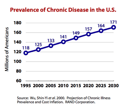
Chronic Disease Rates
In 2008, The Milken Institute found that one third of Americans reported having at least one of seven common chronic diseases, with a total of 162.2 million cases in 2003. They forecasted a 42% increase in cases of those diseases by 2023, for a total of 230.7 million cases.
Of the seven chronic diseases, pulmonary conditions were the most common, with 49.2 million cases recorded. Next in prevalence were hypertension, with 36.8 million recorded cases, and mental disorders, with 30.3 million; followed by heart disease at 19.2 million; diabetes at 13.7 million; cancer at 10.6 million; and stroke at 2.4 million.
Src:
Ross DeVol, Armen Bedroussian. 2007. “An Unhealthy America: The Economic Burden of Chronic Disease.” Milken Institute.
*
In 2009, almost half of Americans, 145 million people, had at least one chronic condition. This represented an increase of 10 million people over the estimate that was made in 2002 for the year 2009.
The number of people with chronic conditions reached 125 million in 2000, forecast to reach 147 million by 2010 and 157 million by 2020. By 2030 half the population will have one or more chronic conditions.
Src:
2010. “Chronic Care: Making the Case for Ongoing Care.” Robert Wood Johnson Foundation.
*
Prevalence of Chronic Disease in the U.S. Population
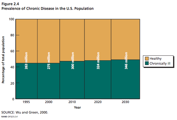
Millions of Americans
Src: Wu, Shin-Yi and Anthony Green. Projection of Chronic Illness Prevalence and Cost Inflation. RAND Corporation; October 2000. (unavailable online)
Cited in:
Soeren Mattke, Lisa Klautzer, Tewodaj Mengistu, et al. 2010. “Health and Well-Being in the Home.” RAND Corporation.
and
The Marshall Protocol Knowledge Base. 2012. “Incidence and Prevalence of Chronic Disease.” Autoimmunity Research Foundation.
Supplement Usage Prevalence
Usage Trends
The CDC tracks U.S. dietary supplement usage (which includes multivitamins and multiminerals) via its National Health and Nutrition Examination Survey (NHANES), which began in the 1970s. In 2011, the CDC said over half of U.S. adults were taking dietary supplements.
Overall usage trend:
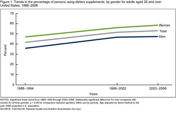
Usage prevalence percentages for adults over 20:
| Year | Men | Women |
| 1971-1975 | 28% | 38% |
| 1976-1980 | 32% | 43% |
| 1988-1994 | 35% | 44% |
| 1999-2000 | 47% | 56% |
| 2003-2006 | 47% | 59% |
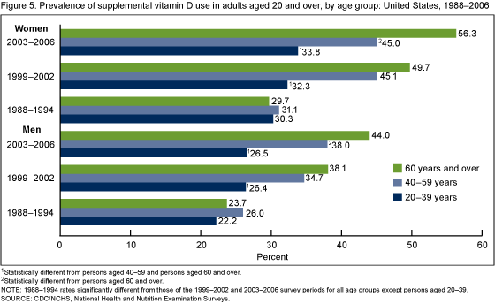
Vitamin D use by age group and gender:
Srcs:
Gahche J, Bailey R, Burt V, et al. 2011. “Dietary Supplement Use Among U.S. Adults Has Increased Since NHANES III (1988–1994).” NCHS data brief, no 61. Hyattsville, MD: National Center for Health Statistics.
Madison Park. 2011 April 13. “Half of Americans Use Supplements.” CNN.
Market Research
Euromonitor tracks the vitamins and dietary supplements (VDS) market. In 2013, they estimated that the market would grow at a CAGR of 4% between 2013 and 2018 to reach $112 billion in 2018.
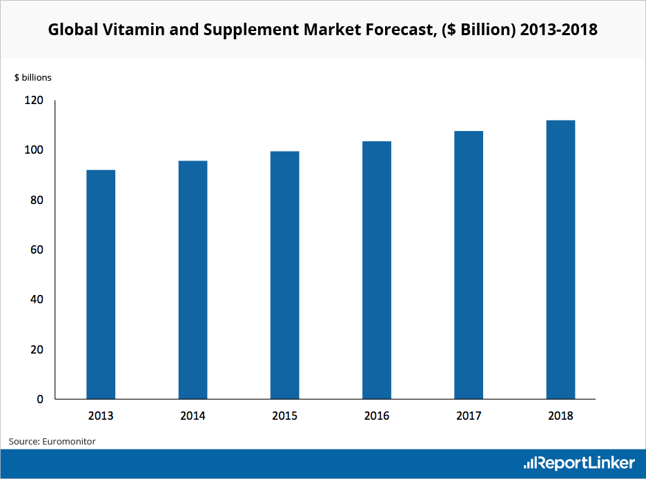
Src:
Euromonitor (via Reportlinker). 2013. “Global Vitamin and Supplement Industry Overview.”
