Typography for Lawyers
Typefaces for justice
I’m not a lawyer. Typography for Lawyers isn’t just for lawyers. It’s for anyone who cares about how text looks in print or on the Web.
The author, Matthew Butterick, is a lawyer, and also a professional typographer who has created several original commercial fonts.
Butterick’s main point is that appearance matters for anyone making or reading a written argument. Most any written communication is an argument of some sort. Most legal communication is unnecessarily ugly. So, I would add, is most everyday business communication.
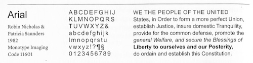
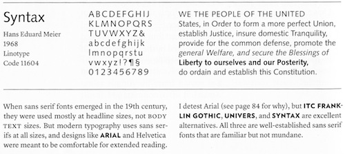
In a clear, coherent, and personable way, Butterick guides the reader through seemingly mundane matters like font, font size, paragraph format, line spacing, em dashes, en dashes, and the rest. He makes a case for what looks good, what doesn’t, and why it matters. He supplies plenty of visual examples.
While some material will interest only attorneys, those parts don’t break the flow for the general reader. Anyone who uses a computer is also a user of typography, even if few people take that fact seriously.
Other top-notch typography books are available. One is the previously reviewed classic Elements of Typographic Style. But like most, Elements is aimed mainly at serious students of typography and typography pros. Butterick’s book assumes no knowledge of the subject and focuses on the what to do, and how to do it.
02/4/11Excerpt
Typography matters because it helps conserve the most valuable resource you have as a writer — reader attention. … Writing as if you have unlimited reader attention is presumptuous because readers are not doing you a personal favor. Reading your writing is not their hobby. It’s their job.
*
Even though the en dash is used for joint authors (Sarbanes–Oxley Act), use a hyphen for compound names. If the children of Sarbanes and Oxley married, they’d be known as Mr. & Mrs. Sarbanes-Oxley (with a hyphen), not Mr. & Mrs. Sarbanes–Oxley (with an en dash).
*
All-caps paragraphs are an example of self-defeating typography. If you need readers to pay attention to an important part of your document, the last thing you want is for them to skim over it. But that’s what inevitably happens with all-caps paragraphs, because they’re so difficult to read.
*
*
Typography for Lawyers Matthew Butterick 2010, 220 p. $25 http://www.typographyforlawyers.com/