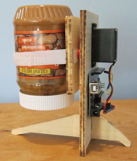
Sign Game

It’s always fun to cruise through Fantagraphics’s store in the Georgetown neighborhood of Seattle. You never know what you might stumble across amid the new comics releases, independent zines and assorted odd runs and old stock there. I happened upon a copy of Justin Green’s Sign Game (ST Publications and Last Gasp Of San Francisco). It’s an 80 page paperback collection from 1995 of the monthly comic strips Green did for the sign painter’s trade newsletter Signs of the Times from back in the 1980s and 90s.

As detailed in Green’s comics, that was a turbulent time of transition for sign painters. Just as desktop publishing and digital photography transformed the graphic design and photography businesses (ask bankrupt Kodak about that!), the dawn of the computerized vinyl letter cutting machines undid the business of hand-lettered and painted signage.

Each densely rich comic takes on one arcane aspect of this dying art, from the ins and outs of doing gold leaf lettering, or how to wield a mahlstick, to the fine points of font design and brush technique needed for painting on the corrugated surface of metal trucks. Green’s sardonic tone and hilarious perspective also illustrate each hard won lesson of running a business, filled with characters like hard-boiled artists, chiseling customers, and back-biting competitors.

As a comic, Green’s one-page masterpieces employs a myriad of graphic techniques: send ups of Johnson Smith & Co. catalog layouts, Goofus and Gallant-ish profiles, Dick Tracy Crimebsuters comic crooks, and an endless supply of cartoon lettering intro panel gimmicks that ape plexiglass, peeling vinyl letters and stencils.

One installment is most telling: his predictions for the sign biz from 1994. Many were already coming true then, like computer-less mini vinyl letter-cutting systems. One thing he did NOT foresee: the current hipster renaissance for all things artisanal—like hand painted signs and lettering! A brand new book and documentary film Sign Painters by Faithe Levine and Sam Macon promises to tell that tale, and I hope it will be as funny and informative as Green’s Sign Game.

-- Bob Knetzger  

Sign Game
Justin Green
1995, 80 pages
$12 and up (out of print)

Available from Amazon

Sample Excerpts:


Pogo Connect

I’ve been using this stylus like crazy and I am in love! It’s a touch sensitive stylus for drawing and painting on the iPad which works incredibly well. Because of its touch-sensitive capabilities, this is the first stylus that allows me to think of the iPad as tool for serious illustration. I love my Wacom tablet, but using this is a completely different and, in some ways, a much more direct way to connect to my work… especially once I’d found the right drawing app. I suggest Procreate, which is designed to take advantage of the Pogo Connect.

Having said this, the Pogo stylus has a couple drawbacks. For example, the setup of the pen is unclear. This confused me and a number of other Amazon reviewers who expressed their frustration at never getting it working. Stick with it! Follow the directions… it does work and it works well!

Secondly, the build of the stylus is sorta cheap. During the first usage of my Pogo Connect, I pressed the (flimsy) plastic button into the hollow body. Arg! How infuriating! And I am not the first to have had this problem. With no button, the stylus was unusable.

The Pogo Connect is an awesome tool. Now that I have it, I’m unable to live without it! But I’ll always press that button with a feather touch!

-- Robyn Miller  

Pogo Connect
$66

Available from Amazon

Manufactured by Ten 1 Design Sketch by Robyn Miller

Sample Excerpts:


Notability

I’ve been using Notability on my iPad for over a year now. I find it handy for taking notes on the fly. You can type or handwrite (though it does not do handwriting recognition) I can take pictures of slides at a lecture and caption them on the fly. I also take pictures of any business cards I get handed, which gives me a visual record apart from the little piece of paper that can so easily get lost. You can also record a lecture while taking notes.

You can draw with a finger or a stylus, in a variety of line styles and colors, highlight your notes, annotate your drawings, customize paper color, make it lined, plain or graph, textured or not.

You can store notes by category, and email them to yourself or store them via Dropbox (though not to iCloud), import and export files as .pdfs and .rtfs. What I like best is that it’s really flexible and intuitive. I’m sure there are plenty of tweaks and features that I’ve failed to mention. I leave it as an exercise for you to discover them all.

-- Amy Thomson  

[Note: If there is a comparable app in the Android ecosystem, do let us know in the comments. --OH]

Notability
$2

Available from iOS App Store

Produced by Ginger Labs

Sample Excerpts:


A Pattern Language

Don’t go to architecture school; devour this book instead and use it to design buildings and places that really work. This 1,000-page encyclopedia contains two hundred design patterns found in the buildings and cities that people love. For instance, pattern number 167: “Balconies and porches less than 6 feet deep are hardly ever used.” Therefore make balconies wider than 6 feet. Each pattern is what computer programmers call a heuristic: a compressed principle that can be unpacked in many ways. Each pattern is illustrated with exemplary examples and photos, and sociological evidence from studies of real places.

Employ this book to design attractive, timeless buildings (or towns) by combining as many of these patterns as can be consistently contained in one project. Does the house have a hat? An obvious central entrance? A transition zone between public and private? All these are eternal patterns that have worked in the past and will make a place better. First published 45 years ago by Christopher Alexander and team, this book has influenced tens of thousands of architects and urban planners who credit it with giving them tools to make buildings and towns that operate at human scale.

I used this pattern language to design our own house and my studio and both are structures that people love to be in. Among the many fancy homes I have visited, my three favorites are houses designed by the owners using Alexander’s pattern wisdom. These spaces are comfortable, humane, inviting, and the structures treat inhabitants intelligently.

-- KK  

A Pattern Language

Christopher Alexander, Sara Ishikawa, Murray Silverstein

1977, 1171 pages

$40

Available from Amazon

Sample Excerpts:

In both format (patterns) and content (timeless wisdom) this is a core text for anyone building anything at human scale.

A building cannot be a human building unless it is a complex of still smaller buildings or smaller parts which manifest its own internal social facts.

*

Ceiling Height Variety

A building in which the ceiling heights are all the same is virtually incapable of making people comfortable.

In some fashion, low ceilings make for intimacy, high ceilings for formality. In older buildings which allowed the ceiling heights to vary, this was almost taken for granted.

*

Pools of Light

Uniform illumination–the sweetheart of the lighting engineers–serves no useful purpose whatsoever. In fact, it destroys the social nature of space, and makes people feel disoriented and unbounded.

*

On no account place buildings in the places which are most beautiful. In fact, do the opposite. Consider the site and its buildings as a single living eco-system. Leave those areas that are the most precious, beautiful, comfortable, and healthy as they are, and build new structures in those parts of the site which are least pleasant now.

*

Always place buildings to the north of the outdoor spaces that go with them, and keep the outdoor spaces to the south. Never leave a deep band of shade between the building and the sunny part of the outdoors.


*

 Each creates the transition with a different combination of elements.


*

Make a transition space between the street and the front door. Bring the path which connects street and entrance through this transition space, and mark it with a change of light, a change of sound, a change of direction, a change of surface, a change of level, perhaps by gateways which make a change of enclosure, and above all with a change of view.

*

Lay out the space of a building so that they create a sequence which begins with the entrance and the most public parts of the building, then leads into the slightly more private areas, and finally to the most private domains.

 *

A Buddhist monk lived high in the mountains, in a small stone house. Far, far in the distance was the ocean, visible and beautiful from the mountains. But it was not visible from the monk’s house itself, nor from  the approach road to the house. However, in front of the house there stood a courtyard surrounded by a thick stone wall. As one came to the house, one passed through a gate into this court, and then diagonally across the court to the front door of the house. On the far side of the courtyard there was a slit in the wall, narrow and diagonal, cut through the thickness of the wall. As a person walked across the court, at one spot, where his position lined up with the slit in the wall, for an instant, he could see the ocean. And then he was past it once again, and went into the house.

What is it that happens in this courtyard? The view of the distant sea is so restrained that it stays alive forever. Who, that has ever seen that view, can ever forget it? Its power will never fade. Even for the man who lives there, coming past that view day after day for fifty years, it will still be alive.

This is the essence of the problem with any view. It is a beautiful thing. One wants to enjoy it and drink it in every day. But the more open it is, the more obvious,the more it shouts, the sooner it will fade. Gradually it will become part of the building, like the wallpaper;  and the intensity of its beautify will no longer be accessible to the people who live there.

Therefore:

If there is a beautiful view, don’t spoil it by building huge windows that gape incessantly at it. Instead, put the windows which look onto the view at places of transition–along paths, in hallways, in entry ways, on stairs, between rooms.

If the view window is correctly placed, people will see a glimpse of the distant view as they come up to the window or pass it; but the view is never visible from the places where people stay.

*

Balconies and porches which are less than six feet deep are hardly ever used.

*

 *

Everybody loves window seats, bay windows, and big windows with low sills and comfortable chairs drawn up to them.

It is easy to think of these kinds of places as luxuries, which can no longer be built, and which we are no longer lucky enough to be able to afford.

In fact, the matter is more urgent. These kinds of windows which create “places” next to them are not simply luxuries; they are necessary. A room which does not have a place like this seldom allows youth feel fully comfortable or perfectly at ease. Indeed, a room without a window place may keep you in a state of perpetual unresolved conflict and tension–slight, perhaps, but definite.

*

Bed Alcove

Bedrooms make no sense.

Don’t put single beds in empty rooms called bedrooms, but instead put individual bed alcoves off rooms with other non sleeping functions, so the bed itself becomes a tiny private haven.

*

Now, try to imagine how, on your particular site, you can establish this pattern. Stand on the site with your eyes closed. Imagine how things might be, if the pattern, as you have understood it, had suddenly sprung up there overnight. Once you have an image of how it might be, walk about the site, pacing out approximate areas, marking the walls, using string and cardboard, and putting stakes in the ground, or loose stones, to mark the important corners.

While you are imagining how to establish one pattern, consider the other patterns listed with it. Some are larger. Some are smaller. For the larger ones, try to see how they can one day be present in the areas you are working on, and ask yourself how the pattern you are now building can contribute to the repair or formation of these larger patterns.


Collapsible

collapsible.jpeg

Witness this marvelous gallery of ingenious objects that unroll, unfold, and unstack in order to save space or become more portable. The examples range from the obvious unfolding umbrellas and strollers, to non-obvious unfolding cameras, bicycles, and ladders. As we become (or return to) more nomadic beings, collapsible products are ever more desirable. Almost anything could be designed to collapse. This collection is an inspiring catalog of what is possible.

-- KK  

Collapsible
Per Mollerup
2006, 232 pages
$20

Available from Amazon

Sample Excerpts:

collapsible1.jpeg
Stockholm folds out for inspection on this map handed out free by the city’s cabdrivers. Produced by CR Grafiska.

*
collapsible 1.jpeg
The Polaroid SX-70 from 1972 includes a number of improvements on the original 1948 model. Among these is the space-saving SLR (single lens reflex) and the power source included in the film pack. Dr. H. Hand was the inventor, with Henry Dreyfuss Associates acting as design consultants.

*
collapsible 2.jpeg
The first Brompton Bicycle was designed in 1975 by landscape gardener Andrew Ritchie, in his bedroom overlooking London’s Brompton Oratory.

*
collapsible 3.jpeg
The Columbus foldaway staircase by Trip-Trap, Denmark.

*
collapsible 4.jpeg
The GF chair designed by David Rowland in 1964 is the world chap ion of stack ability. Forty chairs form a tower of just 120 cm (3 ft 11 in). The seat and back of vinyl-covered steel offer a reasonable measure of comfort. Manufactured by GF Office Furniture, USA.

*
collapsible5.jpeg
Battista, a length-adjustable, concertina-collapsible table designed by Antonio Citterio and Oliver Low. Manufactured by Kartell, Italy.


Materials, Structures, Standards

MSS.jpg

This book, also known as MSS, is an outstanding work of architecture reference. It is 264 pages of impeccably drafted architectural and design elements with a wonderfully accessible style. It is full of annotated scale drawings designed to convey as much information as possible using few words.

MSS has a depth of visual information broken up into six chapters: The “Measuring and Drawing” section includes information about drafting standards and techniques. “Proportion and Form” includes information on human scale, basic design and residential spaces. “Codes and Guidelines” is basically a code/accessibility primer. The “Systems and Components” chapter covers a wide range of component interactions (the sections on doors, windows and stairs have been very useful to me). “Characteristics of Materials” discusses the characteristics of wood, masonry, metals and more with lots of pictures and tables. Lastly, “Compendium” is an interesting guide to historical architecture and architectural elements.

I’ve used this book for the past two years in my side job designing theatrical scenery. Whenever I need to know how high a hand rail should be, or how deep a chair should be, this book is my first stop. If I need to know how long an average adult male’s torso is, or how high the surface of a counter should be, MSS sits right on my desk.

MSS puts an enormous amount of useful information in a small, easy to read reference book. Information is easy to find because the drawings are large and are easily spotted while skimming through its pages. I recommend it as a desktop companion for anyone who occasionally dabbles in architecture or interfaces with architects.

-- Dave Seltzer  

Materials, Standards, Structures: All the Details Architects Need to Know But Can Never Find
Julia McMorrough
2006, 264 p.
$20

Available from Amazon

Sample Excerpts:

MSS2.jpg
Seated dimensions

*

MSS3.jpg

*

MSS4.jpg
Ramps: The minimum clear width of a ramp should be 36″, inside handrails, if a ramp has a rise greater than 6″ or a horizontal projection greater than 72″, then it should have handrails on both sides. Maximum slope is 1:12


Typography for Lawyers

typography-lawyers.jpg

I’m not a lawyer. Typography for Lawyers isn’t just for lawyers. It’s for anyone who cares about how text looks in print or on the Web.

The author, Matthew Butterick, is a lawyer, and also a professional typographer who has created several original commercial fonts.

Butterick’s main point is that appearance matters for anyone making or reading a written argument. Most any written communication is an argument of some sort. Most legal communication is unnecessarily ugly. So, I would add, is most everyday business communication.

In a clear, coherent, and personable way, Butterick guides the reader through seemingly mundane matters like font, font size, paragraph format, line spacing, em dashes, en dashes, and the rest. He makes a case for what looks good, what doesn’t, and why it matters. He supplies plenty of visual examples.

While some material will interest only attorneys, those parts don’t break the flow for the general reader. Anyone who uses a computer is also a user of typography, even if few people take that fact seriously.

Other top-notch typography books are available. One is the previously reviewed classic Elements of Typographic Style. But like most, Elements is aimed mainly at serious students of typography and typography pros. Butterick’s book assumes no knowledge of the subject and focuses on the what to do, and how to do it.

-- Russ Mitchell  

Typography for Lawyers
Matthew Butterick
2010, 220 p.
$25
http://www.typographyforlawyers.com/

Available from Amazon

Sample Excerpts:

Typography matters because it helps conserve the most valuable resource you have as a writer — reader attention. … Writing as if you have unlimited reader attention is presumptuous because readers are not doing you a personal favor. Reading your writing is not their hobby. It’s their job.

*
Even though the en dash is used for joint authors (Sarbanes–Oxley Act), use a hyphen for compound names. If the children of Sarbanes and Oxley married, they’d be known as Mr. & Mrs. Sarbanes-Oxley (with a hyphen), not Mr. & Mrs. Sarbanes–Oxley (with an en dash).

*
All-caps paragraphs are an example of self-defeating typography. If you need readers to pay attention to an important part of your document, the last thing you want is for them to skim over it. But that’s what inevitably happens with all-caps paragraphs, because they’re so difficult to read.

*

typography-lawyers1.jpg

*

typography-lawyers2.jpg


MakerBot Cupcake CNC

makerbotcupcake1sm.jpg

I highly recommend the MakerBot Cupcake CNC, a very cool tool! I’m an engineering student and worked as an intern for MakerBot last summer, which gave me the opportunity to play around with their bots a lot. I got one for myself, and am very happy with it. For those unfamiliar with the MakerBot Cupcake CNC, it’s a desktop 3D printer that takes digital design files and builds objects up to approximately the size of a large cupcake by laying down many minute layers of ABS plastic.

The MakerBot comes as a kit requiring assembly. All you need to put one together are some basic tool skills, and a few days of work. It took me a weekend of on-and-off work to get mine from boxed-up to printing. The most complex, and definitely the process requiring the most adjustments, and a little bit of basic soldering, is the construction of the extruder. Once your bot is built, it shouldn’t take you more than an hour to get it printing.

Since building a MakerBot is a large DIY project, some things will not be perfect and will require some tinkering on the builder’s part. You might come across some problems such as loud, shaky X- and Y-stages, an angled Z-stage, or an extruder that clogs, but MakerBot has lots of solutions to the most common problems on their wiki.

There’s nothing else similar that’s readily available for purchase. The RepRap is in many ways the antecedent of the MakerBot, but it’s not for sale as a kit, as is the MakerBot. Since the RepRap project and all of MakerBot Industries are completely open-source, they have worked together. All the boards used to run MakerBots are actually used to run RepRaps, and many of the parts sold in the MakerBot store, such as motors and electronics, can be used to build a RepRap.

makerbotcupcake2sm.jpg

I’ve used my MakerBot to build a 7-piece block puzzle and Owl Headphone Wraps (pictured), and in the future I plan to build a refrigerator clip and a small puzzle box with my MakerBot, among other things.

makerbotcupcake3sm.jpg

I would also highly recommend looking at all the cool stuff on Thingiverse.com. It has a lot of free design files of things you can print with your MakerBot. The website was created by Bre Pettis and Zach Hoeken, two of the three MakerBot co-founders.

-- Eric Weinhoffer  

CupCake CNC Basic Kit
$750

Available from Makerbot

Printing the Statue of Liberty on a MakerBot 3D Printer!


How to Build With Grid Beam

Think of it as a giant Erector Set. Grid Beam is a great way to make working prototypes of furniture, experimental vehicles and even small buildings. If your idea doesn’t work, you can change it until it does. If you don’t need it anymore, Grid Beams are easily demountable and ready to use for the next project. I find the ability to try ideas quickly in analog form to be a huge advantage. With nothing simulated, you know for sure it works, not merely that it should work. A drawing can lie to your client or worse, to you. Grid Beams never lie. The book illustrates a remarkable array of projects, all real, and many actually at work. Inspiring!

-- J. Baldwin  

How to Build with Grid Beam
Phil Jergenson, Richard Jergenson and Wilma Keppel
2008, 288 pages
$27

Available from Amazon

Sample Excerpts:
gridbeam2.jpg

*

gridbeam3.jpg

Figure 1.5: Four types of commercial grid beam. From bottom: 1-inch (25mm) steel, 1 1/2-inch (40mm) wood, 1 1/2-inch aluminum, 2-inch (50mm) steel double-hole with a 1 3/4-inch (45mm) insert. You can also drill your own.

*

gridbeam4.jpg

Figure C.17: The wood-framed workbench that Phil assembled in chapter 1.

*

gridbeam5.jpg

Figure C.1: Ken Issac’s Superchair, the first commercial grid beam product, has built-in shelves and a book holder, snack tray and overhead reading light. The seat back lowers to make a bed.


Alvin Architect’s Scale

Most of my analog design tools now sit longingly in a cabinet, but one I still use daily is my architect’s scale. Aside from a pencil, my scale is the most versatile tool on my desk.

I use a three-sided Alvin brand imperial unit model with inches and ten different fractional scales. It’s a handy basic ruler and straight edge for drawing or cutting, as well as for measuring and creating scale drawings. The aluminum model also makes a fairly intimidating weapon during heated meetings (the corners do tend to bend if it’s dropped).

Though so much of my process is digital now, I still use this tool for drafting and measuring drawings almost daily. It’s far quicker and less cumbersome to pull out a scale and create an accurate drawing on the back of a document right in a meeting than going back to a workstation and building a digital model. Sometimes I’ll need to explain why something will or will not work because of scale without breaking the flow of a conversation.

Our analog tools were once so precious. Designers built collections over the course of their careers. The most prized ones were cherished and passed down from mentors and older family members in the field. Who cherishes his copy of AutoCAD — much less carries an old floppy disk around in a velvet-lined box?

I still cherish my aluminum Alvin ruler. And it rules.

-- Michael Doyle  

Aluminum Architects Scale 2200 Series
6, 12, 18 and 24 inches
$16+
Available from Drafting Steals

Manufactured by Alvin