

time-use
Social Media Consumption: Extrapolations
ASK
Extrapolate to 2050:
Individual daily consumption of all media (web-based and traditional)
Individual daily consumption of social media
All Media
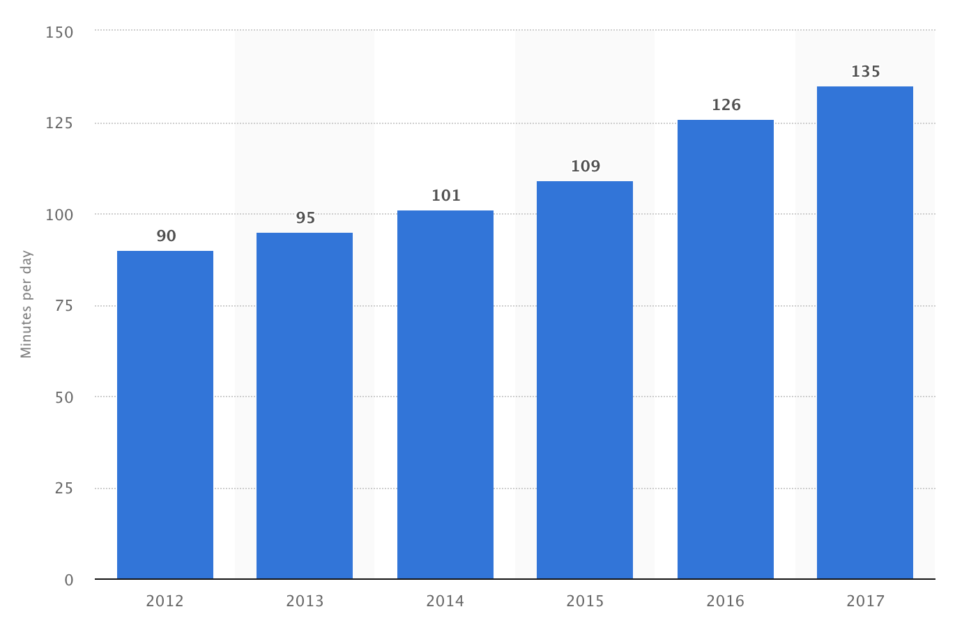
Zenith (a media agency) tracks this info on a global scale (I’ve not found other sources). They’ve only been publishing reports for the last four years, but I found a Recode article that interviews the head of forecasting at Zenith (Jonathan Barnard). This article provides historic data back to 2010, and forecasts to 2019, contrasting North America with the global average. The article was published in May 2017, and Zenith published a new report in 2018 with slightly different data for the last few years and looking forward, but the most recent report does not provide the context of the previous 10 years. For consistency of methodology, I’ve just used the data quoted by Recode for the following extrapolation.
[Excerpts from all four published Zenith reports are below, showing the yearly revision to their data. In summary, the estimates become more conservative with each subsequent report up until the latest report, which shows a jump again.]
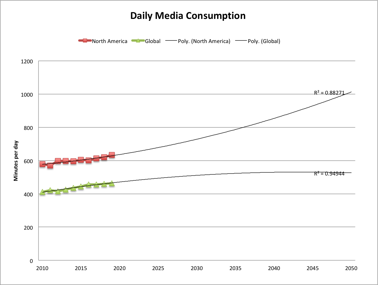
[This and all extrapolations in this post in my file media-consump-forecast.xlsx]
src:
Recode, May 2017
“People consumed more media than ever last year — but growth is slowing”
figure: Average individual daily media consumption in minutes
citing Zenith (appears to be from their 2017 report, including historic data available not freely accessible).
*
Here are excerpts from the press releases for the annual “Media Consumption Forecasts” by Zenith.
From the 2018 Report:
2018: 479 minutes per day consuming media
12% more than in 2011
2020: 492 min/day
From the 2017 report:
2019: less than 1% growth
2017: same as 2016
2016: 456 min/day
2010: 411 min/day
From the 2016 report:
2018F:448 min/day
2015: 435 min/day
2010: 403 min/day
From the 2015 report:
2017F:506 min/day
2015: 492 min/day
2014: 485.3 min/day
2010: 461.8 min/day
***
Social Media
eMarketer and Statista both provide estimates of daily social media consumption. The eMarketer figures cover the US, and the Statista figures are global.
Upon first inspection of the data, the Statista figures seem to be roughly 3X higher than eMarketer’s figures, a disparity that does not agree with my understanding of the variation by country (see We Are Social chart below). I’m quite confident that Statista’s data actually comes from marketing firm Global Web Index, and their recent report (which does not include all the historic info available at Statista) makes frequent passing reference to the increasing amount of time users are watching video on social platforms. In reading various qualitative discussions of social media use, I find many sources group YouTube and Facebook minutes of use together under the social category.
When eMarketer’s social and video minutes are combined, they come in closer range to Statista’s figures, so I believe this is a good rough approximation.
Here’s the extrapolation for both eMarketer (combined social and video) and Statista:
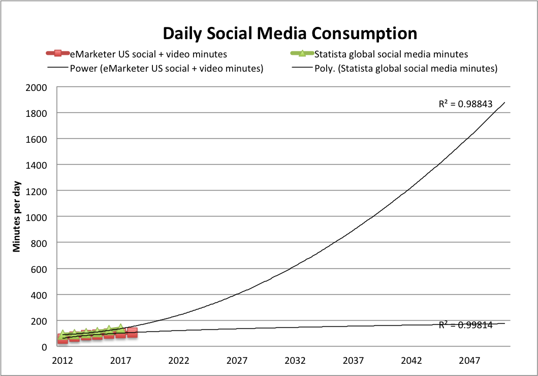
Note: The trendline of best fit for most of our extrapolations doesn’t fit the eMarketer data very well, so instead I’ve used a power trendline. The polynomial(2) trendline we often use does fit the Statista data pretty well, however. (You see both in the figure above)
I also noticed in reading qualitative discussions that Facebook and YouTube’s average daily minutes are very similar, with video getting a bit more time, and this is also the shown in eMarketer’s data, with the gap slowly widening in video’s favor. I’ve extrapolated eMarketer’s social and video figures separately to show how that divergence might take shape (again, the power trendline seemed to fit best).
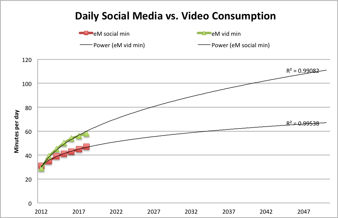
No surprise to see video pulling ahead of social, and I’m certain that marketing research focused on the growth of online video would suggest a much steeper curve.
Meanwhile, and also no surprise, here’s a chart (from Recode, citing Zenith) showing that Internet consumption is overtaking traditional TV consumption (from the same source as the Global/N.American overall media consumption figures above).
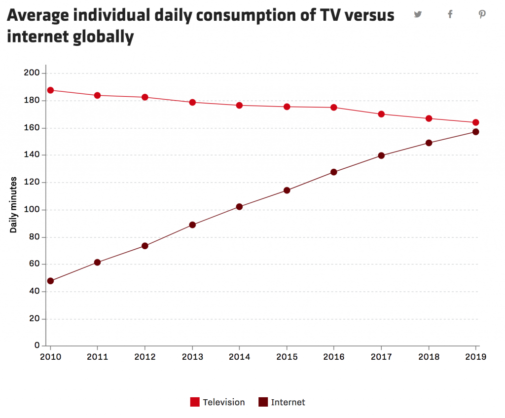
[Click through to the great interactive version at Recode.]
Another ad media firm, GroupM, also predicts online time overtaking traditional TV this year.
In line with that, this year (2018), globally, advertisers are expected to spend more online than on television for the first time. Interestingly, social media ad spending is expected to rise 21% to $58 billion while video ad spending is rising 19% to $32. (Recode citing Zenith)
Here’s a snapshot from We Are Social showing how social media consumption varies from one country to another in 2017.
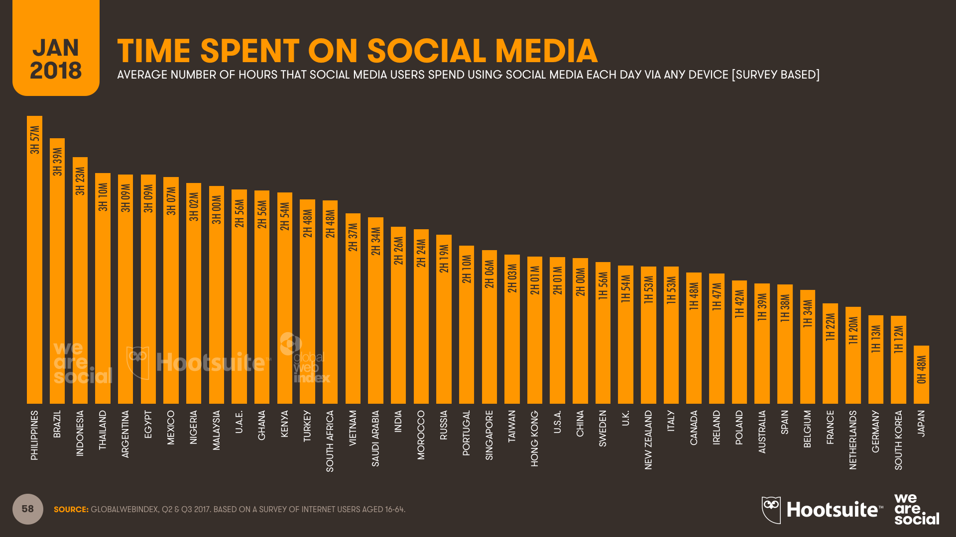
srcs:
eMarketer, June 2016
“Growth in Time Spent with Media Is Slowing”
Note:
eMarketer aggregates data from various research firms and they don’t offer much detail (at least, not to unpaid customers). I don’t know if these figures are based on consumer surveys or if they are based on data provided by service providers.
Statista (citing ??, 2017), 2018
“Daily time spent on social networking by internet users worldwide from 2012 to 2017”
Note:
Statista does not give the name of the original source (to unpaid customers), but they do specify that this data is based on worldwide, online consumer surveys of adults aged 16-64. Statista also reports that the survey question asks, “Roughly how many hours do you spend engaging with/connected to social networks or services during a typical day?” The source must be GlobalWebIndex, which conducts web-based surveys. Their latest report (2018) estimates current social media time exactly as reported by Statista. Their press release here describes the same survey question, and the same survey audience (16-64 year olds).
Entrepreneur, in Jan 2018 (date established via InternetArchive), published the following comparative daily consumption figures:
youtube: 40min/day
facebook: 35min/day
Snapchat: 25min/day
Instagram: 15min/day
Twitter: 1min/day
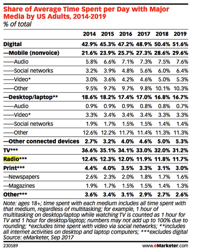
Media/Internet Time Allotment
Overall Media Allotment
src:
Statista, accessed May 2018
citing: info not available (likely eMarketer)
*
CC’s Note: eMarketer tracks the way people spend their time with media, showing comparison between desk/laptops, mobiles, non-streaming TV, radio, print
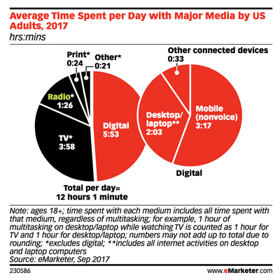
src: eMarketer, Sep 2017
via InsideRadio, Oct 2017
“EMarketer: Adults Spend Half Of Daily Media Usage On Digital”
*
UK Adults’ media time has plateaued
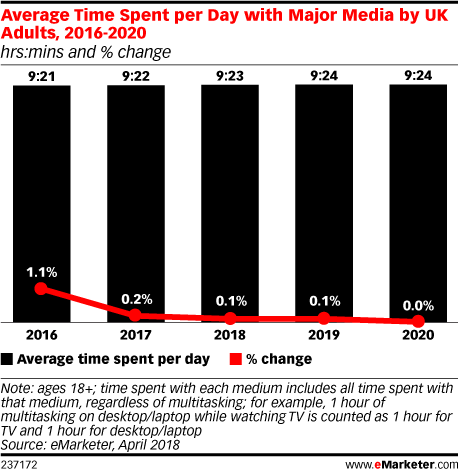
“The way that people consume media will continue to change,” said eMarketer’s UK analyst, Bill Fisher. “Many traditional habits are simply transitioning over to digital devices and platforms, while digital-only habits continue to proliferate. However, what’s apparent from this forecast is that UK adults have reached a plateau. While the media mix may ebb and flow, and it will increasingly flow toward mobile, adults’ media consumption capacity has reached its peak.”
*
src: eMarketer
small thumbnails retrieved 5/14/18
permalinks (data restricted by paywall)
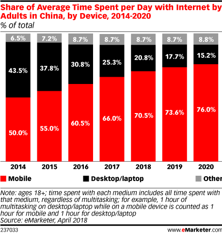
Average time spent per day with internet by adults in China by Device 2014-2020
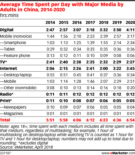
Average time spent per day with major media by adults in China 2014-2020
*
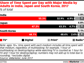
In 2017, daily time spent with digital media among adults will top 3 hours in Japan (3 hours 5 minutes) and South Korea (3 hours 26 minutes). Those in India will average less than half that time (1 hour 18 minutes), with digital accounting for just under one-third of total daily time spent with media.
src:
eMarketer, June 2017
*
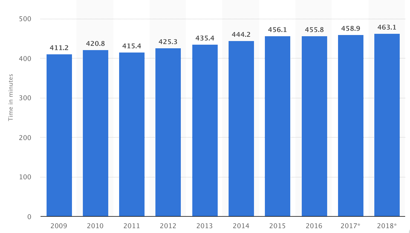
Daily time spent on social networking by internet users worldwide from 2012 to 2017 (in minutes)
src:
Statista, accessed May 2018
citing: untracked
*******
Mobile Time Allotment
FIGURE A3.1
Traffic Daily Profiles of the Five Major mobile Applications in North America (2020)
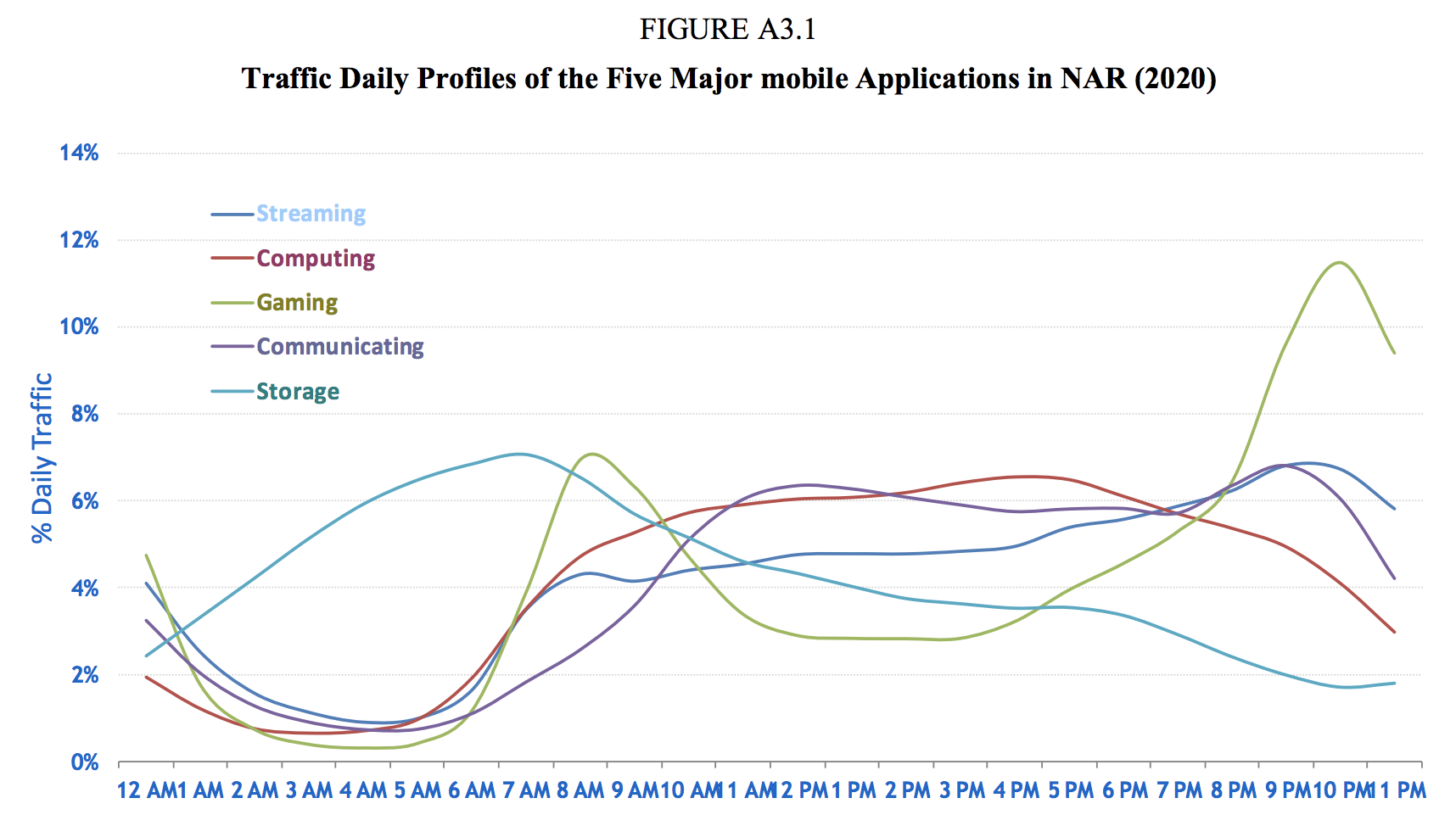
Figure A3.1 shows the daily profiles of the five major mobile applications in North American Region (NAR), namely, streaming (audio and video), computing (cloud processing, office productivity, other mobile applications), storage (media sharing, backup and device synchronisation), gaming (casual, interactive or emerging applications), and communicating (voice, video, e-mail and M2M). All these represent human behaviours and they are similar across geographies.
src:
International Telecommunication Union, July 2015
“Rep. ITU-R M.2370-0: IMT traffic estimates for the years 2020 to 2030”
P.40-41
citing:
Source: Bell-Labs, Alcatel-Lucent, 2015.
[CC’s note: Haven’t been able to track this down]
*
Mobile traffic distribution over different applications
Contrast with voice usage
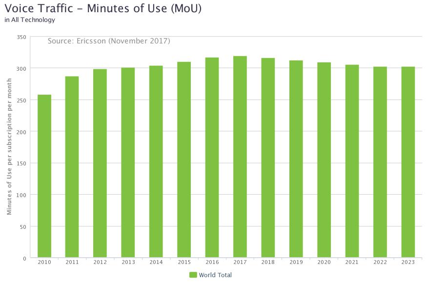
[Data here: Ericsson-Minutes-of-voice-monthly-2010-2023.xls]
src:
Ericsson, Accessed May 2018
Traffic Exploration [interactive data tool]
*
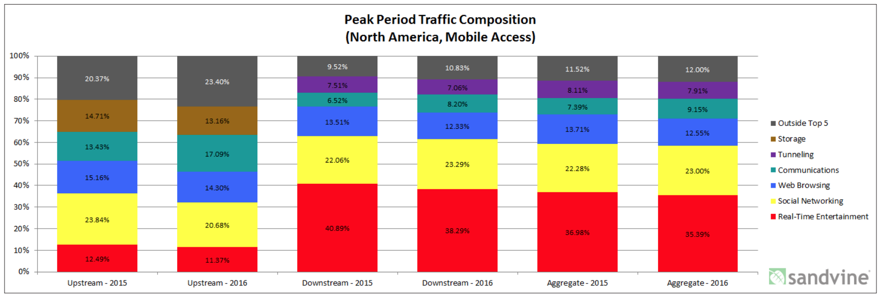
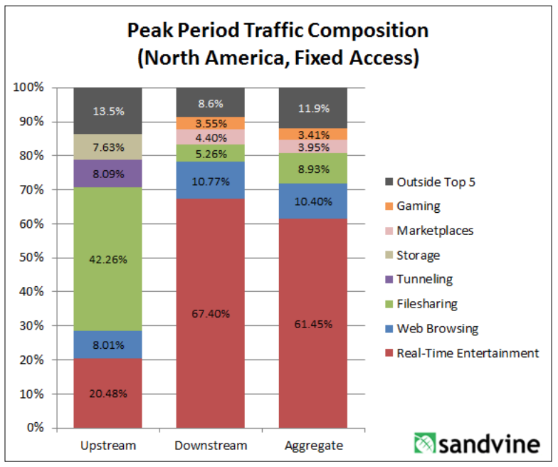
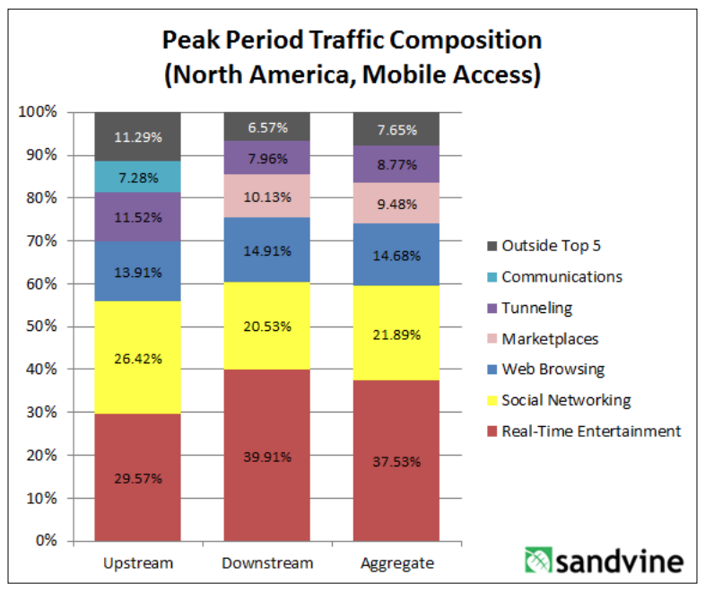
Sandvine, a Canadian network intelligence firm, tracks traffic composition. They’ve published a few reports with the current and previous year’s data, but I haven’t found anything more longitudinal. The reports describe peak period traffic composition across the following categories: real-time entertainment, marketplaces, storage, filesharing, web browsing, gaming, social networking, communications, and other. There are separate charts for mobile and fixed access.
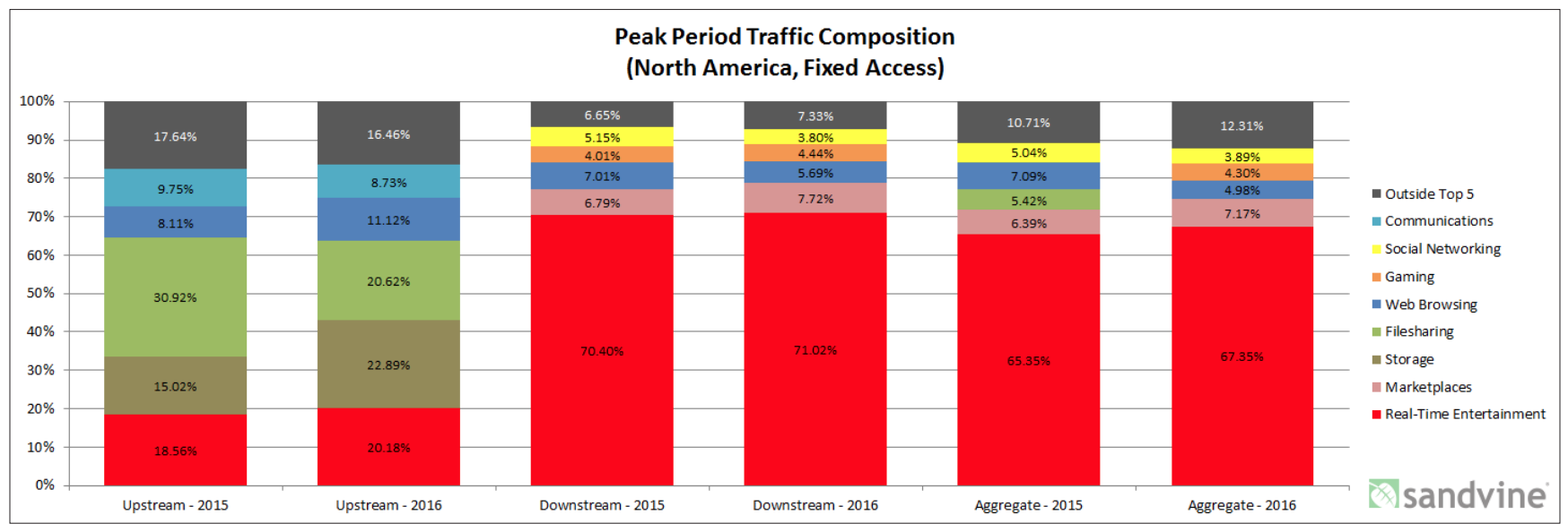
from
“2016 Global Internet Phenomena: Latin America and North America”
from
“Global Internet Phenomena Report: 2H 2013”
CC’s Note: I’ve not been able to find a more recent version of the report. Sandvine was acquired recently, although the report author is still with the company. Could contact him to ask. Dan Deeth: ddeeth@sandvine.com
*
Comscore is tracking differences between desktop and mobile internet usage.
CC’s note: Not sure if historic data are aggregated, but here’s a sample of recent statistics (covering US, Canada, France, Germany, Italy, Spain, UK, Argentina, Brazil, Mexico, India, Indonesia and Malaysia)
Smartphones are the dominant platform in terms of total digital minutes, in every region Comscore examined.
Most pronounced in India – 89% total minutes
Least noticeable in Canada – 43% of total minutes (42% desktop, 15% tablet)
US: 60% (30% desktop, 10% tablet)
Mobile minutes are overwhelmingly spent with apps – over 80%
Top apps (everywhere, in various rankings) include:
Google Search, Whats App, Facebook, YouTube, Google Play, FB Messenger
Three largest categories where digital time is spent:
Multimedia (includes several large video streaming services), Social Networking, Instant Messengers
Looking specifically at mobile digital time, the top four categories are:
Entertainment, Social Media, Instant Messaging, and Games
On average, Social Media has the largest average share of mobile minutes, but Entertainment is larger in the US and Canada.
Among Social Media apps, Facebook, totally dominates, followed by Instagram, then Snapchat, then Twitter (Twitter’s share is tiny).
Among Messaging apps, WhatsApp totally dominates, then Facebook Messenger (less than half), then WeChat (very small share).
The report includes visualization of platform preferences for certain categories. Business/Finance (which includes banking) shows the most even split between mobile and desktop reach. In the majority of markets, retail is heavily biased toward mobile. News/Information is overwhelmingly biased toward mobile.
(shown for UK and India – both show a fairly even split between desktop and mobile for banking minutes).
The report also includes visualization of subtle seasonality in certain categories of content (shown for UK and Brazil).
src:
Comscore, 2018
“Global Digital Future in Focus”
Whole-Day Time Allotment
ASK: Historic trends in time allotment? Global data?
SUMMARY
The Bureau of Labor Statistics has conducted the American Time Use Survey (ATUS) annually since 2003. This is the first federally funded, rigorous time use survey, although other large scale surveys have been conducted in the mid 20th century. Smaller scale time-use diaries were also collected going back to the early 19th century. Much of this data is US-specific, but the UN has aggregated time-use surveys into regional categories.
FINDINGS
Wall Street Journal, in 2016, created some nice, interactive graphics illustrating the changes reflected in the ATUS from 2003 through 2015.
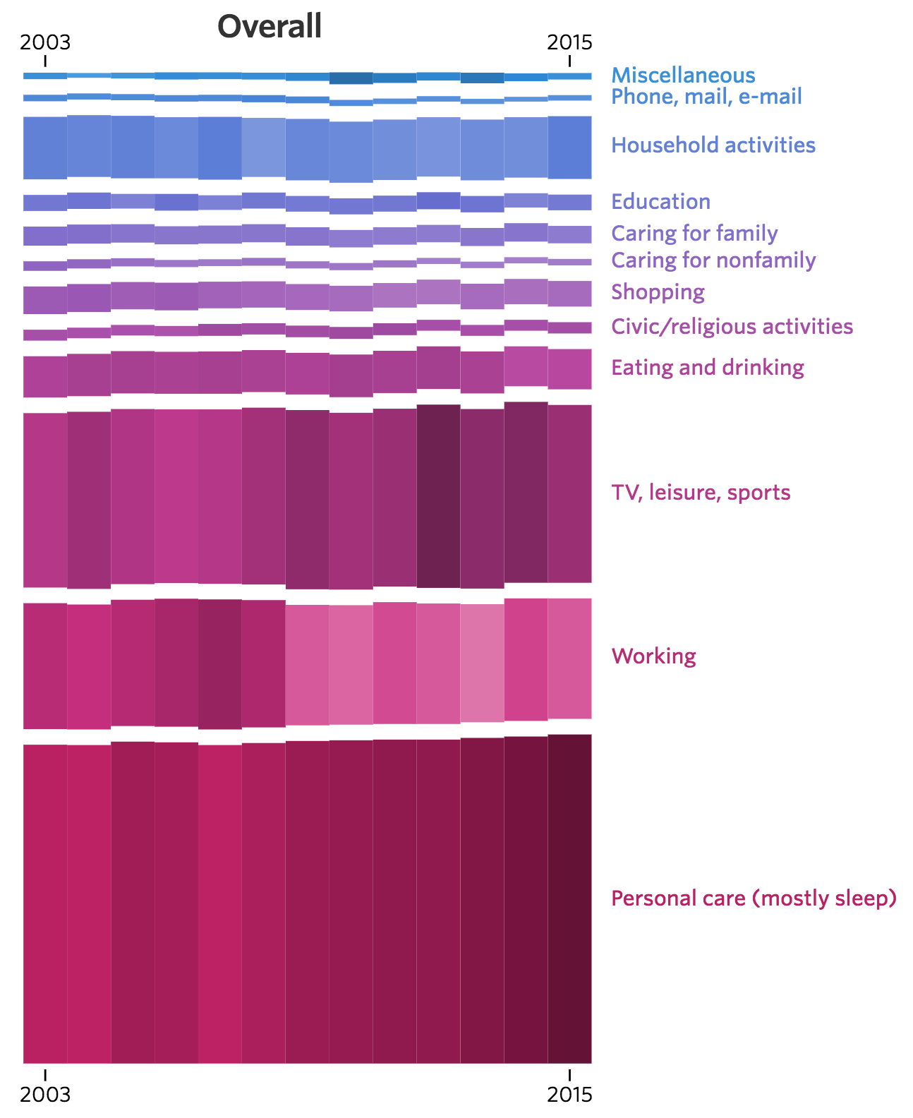
[Click for larger. Visit source for interactive version]
Excerpt:
Americans overall are working less and sleeping more than they were a decade ago, trends that point to an aging population and fewer people in the workforce. But among those who have a job, people are working more. And in general, men spend more time than women on leisure activities, while women sleep about a half-hour more each day.
Additional charts at WSJ show breakdown by sex, employment status, age, and whether children are in the home.
src:
Wall Street Journal, June 2016
“Changing Times: How Americans spend their day reflects a shifting economy and population.”
*
Here are links to the historic BLS time-use data
Data for 2003
See Tables 1 & 2 (pp.9, 10)
src:
BLS, Sep 2004
“Time-Use Survey— First Results Announced By BLS”
Historic tables all linked here
*
Diary data collection in the US dates back to the early part of the 19th century. The first large-scale national sample time use survey was conducted in 1965/1966. Data from this study, and others through 1981, are available via University of Michigan’s Institute for Social Research (ICPSR)
Americans’ Use of Time Series, ICPSR
*
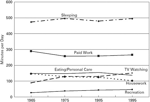
Trends in earlier Americans’ Use of Time Project surveys, 1965-1995
src:
John Robinson, Geoffrey Godbey, 1997
Time for Life: The Surprising Ways Americans Use Their Time
Excerpts:
Distribution of Time in Productive Activities by Gender in Fourteen Countries
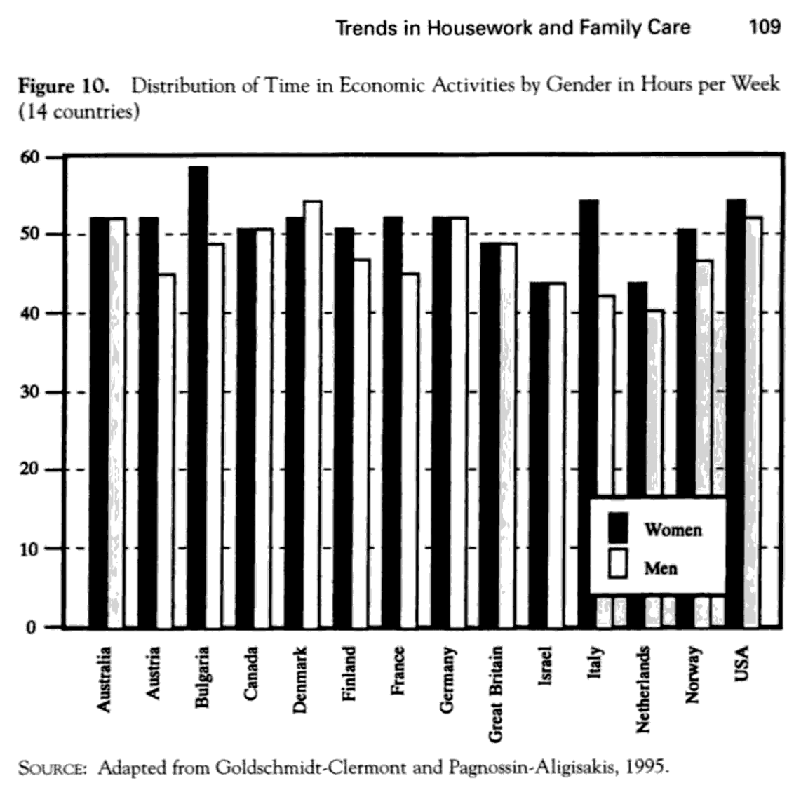
(p.109)
Trends in Free Time and Its Components, 1965-1995 (341)

(p.126)

(p.145)
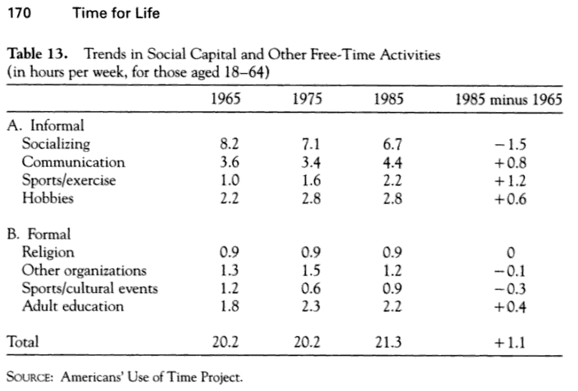
(p.170)
Trends in Different Types of Time for Women and Men, 1965-1995 (348)
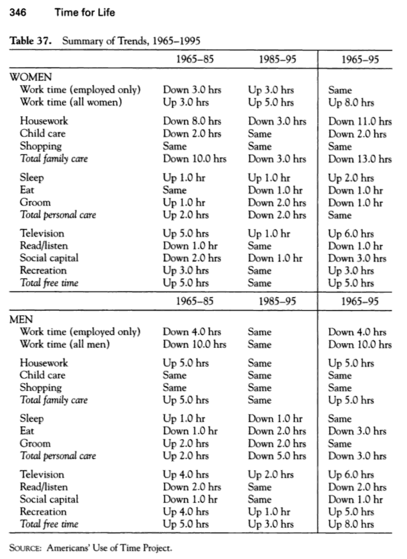
(p.346)
src:
Transportation Research Board and Institute of Medicine, 2005
“Does the Built Environment Influence Physical Activity?: Examining the Evidence — Special Report 282”
p.78, Figure 3-8 Time use, 1965–1995 (ages 18–64).
(data from Robinson & Godbey, above, although the preview of that info is not available in Google)
*
Global aggregation of time-use surveys
United Nations Development Programme, 2015
“Time Use Across the World: Findings of a World Compilation of Time Use Surveys”
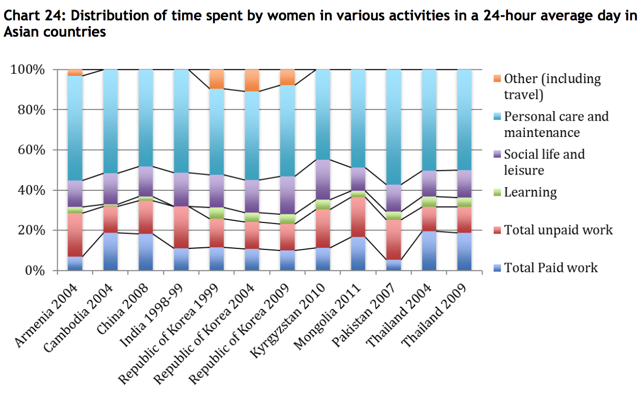
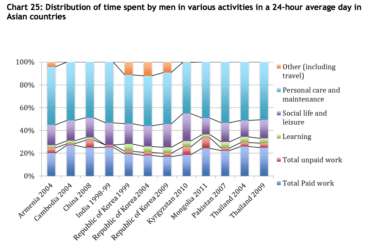
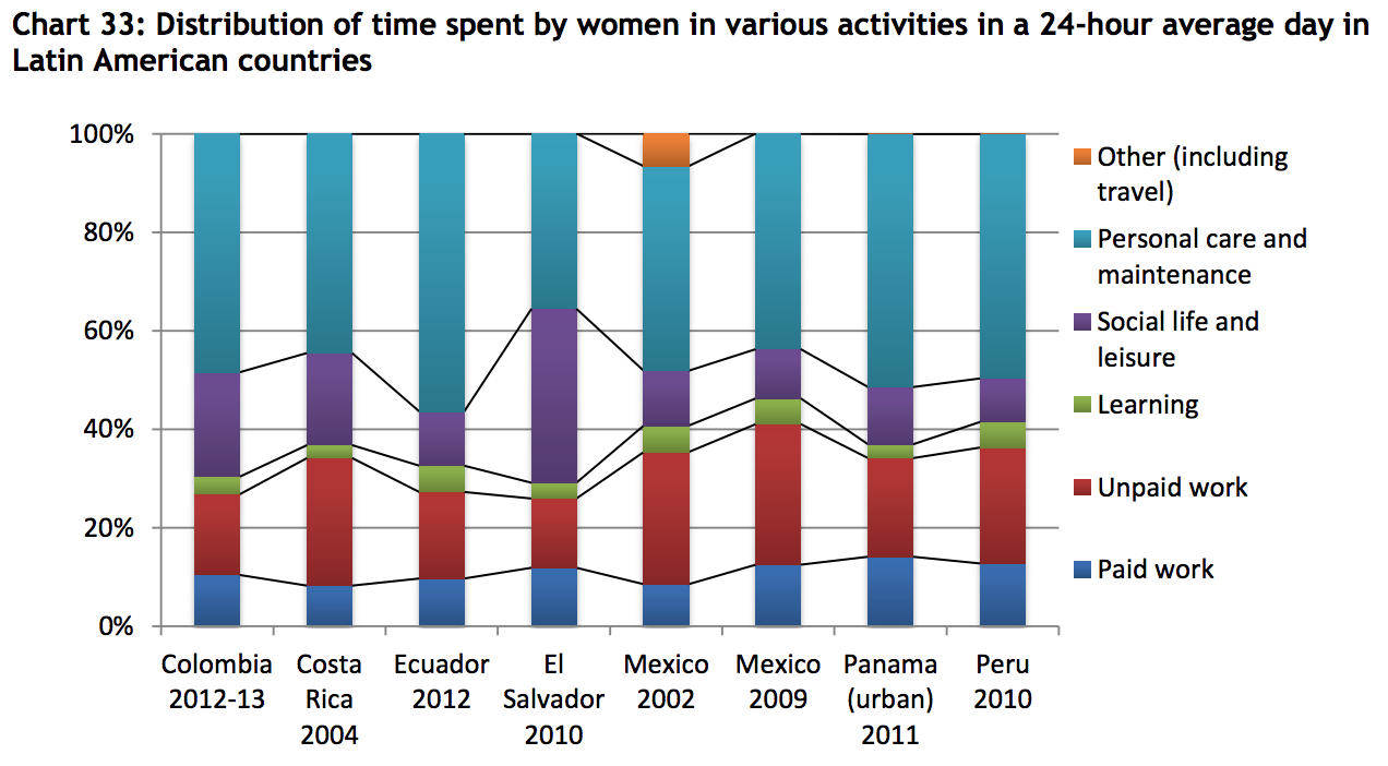
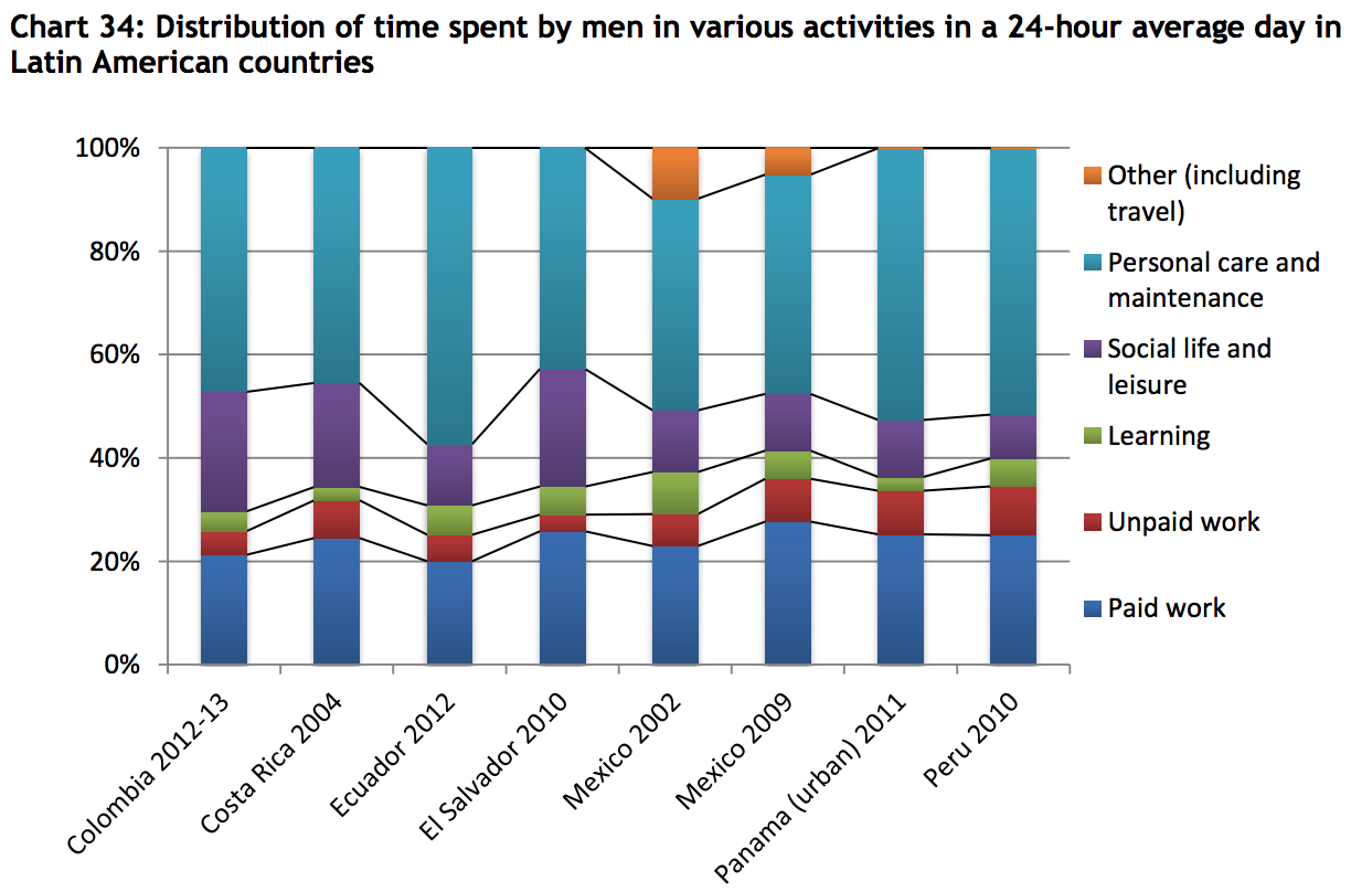
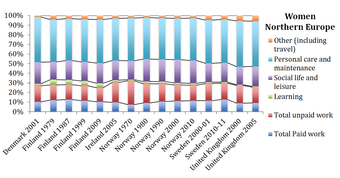
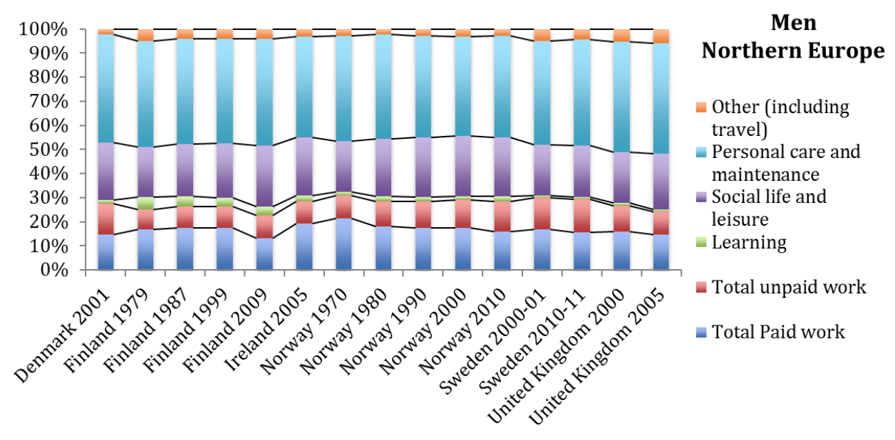
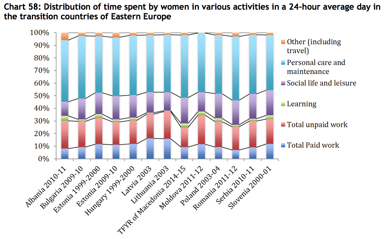
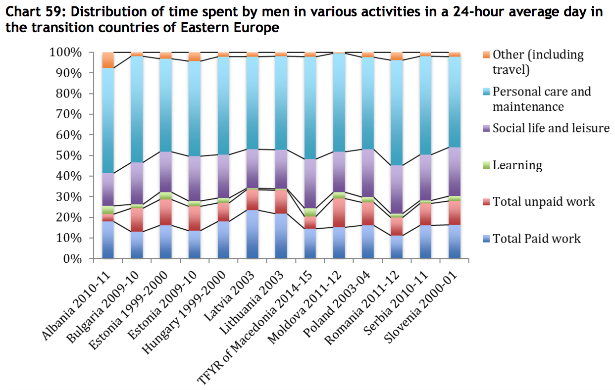
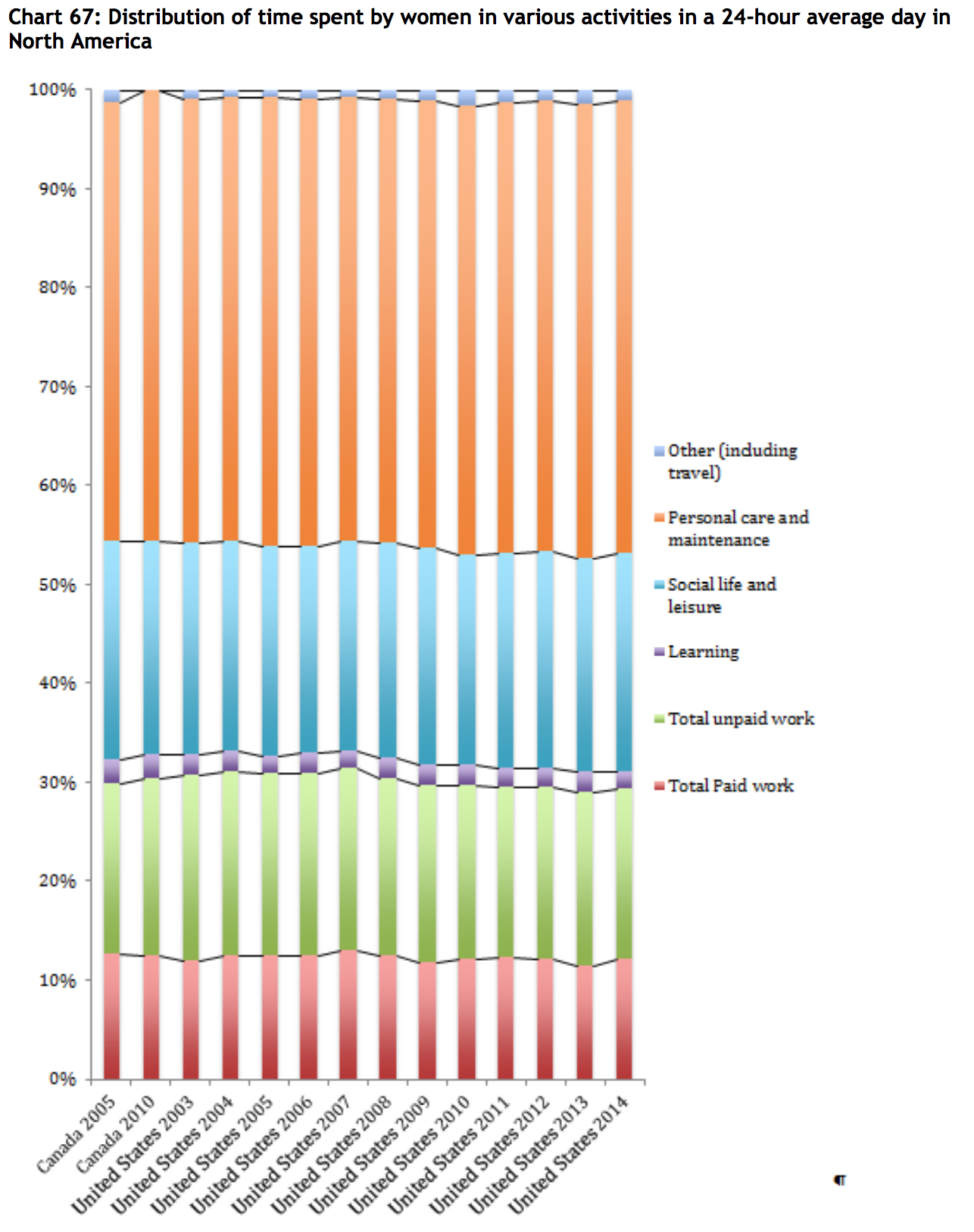
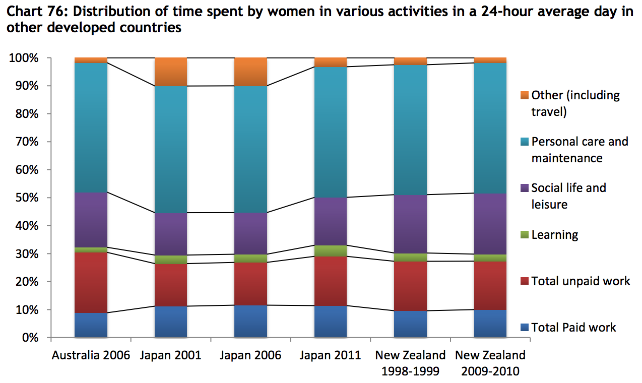
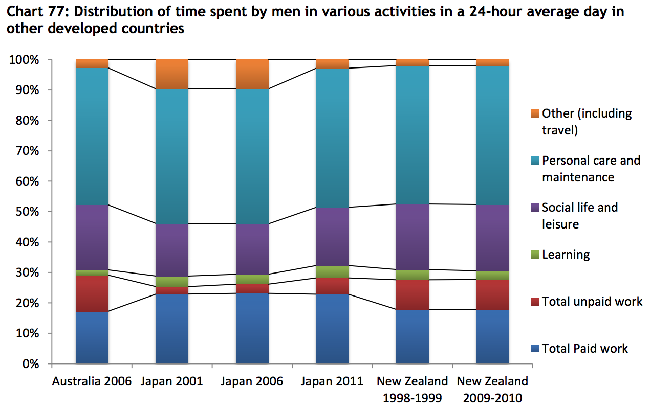
Paper is based on 102 time use surveys carried out in 65 countries. It gathers as many time use survey data and metadata as possible, and builds synthetic indicators on time use across the world, based on this data set. One of the main goals of the paper is to highlight time-use differences between men and women, particularly the inequities between paid work and unpaid work. To that end, most of the charts are divided by gender, with only a single chart showing gender-neutral time-use averages (that one chart is for the Mid East and Northern Africa region). In the case of Europe, the charts are further segmented by west, north, and southern Europe.
Survey data are aggregated into the following broad regions:
Middle East and North Africa (9 countries, 10 surveys)
sub-Saharan Africa (8 countries, 10 surveys)
Asia (9 countries, 13 surveys)
Latin America (7 countries, 8 surveys)
Europe (15 countries, 29 surveys)
Transition [Eastern European countries with Soviet history] (12 countries, 12 surveys)
North America (2 countries, 14 surveys)
Other developed countries (3 countries, 6 surveys)
The following chart shows which countries are included in those categories, and highlights which countries have conducted repeated surveys.
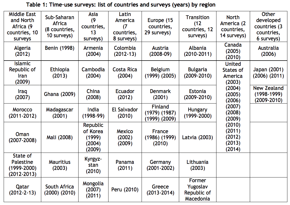
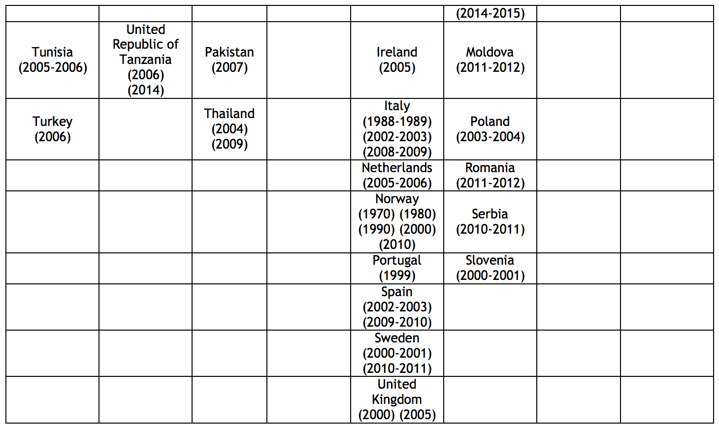
p.5,6
Here are the overall time-use charts from the report:
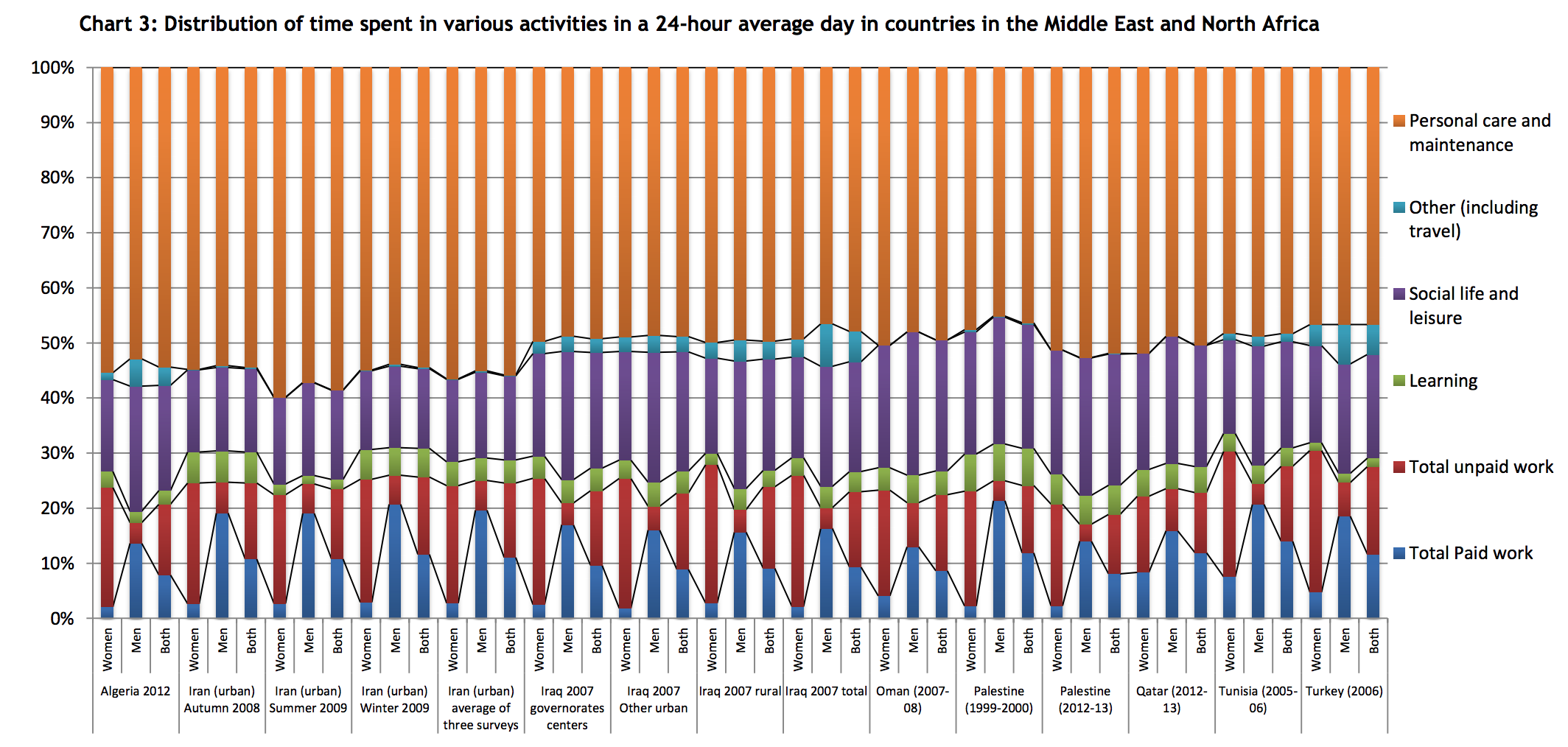
p.19

p.29

p.30
p.42
p.43
p.50
p.51
p.66
See the report for western and southern Europe segments. I’ve excerpted the northern Europe segment because it reflects a broad time series, with many repeated surveys in Finland and Norway.
p.67
See the report for western and southern Europe segments.
p.73
p.73
p.78

p.79
p.84
p.84
***
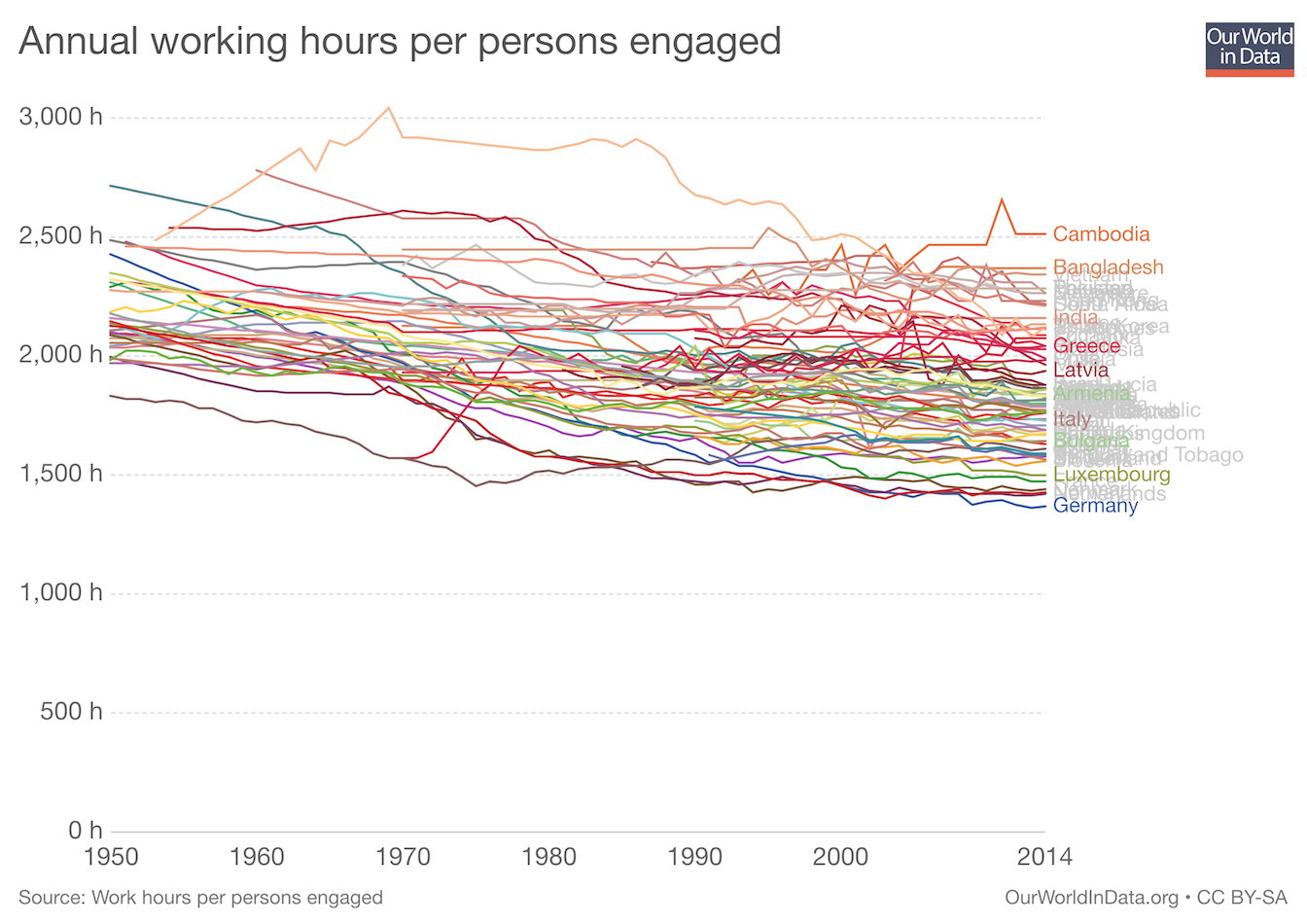
Annual Working Hours 1950-2014
worldwide
Reflects the trend of people in richer countries working less.
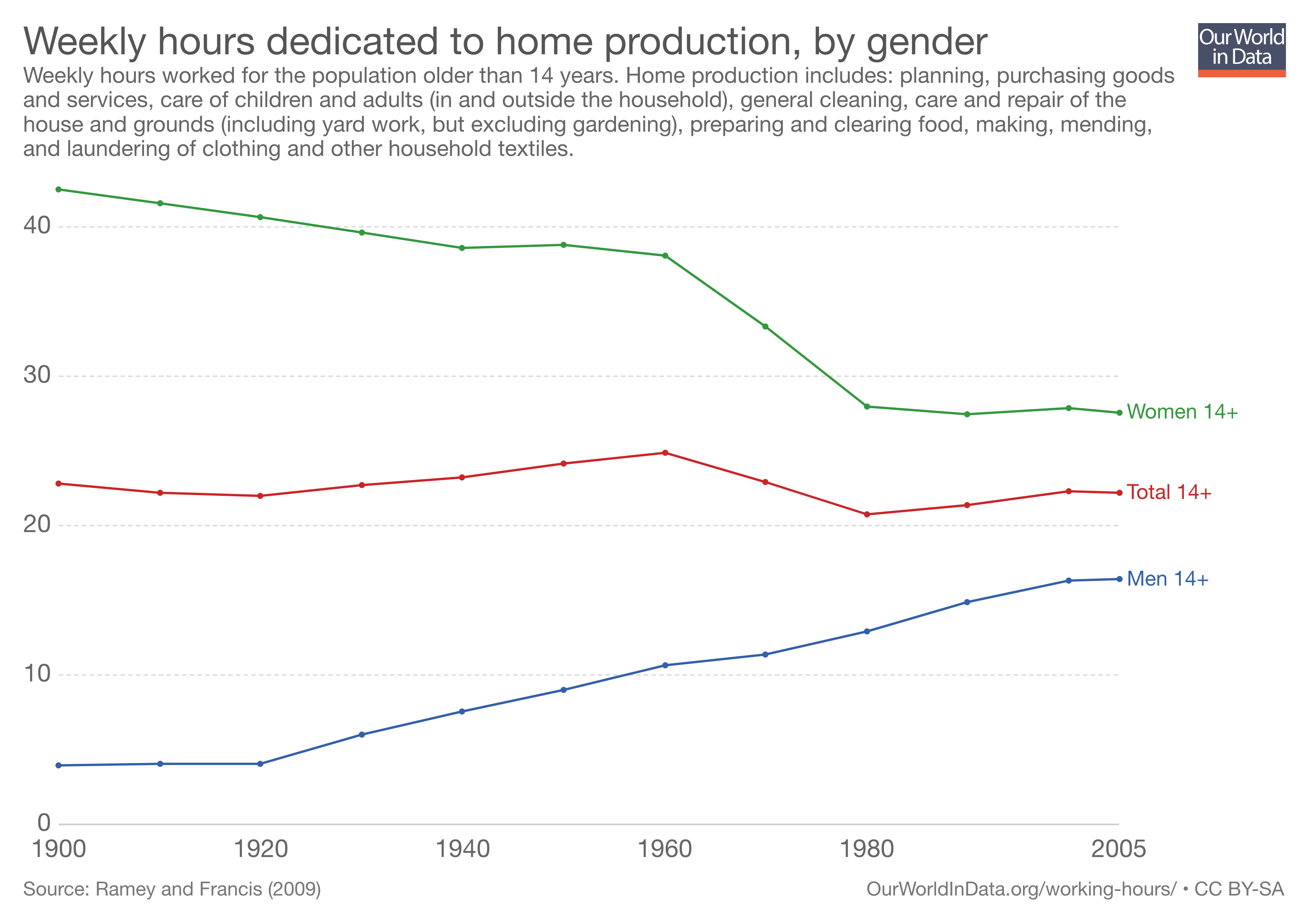
Working Hours in the Household 1900-2005
US
Marked decline for women and increase for men, across all age groups.
Includes planning, purchasing goods and services, care of children and adults, general cleaning, care and repair of the house and ground, preparing and clearing food, making, mending, and laundering clothing and other household textiles.
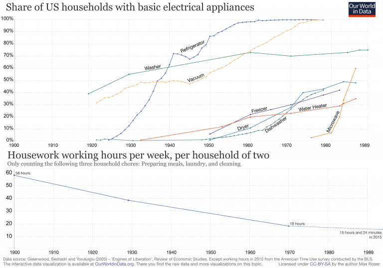
Hours per week on chores have decreased as electrical appliances have proliferated 1900-1989
US
Comparing share of households with basic electrical appliances to hours spent preparing meals, doing laundry and cleaning.
src:
Max Roser, 2018
“Working Hours” – Our World In Data
