

Whole-Day Time Allotment
ASK: Historic trends in time allotment? Global data?
SUMMARY
The Bureau of Labor Statistics has conducted the American Time Use Survey (ATUS) annually since 2003. This is the first federally funded, rigorous time use survey, although other large scale surveys have been conducted in the mid 20th century. Smaller scale time-use diaries were also collected going back to the early 19th century. Much of this data is US-specific, but the UN has aggregated time-use surveys into regional categories.
FINDINGS
Wall Street Journal, in 2016, created some nice, interactive graphics illustrating the changes reflected in the ATUS from 2003 through 2015.
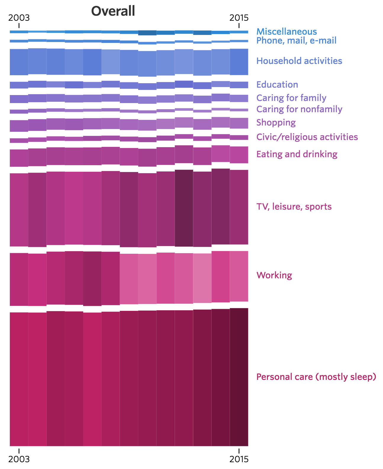
[Click for larger. Visit source for interactive version]
Excerpt:
Americans overall are working less and sleeping more than they were a decade ago, trends that point to an aging population and fewer people in the workforce. But among those who have a job, people are working more. And in general, men spend more time than women on leisure activities, while women sleep about a half-hour more each day.
Additional charts at WSJ show breakdown by sex, employment status, age, and whether children are in the home.
src:
Wall Street Journal, June 2016
“Changing Times: How Americans spend their day reflects a shifting economy and population.”
*
Here are links to the historic BLS time-use data
Data for 2003
See Tables 1 & 2 (pp.9, 10)
src:
BLS, Sep 2004
“Time-Use Survey— First Results Announced By BLS”
Historic tables all linked here
*
Diary data collection in the US dates back to the early part of the 19th century. The first large-scale national sample time use survey was conducted in 1965/1966. Data from this study, and others through 1981, are available via University of Michigan’s Institute for Social Research (ICPSR)
Americans’ Use of Time Series, ICPSR
*
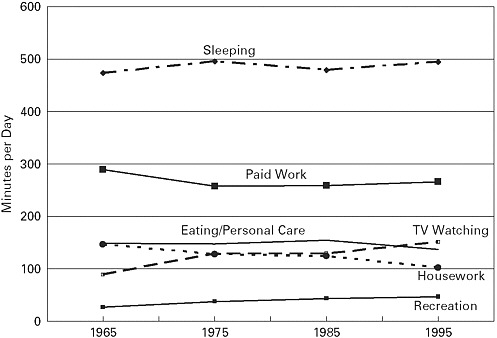
Trends in earlier Americans’ Use of Time Project surveys, 1965-1995
src:
John Robinson, Geoffrey Godbey, 1997
Time for Life: The Surprising Ways Americans Use Their Time
Excerpts:
Distribution of Time in Productive Activities by Gender in Fourteen Countries
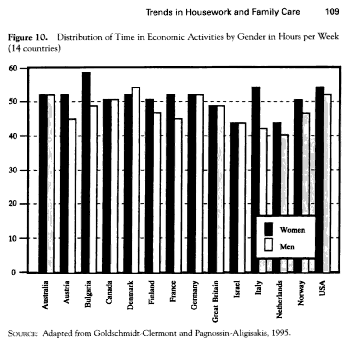
(p.109)
Trends in Free Time and Its Components, 1965-1995 (341)

(p.126)

(p.145)
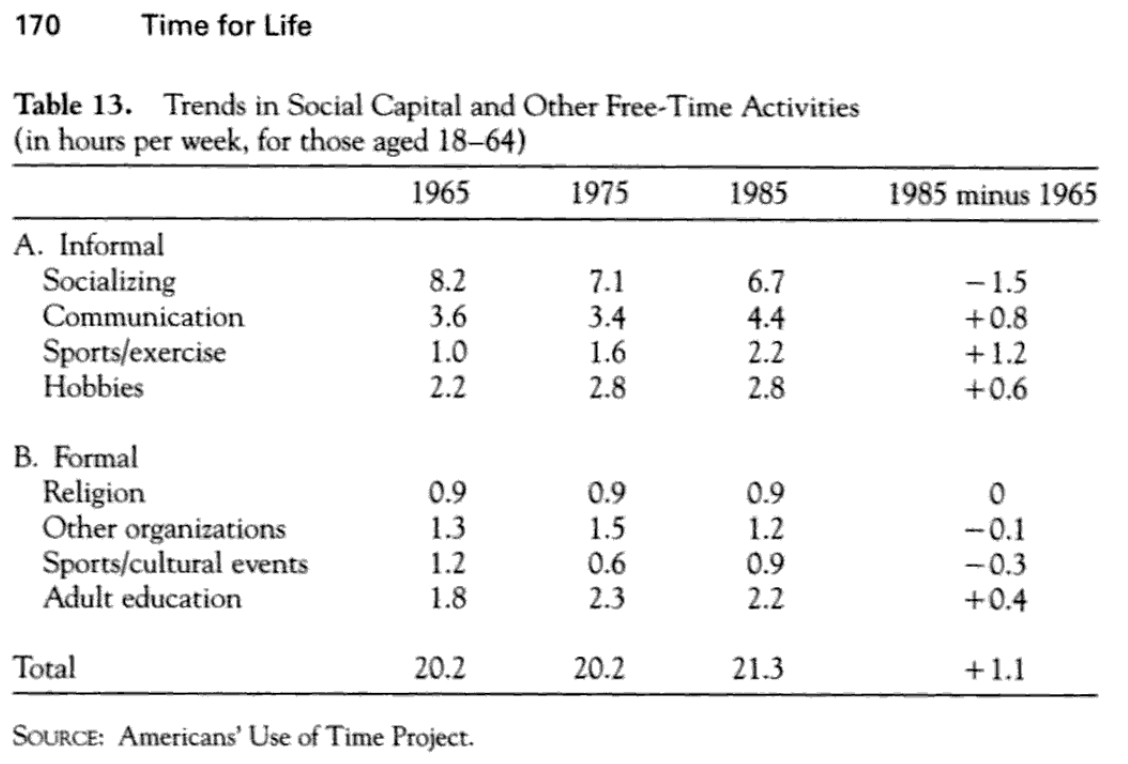
(p.170)
Trends in Different Types of Time for Women and Men, 1965-1995 (348)
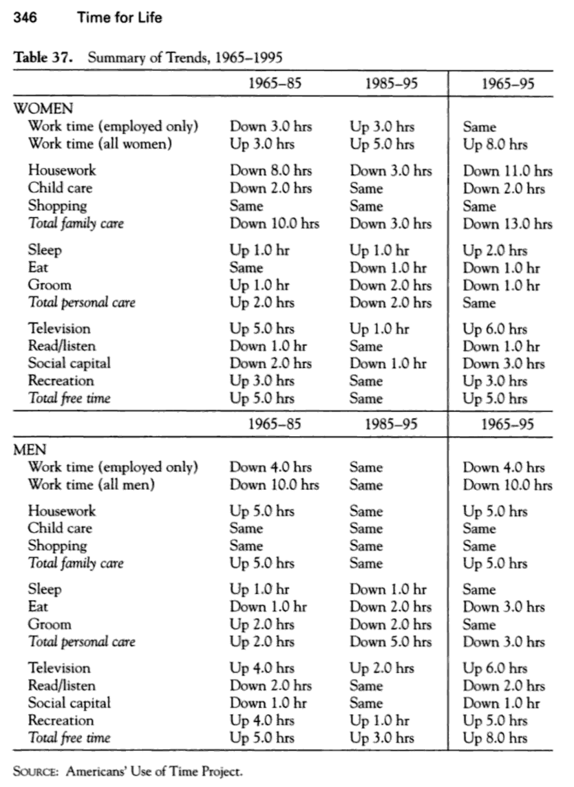
(p.346)
src:
Transportation Research Board and Institute of Medicine, 2005
“Does the Built Environment Influence Physical Activity?: Examining the Evidence — Special Report 282”
p.78, Figure 3-8 Time use, 1965–1995 (ages 18–64).
(data from Robinson & Godbey, above, although the preview of that info is not available in Google)
*
Global aggregation of time-use surveys
United Nations Development Programme, 2015
“Time Use Across the World: Findings of a World Compilation of Time Use Surveys”
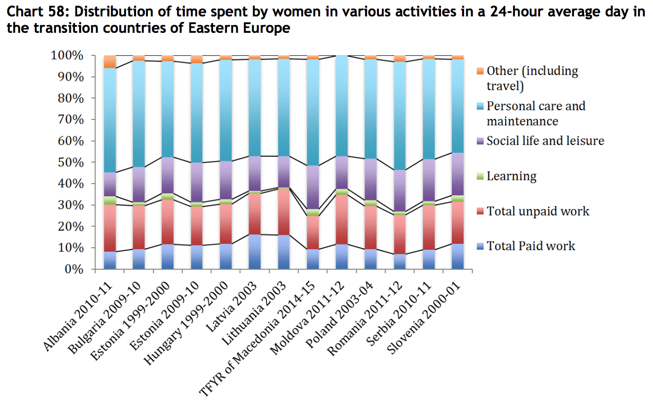
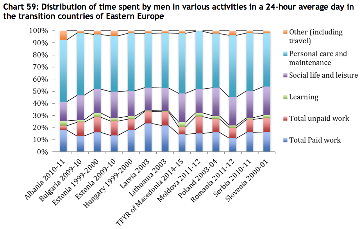
Paper is based on 102 time use surveys carried out in 65 countries. It gathers as many time use survey data and metadata as possible, and builds synthetic indicators on time use across the world, based on this data set. One of the main goals of the paper is to highlight time-use differences between men and women, particularly the inequities between paid work and unpaid work. To that end, most of the charts are divided by gender, with only a single chart showing gender-neutral time-use averages (that one chart is for the Mid East and Northern Africa region). In the case of Europe, the charts are further segmented by west, north, and southern Europe.
Survey data are aggregated into the following broad regions:
Middle East and North Africa (9 countries, 10 surveys)
sub-Saharan Africa (8 countries, 10 surveys)
Asia (9 countries, 13 surveys)
Latin America (7 countries, 8 surveys)
Europe (15 countries, 29 surveys)
Transition [Eastern European countries with Soviet history] (12 countries, 12 surveys)
North America (2 countries, 14 surveys)
Other developed countries (3 countries, 6 surveys)
The following chart shows which countries are included in those categories, and highlights which countries have conducted repeated surveys.
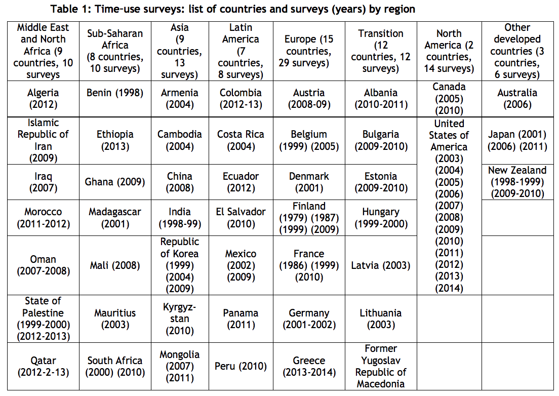
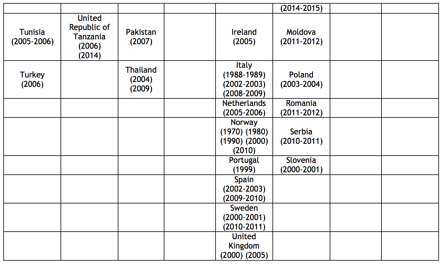
p.5,6
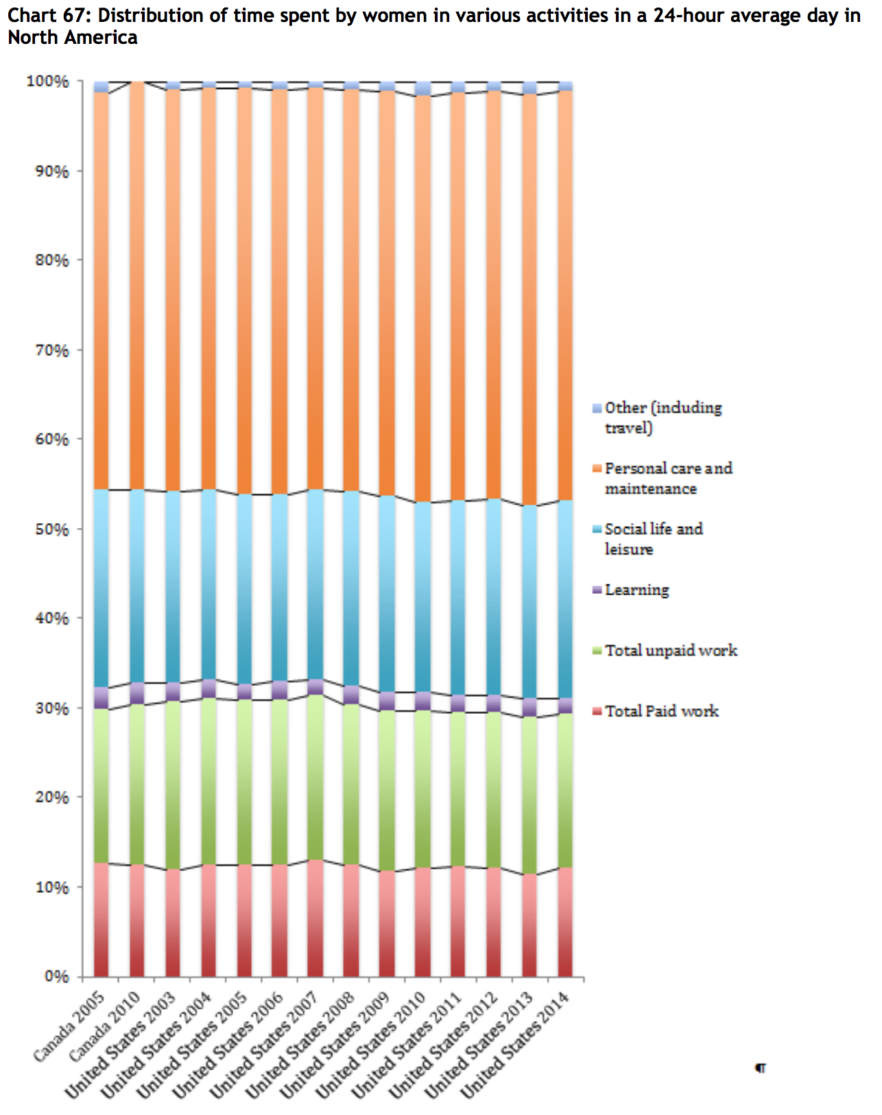
Here are the overall time-use charts from the report:
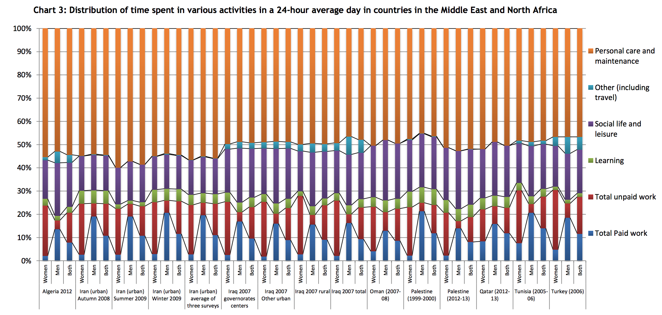
p.19

p.29

p.30
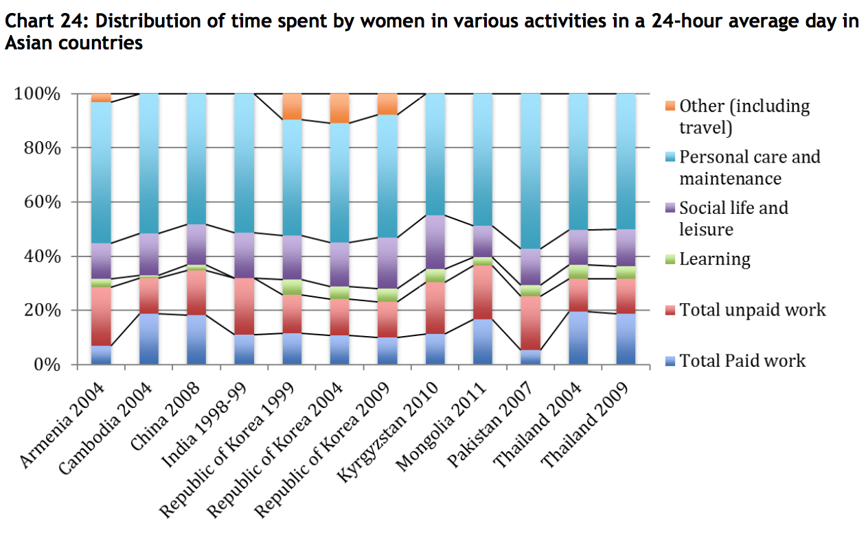
p.42
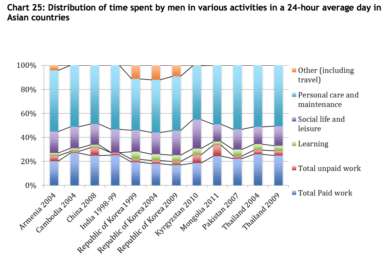
p.43
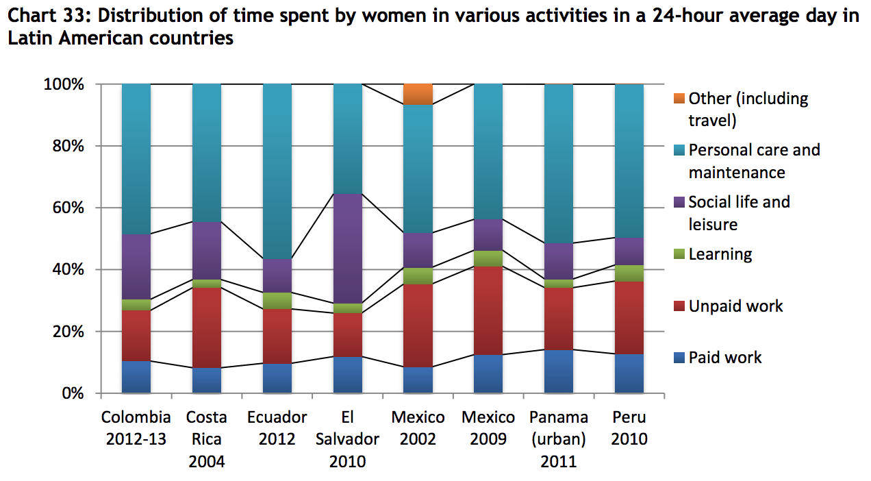
p.50
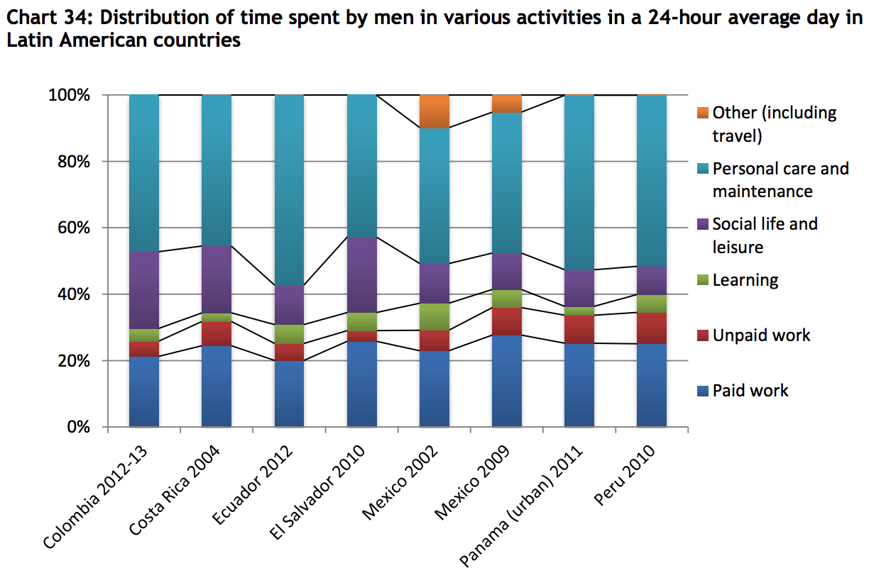
p.51
p.66
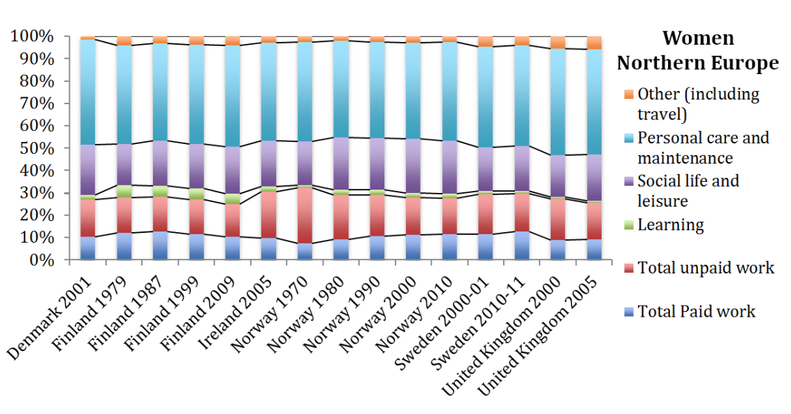
See the report for western and southern Europe segments. I’ve excerpted the northern Europe segment because it reflects a broad time series, with many repeated surveys in Finland and Norway.
p.67
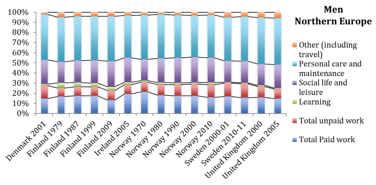
See the report for western and southern Europe segments.
p.73
p.73
p.78

p.79
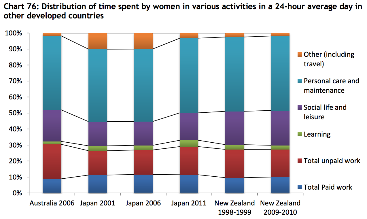
p.84
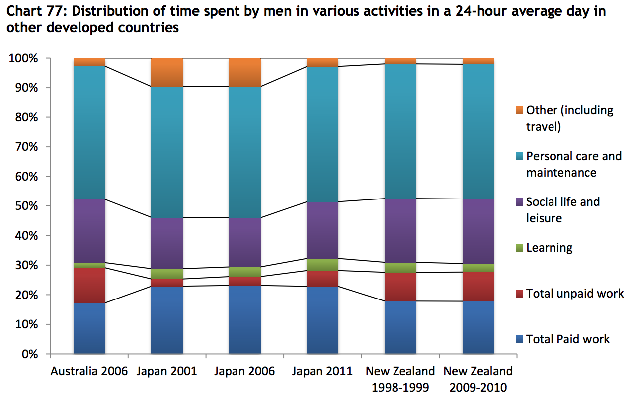
p.84
***
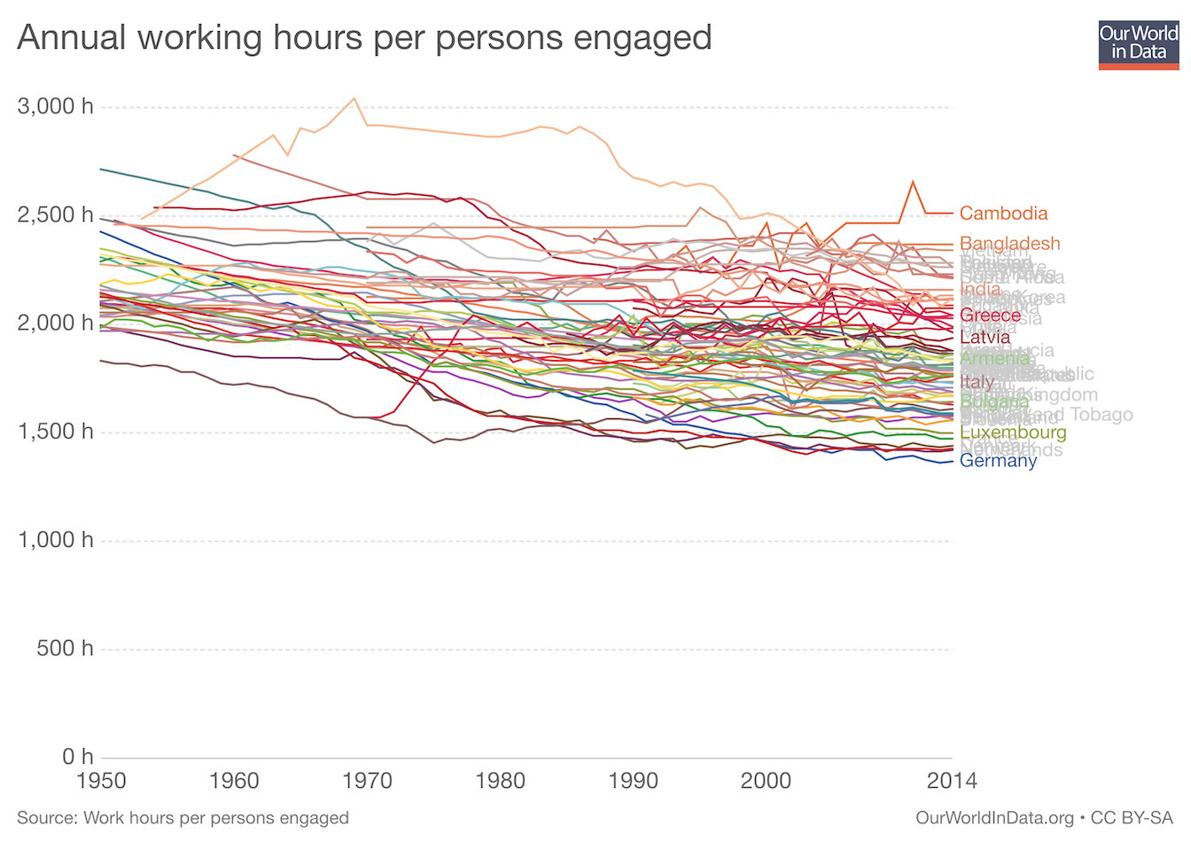
Annual Working Hours 1950-2014
worldwide
Reflects the trend of people in richer countries working less.
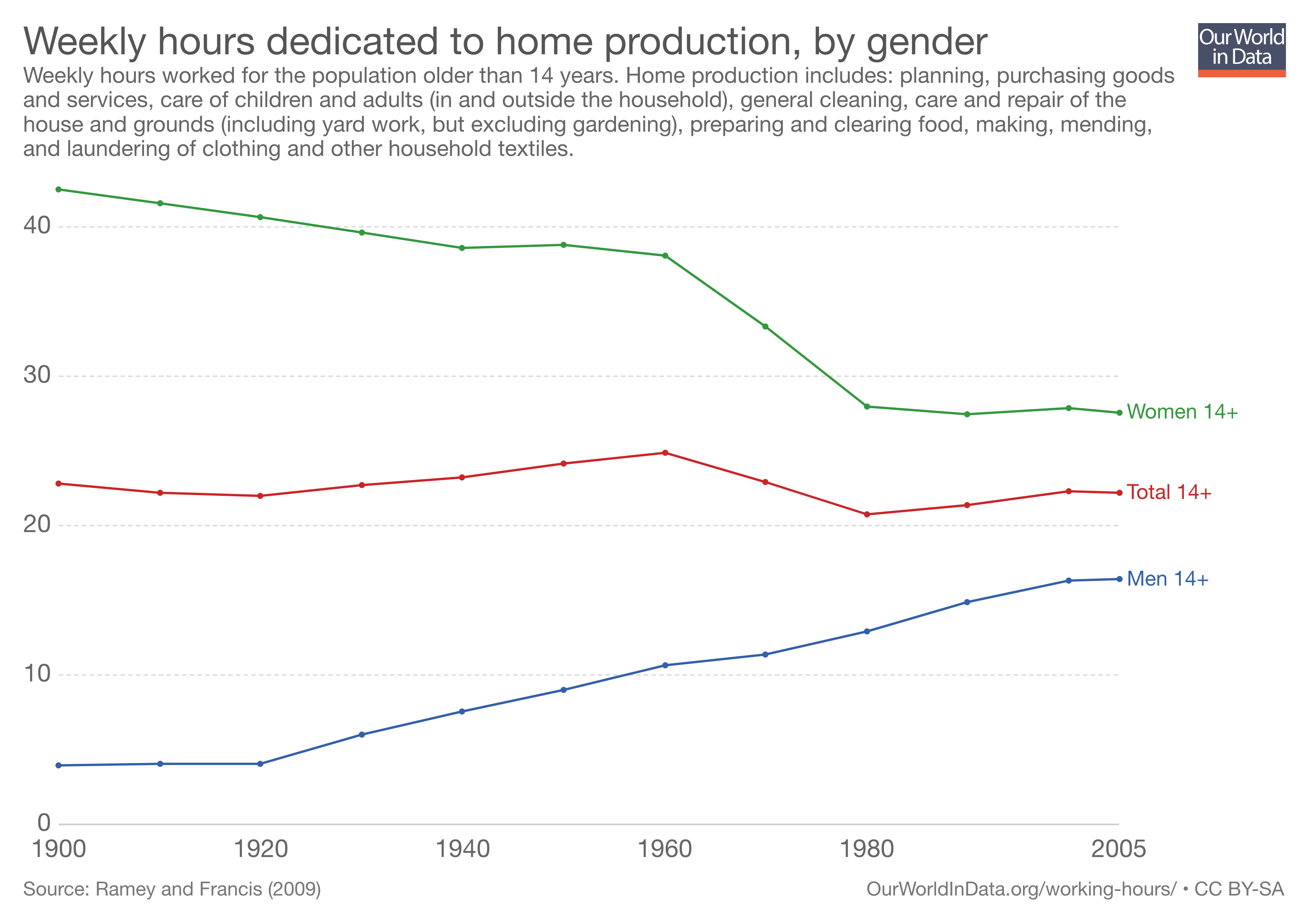
Working Hours in the Household 1900-2005
US
Marked decline for women and increase for men, across all age groups.
Includes planning, purchasing goods and services, care of children and adults, general cleaning, care and repair of the house and ground, preparing and clearing food, making, mending, and laundering clothing and other household textiles.
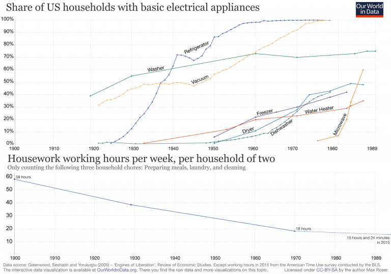
Hours per week on chores have decreased as electrical appliances have proliferated 1900-1989
US
Comparing share of households with basic electrical appliances to hours spent preparing meals, doing laundry and cleaning.
src:
Max Roser, 2018
“Working Hours” – Our World In Data
Clothing Expenditures and Prices
Overview
The Bureau of Labor Statistics tracks apparel expenditures as well as indexed prices (CPI – prices relative to a base year, not actual prices). Apparel includes a broad range of subcategories. Where available, we have also sought item-level data, using men’s Tshirts as an exemplar. Expenditure data is available going back to 1990. CPI data is available going back to 1947. Tshirt CPI data is available back to 1997 (possibly earlier – awaiting clarification from BLS). No forecasts found.
Findings
Clothing Expenditures – 1990-2014
Google Spreadsheet
The apparel and services category had one of the largest increases in 2014.
Average expenditures per consumer unit in 2014 were $53,495, a 4.7percent increase from 2013 levels, the U.S. Bureau of Labor Statistics reported today. During the same period, the Consumer Price Index (CPIU) rose 1.6 percent(1). In 2013, spending decreased 0.7 percent. Average pretax income per consumer unit increased at about the same pace as expenditures, up 4.8 percent from 2013.
Consumer units include families, single persons living alone or sharing a household with others but who are financially independent, or two or more persons living together who share expenses.
Srcs:
[embedded in chart above]
Note: The “Apparel and Services” category includes apparel and footwear for adults, children, and babies (including sportswear, and uniforms), as well as material for making clothes, shoe repair, alterations, sewing patterns and notions, clothing rental, storage, dry cleaning and sent-out laundry, watches, jewelry, and repairs to watches and jewelry.
Src:
Consumer Expenditure Survey Glossary, Bureau of Labor Statistics
*
Consumer Price Index, Apparel – 1947-2014
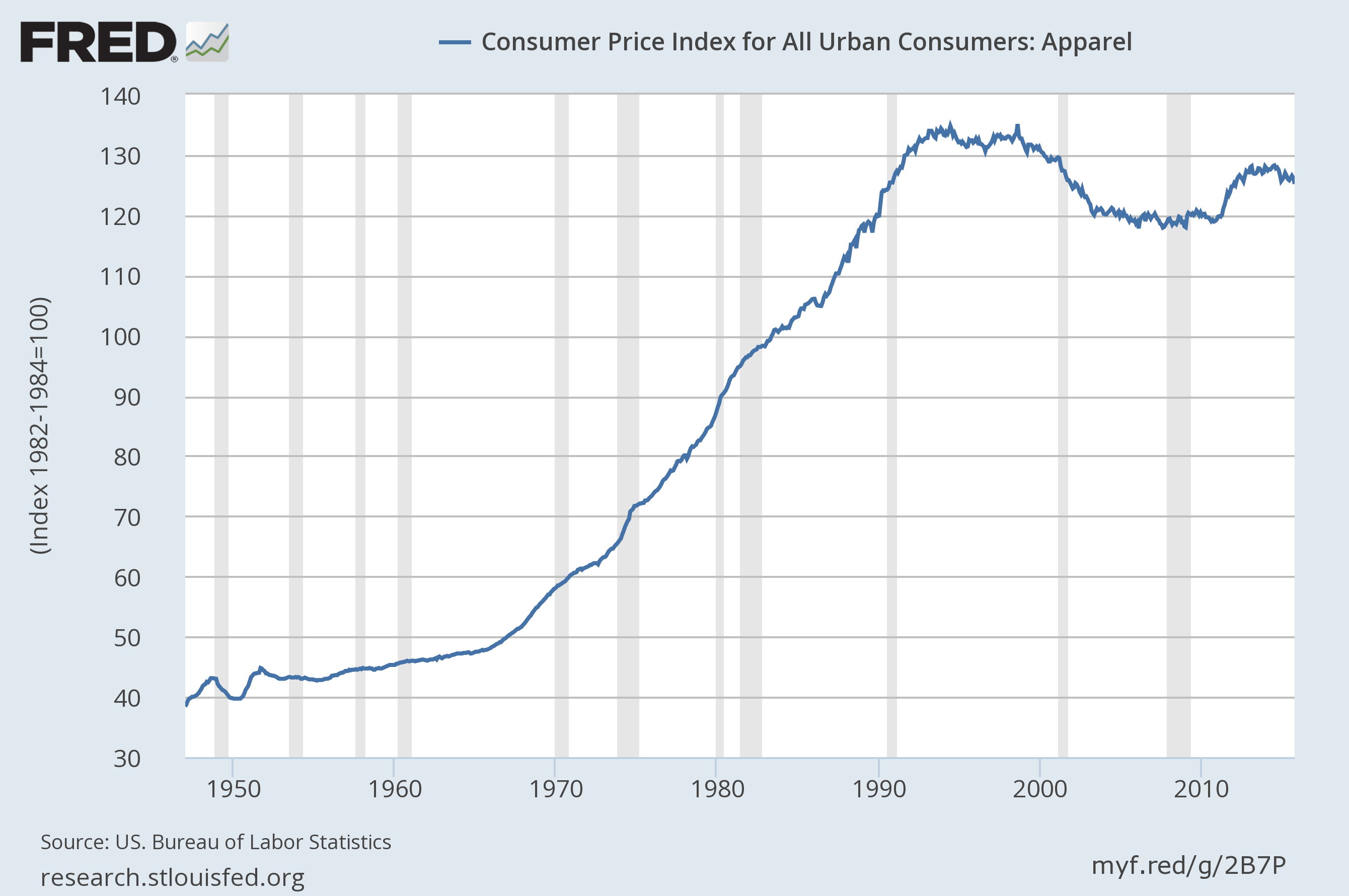
(click for larger)
Src:
US. Bureau of Labor Statistics, “Consumer Price Index for All Urban Consumers: Apparel [CPIAPPSL].” Retrieved from FRED, Federal Reserve Bank of St. Louis, November 18, 2015.
Note: Data available for download.
*
Shirt CPI 1998-2014
Men’s shirts and sweaters (SEAA03)
Series ID: CUUR0000SEAA03
base period: 1997
Annual average:
1998 100
1999 98.6
2000 98.3
2001 93.9
2002 88.8
2003 85.2
2004 85.3
2005 84.2
2006 84.7
2007 82.53
2008 80.444
2009 80.968
2010 78.642
2011 79.583
2012 82.224
2013 82.876
2014 80.973
Src:
“Consumer Price Index – All Urban Consumers.” Custom table, November 19, 2015. Bureau of Labor Statistics.
Nicole Rope, of the BLS CPI Apparel division, warns that there is much more volatility in individual clothing items that in the category on the whole (and more so compared with other items in other categories). She offers to speak with us if we have any other questions about apparel. 202-691-5395.
She also said that the Information and Analysis Section might also be helpful. Ken Stewart, manager, x6966. Steve Reed, senior economist x5378. They would be able to let us know if data older than 1997 is available. Shirt data was collected before that, but under a different name/definition.
UPDATE: Steve Reed shared the following data by email. He said that price data (not index data) older than 1977 may be available on an inconsistent basis. He will followup with whatever he can find later in December or January.
Annual Average CPI for Men’s Shirts 1978-1997
Series Id: MUUR0000SE3604
Not Seasonally Adjusted
Area: U.S. City Average
Item: Men’s shirts
Base Period: 198284=100
1978 81
1979 84.3
1980 91.4
1981 95.4
1982 98.4
1983 99.3
1984 102.4
1985 106.3
1986 107.1
1987 113.7
1988 119.9
1989 123.2
1990 128.1
1991 132.3
1992 135.3
1993 134.1
1994 131.5
1995 133
1996 135.3
1997 138.1
*
T-Shirt Prices – Misc dates 1938-2013
Based on old Sears catalogs featuring men’s white undershits
1938 .24 ($3.97 in 2013)
1945 .79 ($10.22 in 2013)
1955 .79 ($6.87 in 2013)
1970 1.492 (8.9512.01 in 2013)
1990 3.10 (Hanes)
2010 1.90 (Hanes)
2013 2.33 (Hanes)
Src:
Samantha Sharf. July 2, 2013. “The TShirt Turns 100.” Forbes.
Injuries Data
Current injuries data is collected by two federal agencies, the Centers For Disease Control, and the Bureau for Labor Statistics. The CDCs data describes overall injury rates (fatal and nonfatal) going back to 2002. BLS’s data describes work-related injury and illness rates (fatal and nonfatal) going back to 1992 (only 2003 for nonfatal incidents).
The Pardee Center for International Futures produces the most long-ranging forecasts for injury- and illness-related fatalities that I’ve found so far. (As far as I can tell, their forecasts do not included non-fatal incidents.) I’ve taken samples of their data from the top of the decade through 2050, but annual data are available from 2010 through 2100.
Data from all three sources (CDC, BLS, and Pardee) are aggregated in this Google Spreadsheet:
This graphic from a 2011 Pardee paper shows the general trend in fatalities due to injuries versus disease:

Src: Barry B. Hughes, Randall Kuhn, Cecilia M. Peterson, et al. 2011. “Projections of global health outcomes from 2005 to 2060 using the International Futures integrated forecasting model.” Bulletin of the World Health Organization.
